Menu
Shopping Cart
Close

Using Pop Up Banners for Events: A Practical Planning Checklist

Pop up banners for events look simple, yet they often decide whether visitors notice you or walk straight past. When budgets are tight and floor space is limited, every square metre of branding must work hard. A clear checklist helps you turn lightweight hardware into a reliable, reusable event asset.

Used well, pop up banners for events guide visitors, frame conversations and reinforce your message in every photo. Unlike complex exhibition builds, a pop up banner can be carried in one hand, assembled in under 90 seconds and reused at ten or more shows. The challenge is less about buying stands and more about planning how they will perform.

Thinking through objectives, quantities and placement before you order printing prevents last‑minute compromises. You avoid blocking fire exits, cluttering your stand or paying for graphics nobody reads. This checklist walks through each stage, from defining goals and layouts to coordinating with other materials and keeping everything safe.

Work through the sections in order, ideally six to eight weeks before your event. Treat each step as a decision gate: if you cannot answer the questions confidently, pause before ordering new pop up banners. That discipline keeps designs focused, spending controlled and your team aligned on exactly how every banner supports the event plan.

1
pop up banners for events

Why Use Pop Up Banners for Events in the First Place?

Why Use Pop Up Banners for Events in the First Place?

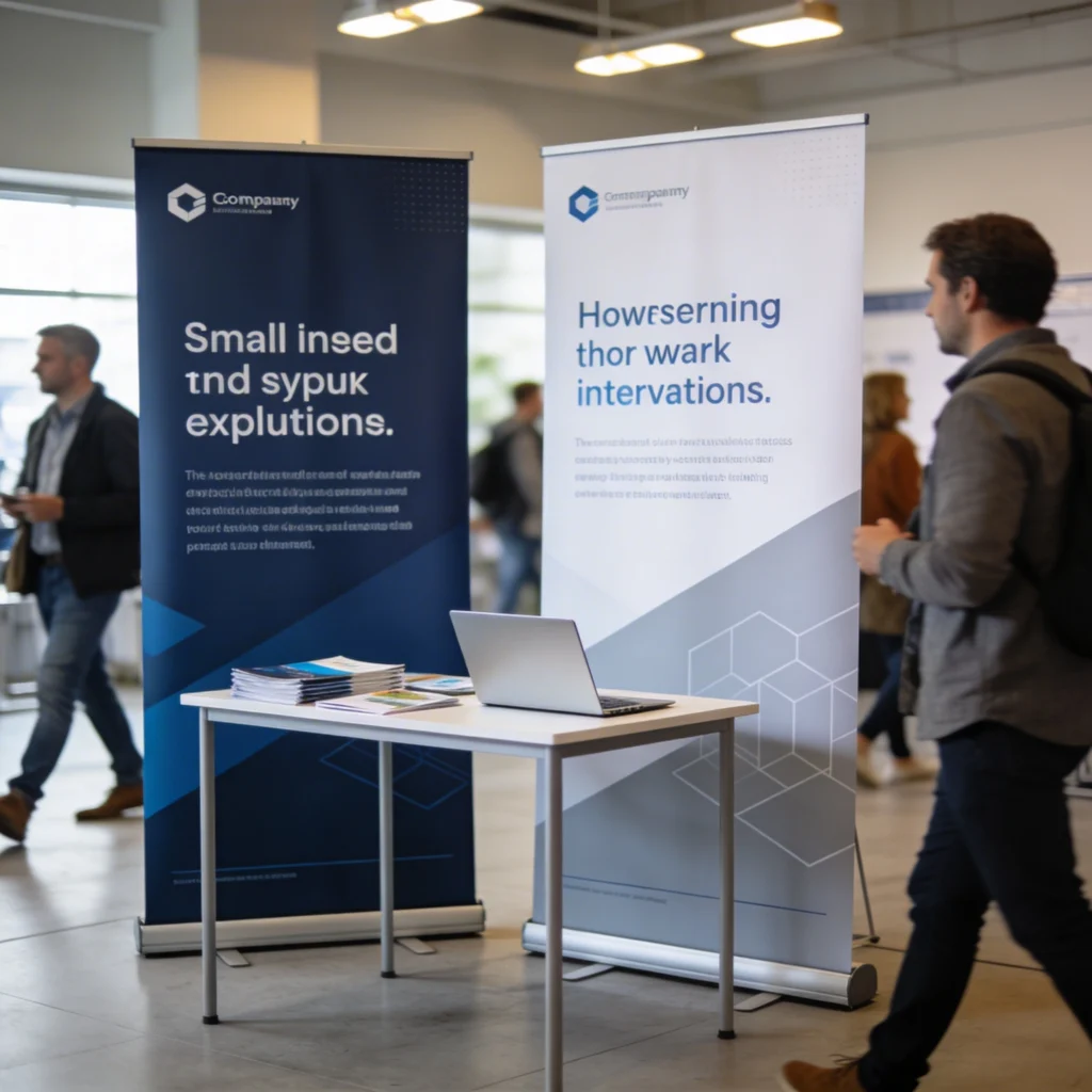
When you first consider pop up banners for events, think about how they support your wider presence. Strong headlines, clear branding and a single key message help passers-by understand who you are within seconds. Used well, they become visual shortcuts that attract attention even in a crowded exhibition hall.

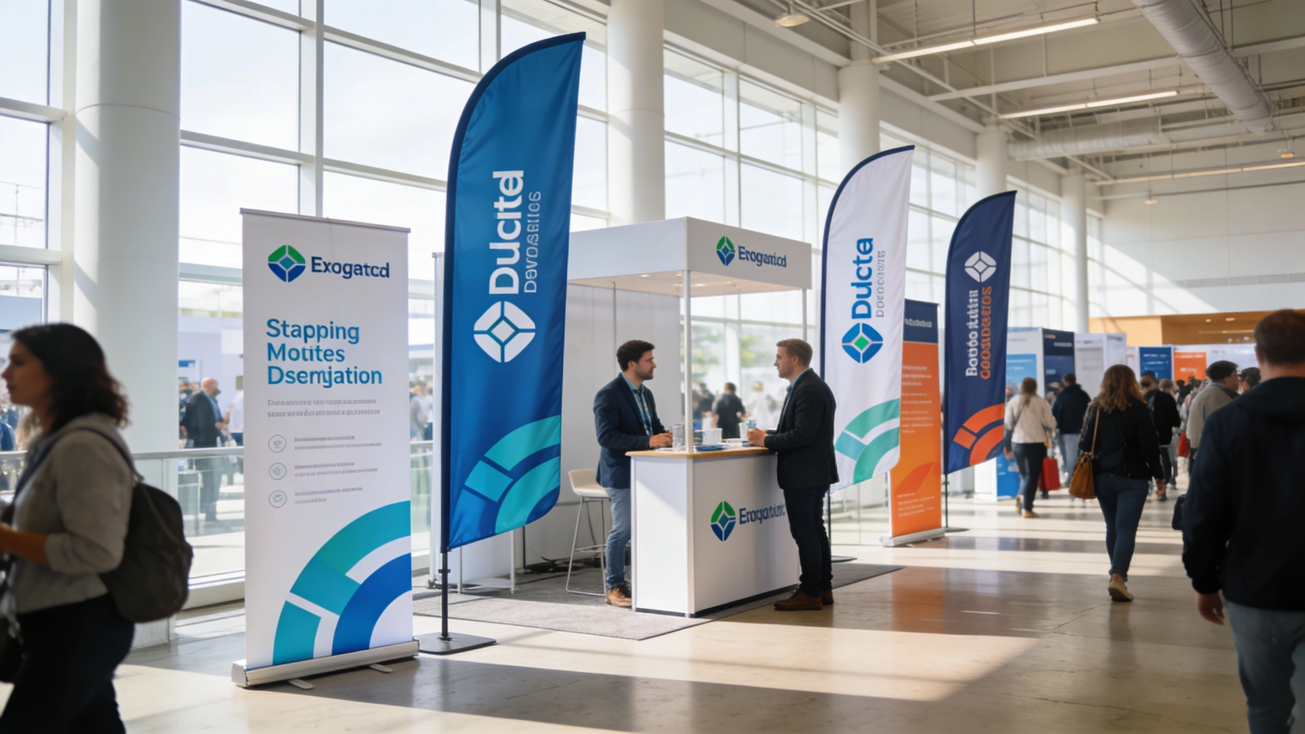
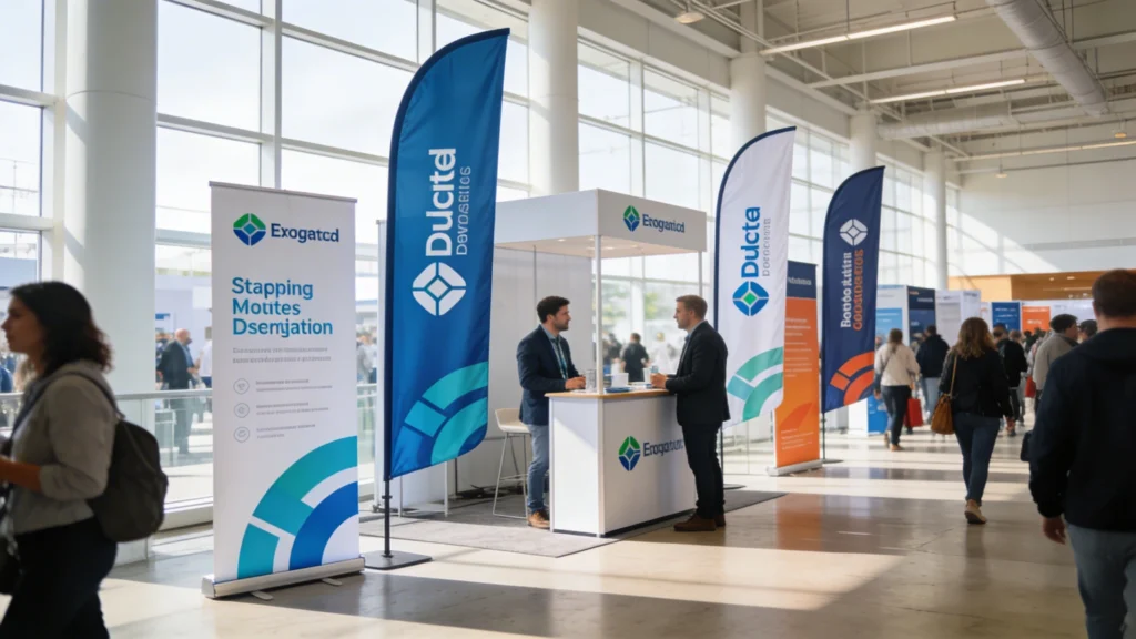
Pop up banners for events earn their keep by doing three jobs simultaneously: branding, wayfinding and promotion. A 2,000‑attendee conference might give each exhibitor only 3×2 metres of floor space, so vertical graphics become essential. Because a pop up banner rises to around 2,000mm, it stays visible above heads and furniture, acting as a constant visual anchor.

Branding and Recognition Across Busy Halls

Branding works through repetition at different distances. A tall pop up banner carries your logo at 2,000–2,200mm height, readable from 15–20 metres away. When visitors see that same logo on brochures and screens, recall increases measurably. Studies on trade shows suggest consistent visual branding can raise unaided brand recall by 20–30% compared with fragmented designs.

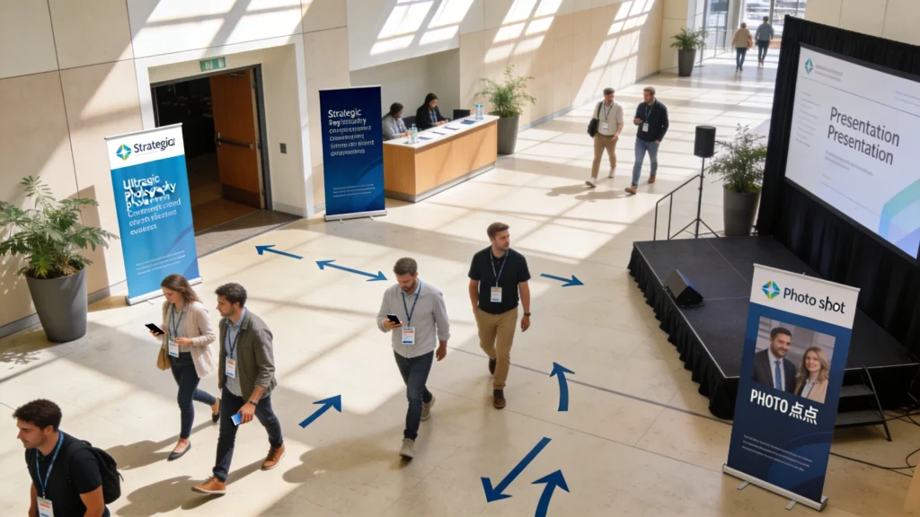
Wayfinding and Promotion That Reduces Confusion

Wayfinding banners reduce friction by answering “Where do I go?” in under three seconds. A simple arrow with “Registration this way” in 120‑point type can prevent queues forming at the wrong desk. Promotional copy such as “Live demo every 30 minutes” printed at eye level nudges undecided visitors to stay, increasing dwell time and contact opportunities without adding extra staff.

2
pop up banner

Planning Objectives Before Ordering Pop Up Banners for Events

Ordering pop up banners without clear objectives usually produces cluttered designs that try to say everything at once. Before speaking to a printer, define what success looks like in measurable terms. For example, you might aim for 150 scanned leads per day, a 20% increase in demo attendance, or guiding 80% of visitors to a specific product zone within three minutes.

Planning Objectives Before Ordering Pop Up Banners for Events

Placement can make or break the impact of your pop up banners. Position them where people naturally pause: at entrances, near registration, along main walkways and beside presentation areas. These high-traffic touchpoints turn your banners into quiet guides that direct visitors, reinforce your message and keep your brand visible all day.

Clarifying Messages for Different Visitor Stages

Different banners should speak to visitors at different decision stages. A high‑level branding pop up banner attracts attention from the aisle with a short benefit statement under ten words. Closer to your stand, detail banners can show three key features or pricing tiers. This staged approach mirrors a sales funnel, moving people from awareness to consideration in clear visual steps.

Ask one question per banner: “Should this attract, explain or direct?” If it tries to do more than one, split the content across multiple stands so each message remains legible from at least two metres away.

Aligning Banners with Event-Specific Goals

Objectives should reflect the event’s purpose. At a recruitment fair, banners might prioritise job roles, salary bands and application URLs in large text. At a product launch, they might highlight a single hero feature and pre‑order incentives. Writing these goals into a one‑page brief shared with designers and printers reduces revisions and avoids wasting budget on generic, unfocused pop up banners.

3
pop up banners

Deciding How Many Pop Up Banners for Events You Really Need

Deciding How Many Pop Up Banners for Events You Really Need

Deciding how many pop up banners you need starts with the size and layout of your space. A single banner can work for a compact table, while three or more may be better for creating a branded backdrop. Balance visibility with practicality so you don’t overcrowd the stand or obstruct visitor flow.

The right number of pop up banners depends on stand size, hall layout and how people will move through the space. As a rule of thumb, a 3×3 metre shell scheme can comfortably host two to three banners without feeling cramped, while larger 6×3 metre spaces might use four to five, including directional stands placed just outside the stand boundary.

Balancing Coverage with Visual Breathing Room

Too many banners create visual noise and hide your team; too few leave gaps that competitors’ graphics fill. Aim for roughly one metre of clear space between each pop up banner to avoid a “wall of text” effect. Consider ceiling height too: in venues with 4‑metre ceilings, a 2.1‑metre banner feels proportionate, whereas using six tall stands in a low‑ceiling room can overwhelm visitors.

Using Traffic Flow to Inform Quantities

Study the floor plan and expected footfall. If you sit on a main aisle, two facing banners may be enough because visitors naturally pass close by. On quieter corners, an extra banner at the junction can act as a signpost, pulling people towards you. For multi‑room events, allocate at least one directional banner per key junction where attendees choose between competing routes.

When in doubt, sketch the stand to scale on grid paper, drawing each banner as a 0.85‑metre rectangle. If the drawing looks crowded, it will feel worse in real life; remove at least one stand before ordering.

4

Best Locations to Place Pop Up Banners for Events

Placement often matters more than design quality. A well‑printed pop up banner hidden behind furniture delivers almost zero value, while a modest design at a decision point can dramatically increase engagement. Think in zones: entrances, aisles, demo areas and quiet corners where visitors pause. Each zone offers different viewing distances and sightlines you can intentionally exploit.

Best Locations to Place Pop Up Banners for Events

Before ordering any stands, define what you want your pop up banners to achieve. Are you driving sign-ups, promoting a new product or simply building brand recognition? Mapping objectives first helps shape the copy, imagery and calls to action on each banner, ensuring every design decision supports a measurable outcome.

Strategic Zones and Typical Uses

Entrance banners work from 10–20 metres away, so they should feature large logos and simple arrows. Aisle‑edge stands operate at 3–5 metres, ideal for short offers like “Free consultation today”. Demo‑area banners sit 1–2 metres from viewers, supporting more detailed diagrams. Photo‑backdrop banners often sit 1.5 metres behind people, so logos must appear around shoulder height to stay visible in pictures.

  • Place one pop up banner at least 1 metre inside the stand boundary, preventing it being knocked by passing bags.
  • Avoid positioning banners directly under strong spotlights that cause glare on laminate surfaces and reduce legibility.
  • Angle aisle‑facing banners at roughly 30 degrees so approaching visitors read them earlier, not only when directly opposite.
  • Keep at least 1.2 metres clear walkway between banners and furniture to comply with common venue circulation guidelines.

Using Banners as Photo Backdrops

Photo‑ready pop up banners extend your reach beyond the event by appearing in social posts and press images. To work well, keep logos within a repeating pattern every 300–400mm vertically and horizontally. Avoid placing critical text below 800mm height, where it will be hidden by shoulders in group photos. Choose matte finishes to prevent flash reflections spoiling images.

5

Coordinating Pop Up Banners for Events with Other Marketing Materials

Pop up banners rarely work alone; they form part of a visual ecosystem including brochures, digital screens, tablecloths and staff clothing. Inconsistent colours or conflicting typefaces dilute recognition and make your brand appear disorganised. A simple style guide, even a two‑page PDF, helps keep everything aligned across different suppliers and print runs over multiple events.

Coordinating Pop Up Banners for Events with Other Marketing Materials

Creating a Cohesive Visual Language

Choose one primary colour, one secondary accent and one neutral background that appear on every item. Use the same two fonts across banners, handouts and presentation slides, maintaining consistent heading sizes. When a visitor picks up a leaflet, they should instantly connect it with the pop up banner they noticed from the aisle, reinforcing trust through visual continuity.

Mapping Messages Across Channels

Think of each medium as handling a different layer of information. The pop up banner delivers the headline promise and main call‑to‑action. Brochures expand on features, pricing and case studies. Digital screens can loop 30‑second demos or testimonials. Staff uniforms reinforce brand colours, acting as moving signposts. Mapping these layers prevents duplication and keeps every touchpoint purposeful.

  • Reuse the same core headline across banners, landing pages and email campaigns to reduce cognitive load on visitors.
  • Include matching QR codes on banners and brochures, linking to a single tracking URL for cleaner analytics later.
  • Brief staff using printed cue cards that mirror banner wording, so spoken pitches echo written promises precisely.
  • Ensure any giveaway packaging, such as tote bags, repeats colours and icons used prominently on your main pop up banner.
6

Set-Up, Safety and Accessibility Considerations for Pop Up Banners

On event day, rushed set‑up can turn well‑designed pop up banners into hazards. Each stand typically weighs 3–6kg and extends to around 2,000mm high. If bases are not fully opened or cassettes are damaged, banners may topple when someone brushes past. A short, rehearsed set‑up routine reduces risk and keeps your stand compliant with venue safety rules.

Set-Up, Safety and Accessibility Considerations for Pop Up Banners

Practical Safety and Accessibility Checklist

Start by fully extending the banner base feet to their maximum width, usually around 300–400mm per side. Position stands at least 1 metre away from emergency exits or fire equipment, as most venues enforce strict access corridors. Tape down any loose case straps to avoid trip hazards. For accessibility, maintain clear 1.2‑metre pathways suitable for wheelchairs around and between banners.

Item Typical Value Safety Note Accessibility Impact
Banner height 2,000–2,200mm Check for low ceilings, lights or sprinklers before raising graphic fully. Ensure top text is not the only place key information appears.
Base footprint 800–1,000mm wide Keep bases inside stand line to avoid tripping passing visitors. Leave at least 1.2m clear route in front of each base.
Weight per stand 3–6kg Lift using both hands; avoid stacking more than three in a tower. Store cases under tables, not in circulation routes.
Text height 900–1,600mm Avoid critical information below 800mm where bags obscure it. Place key messages at seated eye level for wheelchair users.
Viewing distance 1–5 metres Use larger fonts (80–150pt) for headings read from aisles. High contrast colours improve legibility for low‑vision visitors.
Setup time 1–2 minutes Practice beforehand to avoid rushing and incorrect assembly. Less clutter during setup means fewer temporary obstacles.

Assign one team member as “stand safety lead” responsible for a quick inspection every few hours. They should check for leaning stands, loose graphics and any encroachment into walkways as furniture shifts. Photograph final layouts once approved by venue staff; these images become a reference for future events, speeding compliance checks and preserving successful configurations.

7

Evaluating the Impact of Pop Up Banners for Events Afterward

Evaluation closes the loop between design decisions and real‑world performance. Instead of guessing whether a pop up banner worked, build simple measurement into your event plan. Use unique QR codes, short URLs or offer codes printed on specific banners so you can attribute scans, visits or redemptions to individual locations or messages when reviewing analytics afterwards.

Evaluating the Impact of Pop Up Banners for Events Afterward

Collecting Quantitative and Qualitative Feedback

Quantitative data might include the number of QR scans per banner, lead forms completed near certain stands or time‑stamped footfall counts. Qualitative feedback comes from staff observations and visitor comments. Ask team members which banners visitors mentioned or photographed. Combine both data types to identify which designs and positions generated the most meaningful interactions, not just glances.

Right after the event, hold a 30‑minute debrief while memories are fresh. Capture three things to keep, three to change and three experiments for next time, all specifically referencing banner locations, messages and designs.

Iterating Designs for Future Events

Treat each event as a prototype. If a banner with a numbers‑based headline (“Save 30% energy”) outperforms a vague slogan, update your template accordingly. Retain hardware but reprint graphics to reflect proven wording and layout improvements. Over three or four events, this iterative approach can double response rates from the same number of pop up banners, maximising long‑term return on your initial investment.

Cart