


-
Empty cart
No products in the cart.
Return to Shop

Core principles like visual hierarchy, simplicity and legibility make the difference between a banner that blends into the background and one that draws people in. At typical viewing distances, large type, clear focal points and generous spacing ensure your key message is visible first, even in a crowded, visually noisy venue.
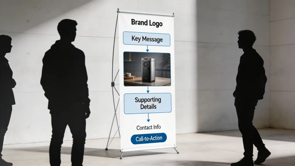
Effective pop up banner designs start with visual hierarchy, which determines what people notice during the first two seconds from 3–5 metres away. Large, high‑contrast headlines at least 150–200 pt guide attention, followed by supporting visuals and concise copy. When you deliberately control this order, you reduce cognitive load and help viewers instantly understand why your stand matters.
Hierarchy, Contrast and Whitespace
Hierarchy works best when combined with strong contrast and generous whitespace, especially on tall formats around 2,000 mm high. Dark text on light backgrounds, or vice versa, improves legibility under mixed exhibition lighting. Leaving 20–30% of the banner as empty space around key elements prevents visual clutter, making your main message feel premium and easier to scan from a distance.
Scale for Distance and Movement
Because visitors often walk past at 4–5 km/h, your design must be readable in motion. That means limiting headline length to around eight words and using icons or product photos large enough to recognise at 5 metres. Placing the core benefit statement in the upper third ensures people see it even when crowds partially block lower sections of the pop up banner.