

-
Empty cart
No products in the cart.
Return to Shop
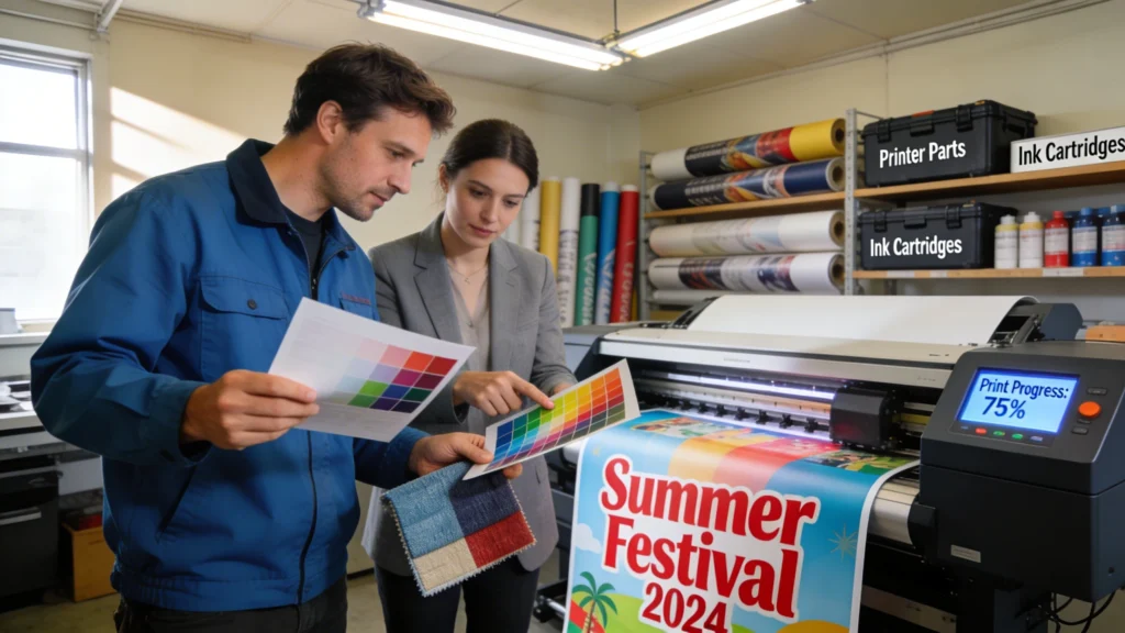
Understanding the basics of pop up banner printing starts with seeing how resolution, viewing distance and colour accuracy interact. A banner that looks fine on screen can appear pixelated or washed out at full size. Knowing the technical limits of large-format printing helps you avoid blurry text, jagged logos and disappointing colour reproduction at events.
Large‑format pop up banner printing follows the same principles as any professional print, but small oversights become very visible at two metres high. Because viewers stand 1–5 metres away, printers balance resolution, viewing distance and ink coverage to keep graphics crisp without creating huge, unmanageable files. Knowing these basics helps you choose the right specs on every order.
Resolution, Viewing Distance and Print Sharpness
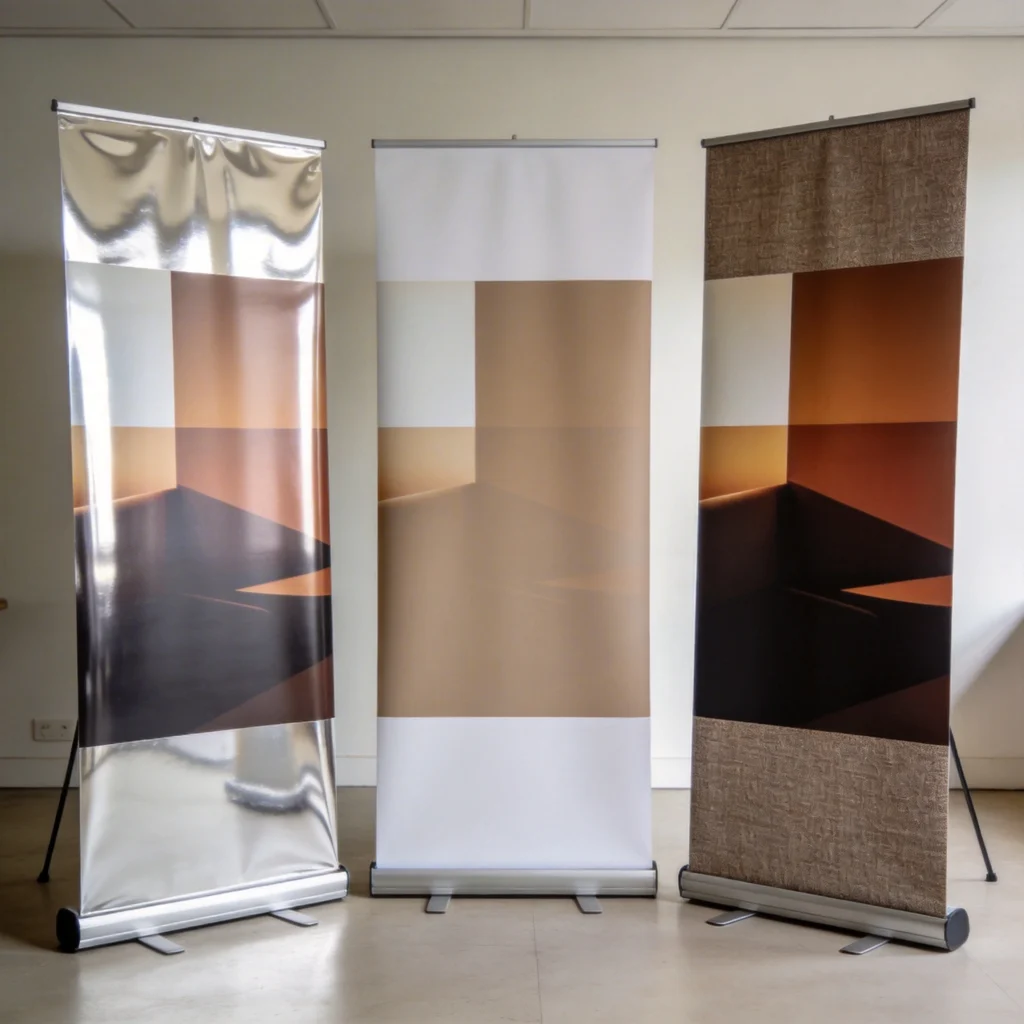
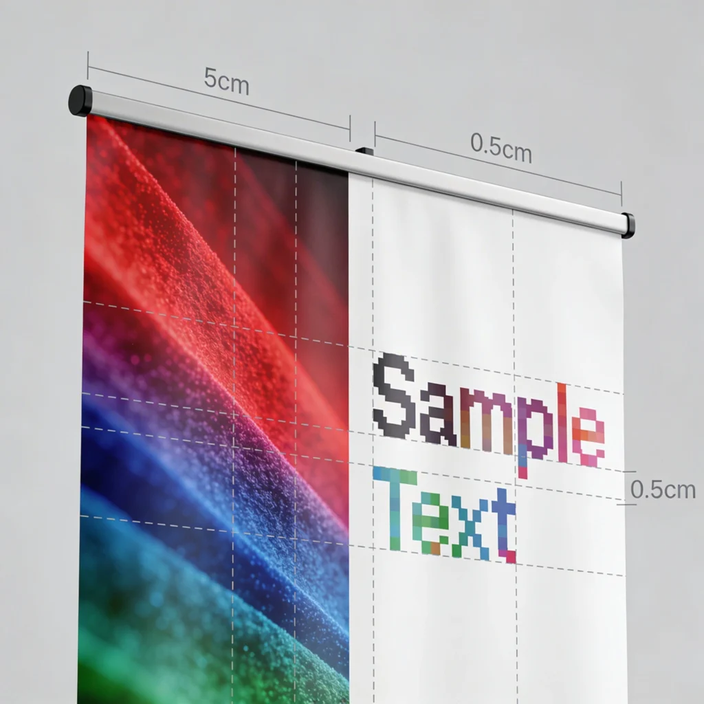
For pop up banners around 800 mm × 2000 mm, aim for artwork at 100–150 dpi at full size, not 300 dpi like brochures. At typical viewing distances of 2–3 metres, the human eye cannot distinguish higher resolutions, so bigger files only slow uploads. However, logos and small body text should start from vector artwork, preventing fuzzy edges when enlarged significantly.
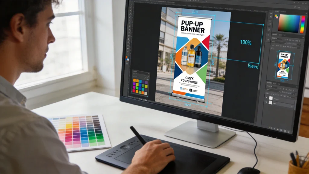
Colour Profiles, Bleed and Safe Areas
Most printers request CMYK colour profiles, often FOGRA39 or ISO Coated v2 in Europe, because their presses lay down cyan, magenta, yellow and black inks. Supplying RGB files can shift brand colours, especially strong blues and oranges. Always include 3–5 mm bleed on all sides and keep text at least 10–15 mm inside the trim line, avoiding accidental cropping during finishing.