Extra Sale 10% off

Menu
Shopping Cart
Close

Roller Banner Design Ideas: Create Effective Roller Banner Designs That Convert

People decide whether to approach your stand in under three seconds, often from five metres away. A well-planned roller banner design can turn that split-second glance into a valuable conversation, lead or sale. When your layout, message and branding work together, the banner becomes a silent salesperson that never gets tired.

Strategic roller banner design starts with clarity: one audience, one main message, one primary action. Instead of cramming every service, you prioritise a bold headline, recognisable branding and a single offer that solves a specific problem. This focus helps your roller banner stand out in crowded venues where visitors are bombarded with competing visuals and noise.

Thinking like a marketer, not just a designer, means planning how people will see the banner from different distances. From 10 metres, they should grasp who you are. From 5 metres, they should understand what you offer. From 1–2 metres, they should know exactly how to respond. Every design decision supports that journey.

By combining clear hierarchy, consistent colours and concise copy, your roller banner designs reinforce your wider marketing campaigns. Used at trade shows, pop-ups or in-store, they repeat the same promise as your website and ads. This alignment builds trust and recall, so people connect your banner instantly with the rest of your brand experience.

1
roller banner design

Fundamentals of Effective Roller Banner Design and Layout

Fundamentals of Effective Roller Banner Design and Layout

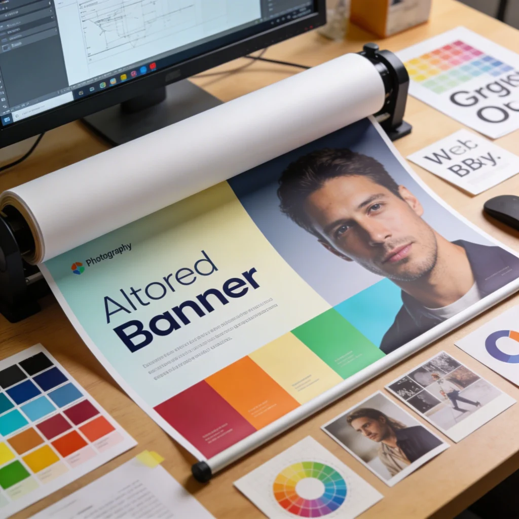
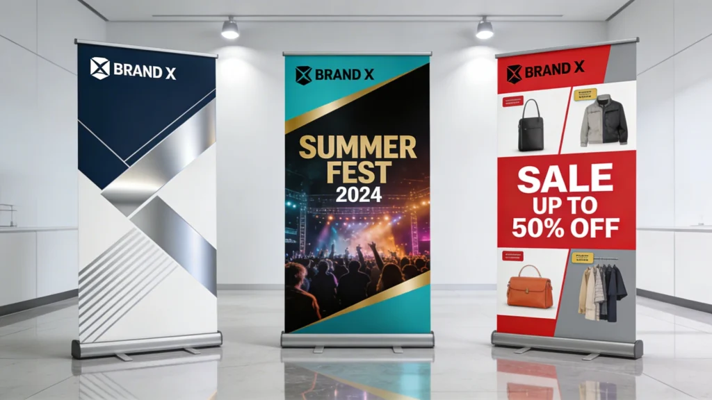
Effective roller banner layouts rely on visual hierarchy and simplicity. Prioritising one main message, supported by a bold headline and clear call-to-action, makes it easy for people to understand your offer at a glance. When you strip away clutter, your key benefit becomes instantly recognisable, even in a busy exhibition hall.

Strong layouts are the backbone of effective roller banner design, because they control how eyes move from headline to logo to call to action. Human eyes typically follow an F-shaped or Z-shaped pattern, scanning from top to bottom and left to right. Designing with this in mind ensures your most profitable information appears exactly where people naturally look first.

Visual hierarchy and focal points

Visual hierarchy means deliberately making some elements louder than others using size, weight and contrast. On a standard 800mm × 2000mm roller banner, the main headline might occupy the top 300–400mm, set in 120–160pt type for legibility at 5–8 metres. A single strong focal image below anchors attention, while supporting text stays smaller and lighter to avoid competing.

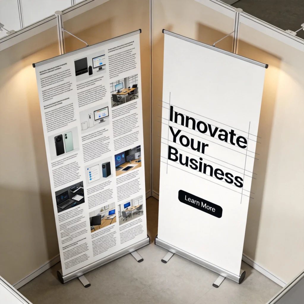
Reading zones and safe areas

Because roller banners retract into a cassette, the bottom 100–150mm can disappear slightly or be hidden behind furniture. Keeping logos, URLs and QR codes at least 200mm above the base prevents vital content from vanishing. Leaving 20–30mm margins around edges avoids trimming issues during printing, so no text or icons are sliced off, even with minor production tolerances.

2
roller banner

Roller Banner Design Ideas for Branding, Events and Retail Campaigns

Roller banner design ideas become more powerful when tailored to specific environments rather than reused everywhere. A banner for a busy trade show must grab attention from an aisle, while an in-store banner can afford more detail because shoppers stand closer. Adjusting imagery, offers and layout to match each context increases relevance and conversion rates.

Roller Banner Design Ideas for Branding, Events and Retail Campaigns

Strong copy turns your roller banner into a clear, persuasive message. A short, benefit-led headline grabs attention first, followed by a concise explanation of what you offer and who it helps. Ending with a specific call-to-action—such as visiting your stand or scanning a QR code—guides visitors on exactly what to do next.

Campaign-specific concepts and placements

For branding-focused events such as conferences, consider a clean roller banner with a large logo, short tagline and brand-colour background. At product launches, feature a life-size product image occupying 60–70% of the height, with a launch date and QR code linking to pre-orders. In retail, place price-driven banners near entrances or aisle ends where traffic and dwell time are highest.

Align each roller banner with a single campaign objective—brand awareness, lead capture or direct sales—and remove any element that does not push that objective forward measurably.

Practical design ideas by scenario

  • Trade shows: Use a bold problem–solution headline, a benefit-led subline and a QR code for instant demo bookings.
  • Conferences: Prioritise logo visibility at the top, a short positioning statement and minimal copy to avoid visual fatigue.
  • Pop-up shops: Showcase lifestyle photography and a limited-time discount, valid only at that location, to drive urgency.
  • In-store promotions: Combine product shots with clear price points and arrows guiding shoppers toward the relevant shelf.
3
roller banner designs

Using Colour, Fonts and Imagery in Professional Roller Banner Designs

Using Colour, Fonts and Imagery in Professional Roller Banner Designs

Colour, fonts and imagery work together to guide the eye and set the mood of your roller banner. High-contrast colours improve readability from a distance, while professional photography and clean typefaces build trust. When these elements are chosen deliberately, they support your message instead of distracting from it.

Colour, typography and imagery determine whether your roller banner looks like a polished brand asset or a last-minute print. Colour choices influence emotion and legibility at distance, while fonts and photos affect perceived professionalism. When these elements follow your brand guidelines consistently, visitors can recognise you instantly across stands, packaging, websites and social posts.

Colour contrast, brand consistency and accessibility

High contrast between background and text is essential because venues often have uneven lighting. Aim for a contrast ratio near 4.5:1 or higher, especially for smaller copy under 40pt. Use your primary brand colour for large areas, then introduce one accent colour for calls to action. Avoid using more than three main colours to prevent visual noise and brand dilution.

Typography, imagery and resolution requirements

Choose one display font for headlines and one highly readable sans-serif, such as Roboto or Source Sans, for body copy. Keep body text around 28–36pt on an 800mm-wide roller banner so it remains legible at 1.5–2 metres. Supply images at 150–300 dpi at final print size; for a full-height 2m background, that means files around 3500–6000 pixels tall.

4

Writing Copy for Roller Banner Designs: Headlines, Messages and Calls to Action

Copy on roller banner designs must communicate value in as few words as possible because people rarely stand reading long paragraphs in crowded spaces. Aim for 5–10 word headlines that promise a clear benefit, supported by one or two short lines of context. Every phrase should earn its place by either clarifying, persuading or directing action.

Writing Copy for Roller Banner Designs: Headlines, Messages and Calls to Action

Roller banners can be adapted for branding, events and retail campaigns while still feeling cohesive. A consistent logo, colour palette and tone of voice ties everything together, even when the message changes. This lets you create families of banners that reinforce your brand across conferences, pop-up events and in-store promotions.

Structuring headlines and key messages

Effective headlines often follow a problem–benefit format, such as “Cut Warehouse Picking Time by 30%” or “Same-Day Dental Implants in London.” Place this at the top third of the roller banner, where eyes land first. Below, add one concise proof point—like “Trusted by 500+ clinics” or “ISO 9001 certified”—to build credibility without overwhelming viewers.

Write your copy at half the length of your first draft, then test legibility by stepping back three to five metres and timing how long it takes to understand.

Calls to action and scannable elements

  • Use direct verbs such as “Book a demo,” “Scan for samples,” or “Join our free trial today.”
  • Place CTAs around waist to chest height so QR codes and URLs are easy to scan or photograph.
  • Limit banners to one primary CTA and, at most, one secondary option to avoid decision fatigue.
  • Shorten URLs using branded short links, ensuring they are memorable and readable from several metres away.
5
roller banner design ideas

Roller Banner Design Ideas for Different Roller Banner Sizes

Different roller banner sizes change how much content fits comfortably and how people physically interact with the display. Narrow banners work well as directional or supporting pieces, while wide and extra-tall formats can carry more storytelling. Adapting your roller banner design ideas to each size prevents cramped layouts and ensures key content remains visible from the right distance.

Roller Banner Design Ideas for Different Roller Banner Sizes

Comparing common roller banner formats

The table below compares typical roller banner dimensions, recommended viewing distances and suitable content density. Treat these as planning guidelines when deciding font sizes, image scales and how many copy blocks to include. Oversizing text on small banners or overloading wide ones with tiny details both reduce clarity and impact in real-world venues.

Banner Size (W×H) Typical Use Ideal Viewing Distance Recommended Headline Size Content Density Guide
600mm × 1600mm Directional signs, small pop-ups 1–3 metres 90–110pt Short headline, logo, one CTA only
800mm × 2000mm General trade show stands 2–5 metres 120–160pt Headline, image, 2–3 bullet benefits
850mm × 2150mm Premium event branding 3–6 metres 130–170pt Headline, subheading, image, proof point
1000mm × 2000mm Retail entrances, product launches 3–7 metres 150–190pt Headline, large product image, price block
1200mm × 2150mm Backdrops, media walls 4–8 metres 170–210pt Logo pattern, short tagline, minimal copy

When adapting artwork, prioritise resizing and repositioning over simple scaling. On wide banners, push imagery to one side and stack text vertically so people can photograph information easily. On narrow banners, drop secondary messages and rely on a single strong headline plus QR code, treating the banner as a pointer to richer digital content.

6

Common Roller Banner Design Mistakes and How to Fix Them

Common Roller Banner Design Mistakes and How to Fix Them

Many roller banner designs underperform not because of the product or offer, but because of avoidable layout and content errors. Typical issues include overcrowded text, weak contrast, low-resolution images and CTAs hidden at ankle height. Each mistake reduces legibility, especially under harsh exhibition lighting, and can cut engagement dramatically compared with cleaner alternatives.

Diagnosing layout and legibility problems

A cluttered banner often results from copying website content directly into the design. If you have more than 40–50 words of continuous text, visitors will likely skim past. Another warning sign is when logo, headline and CTA all use similar font sizes or colours, leaving no clear entry point. In print proofs, blurred logos indicate images below 150 dpi at final size.

Test your design by printing it on A4, placing it three metres away and checking whether the headline, logo and CTA are still instantly readable.

Practical fixes for stronger roller banner designs

  • Cut body copy by half, converting long sentences into three short benefits with measurable outcomes or time savings.
  • Increase contrast by darkening backgrounds or switching text to solid white or black, avoiding mid-tone combinations.
  • Replace pixelated photos with original high-resolution files or licensed stock sized correctly to the print dimensions.
  • Move CTAs and QR codes upward so they sit between knee and chest height, avoiding obstruction by tables or crowds.
7

Working with a Designer vs DIY: Bringing Your Roller Banner Design Ideas to Life

Choosing between a professional designer and DIY tools depends on budget, timelines and how central roller banners are to your marketing. Professional designers typically charge £100–£300 per banner design, but they align artwork with your wider brand system. DIY platforms like Canva or VistaCreate reduce costs but demand more time and design judgment from your team.

Working with a Designer vs DIY: Bringing Your Roller Banner Design Ideas to Life

When to hire a designer and how to brief effectively

Hiring a designer makes sense for flagship events, national campaigns or when you lack internal brand guidelines. A strong brief includes audience description, campaign objective, final banner size, required logos, colour codes and example phrases. Sharing venue photos helps designers anticipate viewing distances, while providing previous materials ensures your new roller banner matches existing collateral.

Using templates and online tools wisely

DIY templates from printing companies often come sized correctly for common roller banner formats, reducing technical errors. Start with a simple layout, then customise colours and fonts to match your brand rather than adding decorative elements. Before uploading artwork, export high-resolution PDFs with fonts embedded and colours set to CMYK, which most roller banner printers specify for consistent output.

Whether you outsource or design in-house, agree on one success metric—such as scanned QR codes or captured leads—and refine future roller banner designs against that benchmark.

By treating your roller banner as a focused marketing asset instead of a generic backdrop, you unlock far higher returns from the same floor space. Clear hierarchy, disciplined copy and size-appropriate layouts ensure people grasp your value quickly. With each iteration, track responses, refine your roller banner design ideas and build a portable brand presence that consistently converts.

Cart