
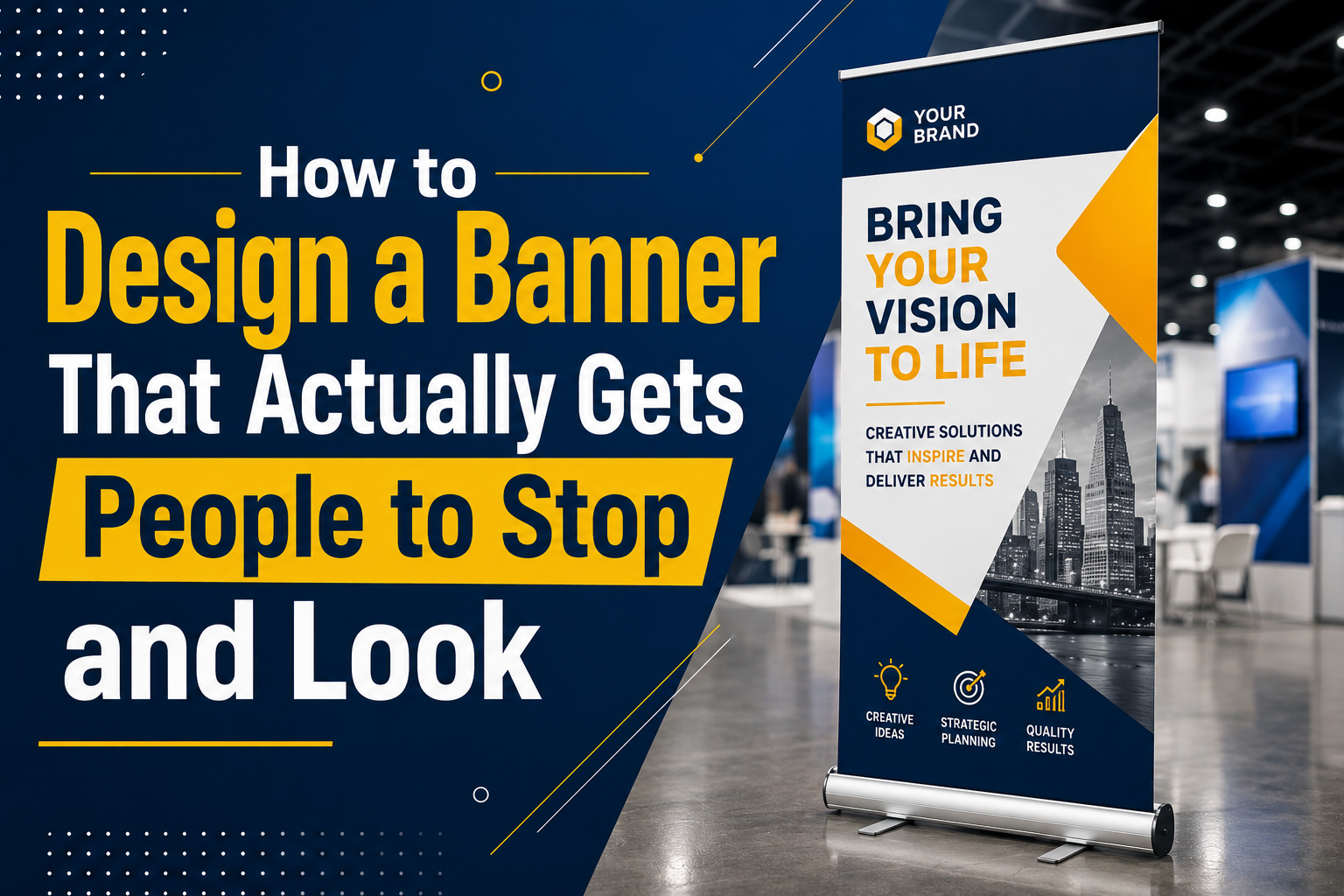
Most banners fail for one simple reason.
They try too hard.
Too much text. Too many colours. Too many logos. Tiny fonts nobody can read from a distance. Random graphics fighting for attention all at once.
And the result?
People walk straight past without noticing anything.
This happens constantly at trade shows, retail events, exhibitions, shopping centres, and even outside local businesses. Companies spend money printing banners that technically contain information but completely fail at grabbing attention.
A good banner is not about squeezing everything onto one design.
It is about stopping people long enough to make them curious.
That is the real goal.
Because once somebody pauses and looks, you already won the hardest part.
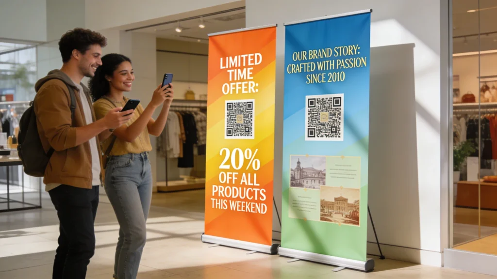
People See Banners for Seconds, Not Minutes
This is the first thing businesses need to understand.
Nobody stands in front of a banner reading paragraphs like a magazine article. Most people glance at displays while walking, talking, checking phones, or looking around busy spaces.
You usually get maybe three seconds.
That means your design needs to communicate instantly.
Strong banners answer three basic questions immediately:
- What is this business?
- What are they offering?
- Why should anyone care?
If people cannot understand the message quickly, they move on.
Simple always performs better than cluttered.
Big Text Wins Every Time
Businesses constantly make text too small.
Honestly, this is probably the most common banner mistake.
If somebody cannot read the main message from several metres away, the banner loses its purpose completely.
Headlines should be bold, clear, and easy to understand within seconds.
Not clever. Not complicated. Clear.
Good examples:
- Same Day Printing
- Up To 50% Off
- Custom Event Banners
- Fast UK Delivery
- Premium Exhibition Displays
Bad examples are usually long sentences packed with unnecessary wording.
At events especially, people scan visually first before deciding whether something deserves attention.
Large readable text matters more than fancy design tricks.
Colour Contrast Is More Important Than Fancy Graphics
A lot of banners look weak simply because the colours blend together badly.
Good contrast creates visibility.
Dark backgrounds with bright text often work well. White space also helps important elements stand out more clearly.
One thing strong banners do really well is controlling visual focus.
Your eye should naturally land on the most important message first.
That usually means:
- Bold headline
- Strong product image
- Clear offer
- Company branding
Everything else should support those elements instead of competing with them.
And honestly, too many colours usually hurt designs instead of improving them.
Simple colour palettes often look more professional and easier to read.
Images Need to Feel Real
People instantly recognize bad stock photography now.
Overly fake smiling office photos or generic business images make banners feel cheap and forgettable.
Strong banner designs usually use:
- Real products
- Real environments
- Clear close-up visuals
- Lifestyle photography
- Simple clean graphics
Good visuals create emotional connection faster than text alone.
Especially in retail, food, fitness, beauty, hospitality, and event marketing.
People respond emotionally before logically most of the time.
That is just reality.
Empty Space Makes Banners Stronger
This part surprises many businesses.
Not every part of a banner needs to contain something.
Whitespace helps important elements breathe.
Crowded banners overwhelm people visually because the brain struggles to decide where to focus first. Clean layouts feel more professional and easier to process quickly.
Luxury brands understand this extremely well.
They rarely overload designs because simplicity creates confidence.
A banner does not need to scream loudly to attract attention.
Sometimes calm, clean design stands out more in busy environments full of visual chaos.
One Message Is Better Than Five
A banner should focus on one primary message.
Not five.
This is where many businesses go wrong. They try to advertise every service, every offer, every social media platform, every phone number, and every product all at once.
People remember almost none of it.
Strong banners stay focused.
If the goal is promoting a sale, focus on the sale.
If the goal is brand awareness, focus on branding.
If the goal is event visibility, focus on making the booth noticeable.
Trying to communicate everything usually weakens the main message completely.
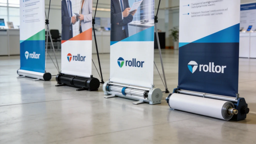
Placement Changes Everything
Even a great banner can fail in the wrong location.
People naturally notice banners differently depending on movement, lighting, and surrounding distractions.
At exhibitions, banners positioned near entrances or corners often perform better because foot traffic slows naturally there.
In retail, window-facing graphics usually work best when placed at eye level instead of too high.
Outdoor banners need stronger colours and larger text because people often view them from greater distances.
Context matters.
Designing without considering placement is a huge mistake many businesses make.
Roller Banners Need Different Design Rules
Roller banners behave differently from large wall banners or outdoor signage.
People view them vertically while standing fairly close.
That means the design should flow naturally from top to bottom.
Good roller banner layouts usually follow this pattern:
- Logo at the top
- Main headline
- Supporting image or benefit
- Short details
- Call to action
The biggest mistake businesses make with roller banners is placing too much information near the bottom where it becomes harder to notice quickly.
Keep important content near eye level.
Lighting Affects Banner Visibility
This gets ignored constantly.
Exhibition halls, shopping centres, and event venues all have different lighting conditions. Glossy materials sometimes create reflections that make text difficult to read.
Matte finishes often solve this problem better.
Fabric displays also photograph nicely because they reduce glare under strong lights.
Good design is not only about artwork.
Material choice matters too.
A beautiful design printed on poor-quality material can still look disappointing in real-world conditions.
Movement Catches Attention Naturally
Human eyes notice movement instinctively.
Designers use this psychologically by creating directional flow inside banner layouts.
Diagonal lines, strong shapes, arrows, and visual pathways subtly guide the eye across the design.
Even static banners can feel dynamic when movement is designed properly.
This is one reason modern banner designs often use angled shapes and layered elements instead of flat block layouts.
It creates energy without becoming messy.
Branding Should Feel Consistent
A banner should feel connected to the rest of the business.
Colours, fonts, logos, and overall visual style should match the website, packaging, storefront, or social media branding.
Consistency builds trust.
When everything visually feels connected, businesses appear more established and professional.
Random inconsistent designs make brands feel weaker.
People may not consciously analyze branding consistency, but they definitely notice when something feels polished versus chaotic.
Call-to-Actions Still Matter
A surprising number of banners never actually tell people what to do next.
Good banners guide attention toward action.
That could mean:
- Visit our stand
- Shop now
- Scan the QR code
- Book today
- Ask for a demo
- Visit our website
Without direction, attention often disappears without conversion.
Even subtle calls-to-action improve engagement significantly.
Trends Change, But Visibility Never Does
Banner design styles evolve constantly.
Minimalism becomes popular. Then bold maximal designs return. Colour trends shift every year.
But some principles never really change.
People still respond to:
- Clear messaging
- Strong contrast
- Readable typography
- Emotional visuals
- Simple layouts
- Professional branding
The businesses getting attention are usually the ones designing for human behaviour instead of just following design trends blindly.
Final Thoughts
Good banner design is not really about making something “look cool.”
It is about getting noticed quickly in busy environments where people are constantly distracted.
The best banners feel simple, clear, readable, and visually confident. They communicate fast without overwhelming people with information.
Whether it is a roller banner, exhibition display, retail graphic, or outdoor sign, the goal stays the same.
Make people stop long enough to care.
Because attention is the hardest thing to earn now.


