Picking the right poster size for printing is your first move toward a winning campaign. In the UK, the most popular and wallet-friendly choices are the 'A-series' sizes—think big-impact A0, versatile A1, and the ever-popular A2. These standard dimensions are the industry backbone, ensuring your poster looks just right whether it’s in a shop window or a massive trade show display. Getting your head around this simple system is the key to making your design work.
Understanding Standard Poster Sizes
Before you get lost in measurements, let's break down the logic behind UK poster sizes. Nearly all commercial printing, including ours here at Banner Printing Ltd, runs on the ISO 216 standard. This is where the famous 'A-series' comes from, and it’s a brilliantly simple system built for pure efficiency.
The easiest way to think about it is folding a piece of paper. The biggest size, A0, has a surface area of exactly one square metre. Fold it in half, and you've got two A1 sheets. Fold that A1 in half, and you get two A2 sheets, and so on. This clever relationship means every size keeps the exact same aspect ratio, so you never get weird stretching or squashing when you scale a design up or down.
This standardisation is exactly why the A-series is the go-to for UK businesses. It just makes life easier.
- No Guesswork: You know precisely what you're getting, so your poster will fit standard frames and display stands without any hassle.
- Cost-Effective: Printers like us are geared up to run these sizes all day long. That efficiency means lower printing costs for you.
- Design Flexibility: An artwork created for an A2 poster can be resized for an A1 or A3 instantly, without any painful cropping or redesign work.
Sticking to these common dimensions takes the guesswork out of the equation and simplifies everything, from design to display. It’s the foundation for any effective visual marketing, making sure your message looks professional and hits with maximum impact.
With this knowledge, you can quickly figure out which category your project fits into. If you want to explore the topic further, you can check out this comprehensive guide to poster prints for some extra helpful insights.
Now, let’s see how these sizes work in the real world.
Standard UK Poster Dimensions and Common Uses
All those codes and numbers can feel a bit abstract, so let's translate them into real-world tools for your business. Knowing what each poster size is typically used for is the key to picking the right one for your marketing goals. Each has its own job, from up-close promotions to big, bold announcements.
The A-series is the undisputed champion of commercial printing here in the UK. It’s a beautifully simple system, and its logic and consistency are why it accounts for a staggering 85% of all commercial print orders. It just works.
This simple diagram shows exactly how the sizes relate to each other—it's all based on folding.
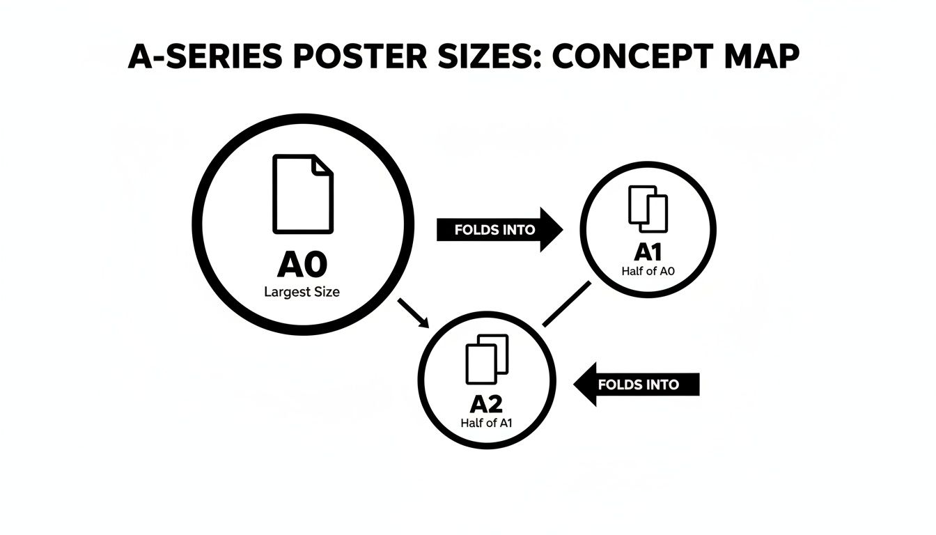
As you can see, each size is exactly half of the one before it. This keeps the aspect ratio identical, which is a lifesaver for designers as it makes scaling artwork up or down a breeze.
The Versatile A-Series Posters
The A-series gives you a brilliant range of options perfect for almost any indoor or semi-outdoor spot. Because they're so common, they are a cost-effective and dependable choice for any campaign.
A0 (841mm x 1189mm) is the giant of the family, designed to grab attention from a distance. Think huge exhibition maps, impossible-to-miss window displays in a flagship store, or trade show backdrops that need to dominate the room.
A1 (594mm x 841mm) is arguably the most popular and versatile poster size out there. It hits that sweet spot between being highly visible and still being a manageable size. This makes it the go-to for shop window promos, event announcements, and point-of-sale displays. In fact, A1 posters make up a massive 32% of all promotional poster printing. If you're planning a campaign, take a look at our complete guide to printing in A1 size.
A2 (420mm x 594mm) is your best bet for messages that people will see up close. It’s the perfect fit for notice boards in offices, community centres, and cafés. It's also seen a 15% jump in demand for printing health and safety signs on construction sites, where clear, concise information is absolutely vital.
The Impactful B-Series Posters
While the A-series has most situations covered, sometimes you need something with a bit more punch. That’s where the B-series comes in, offering larger, more dramatic dimensions often used by advertisers and the film industry.
The B-series has a slightly different aspect ratio that gives designs a grander, more cinematic feel. It’s the ideal choice when you need to break away from the standard A-series crowd and make a real statement.
B1 (707mm x 1000mm) is a powerhouse for getting noticed in busy places. You’ll commonly see this generous size used for film posters in cinema foyers, high-impact retail campaigns, and vibrant backdrops at festivals and events.
B2 (500mm x 707mm) gives you a noticeable size upgrade from an A2 without being quite as massive as a B1. It's an excellent choice for concert posters, art prints, and detailed infographics that need a bit of extra space to breathe.
Standard UK Poster Sizes and Common Applications
To make things easier, here’s a quick-reference table to help you match the right size to your next project.
| Size Code | Dimensions (mm) | Best For |
|---|---|---|
| A0 | 841 x 1189 | Large-scale advertising, trade shows, impactful window displays |
| A1 | 594 x 841 | Shop promotions, event announcements, point-of-sale advertising |
| A2 | 420 x 594 | Notice boards, informational signs, indoor marketing |
| B1 | 707 x 1000 | Film posters, exhibition backdrops, high-impact retail |
| B2 | 500 x 707 | Concert posters, art prints, detailed visual displays |
This guide should give you a solid starting point for choosing the perfect poster for the job.
Matching Poster Size to Your Location and Audience
You can have the most brilliant poster design in the world, but if nobody can read it, it’s not doing its job. The single biggest factor here is the link between the poster size for printing and how far away your audience is. A poster that’s too small for its space will just blend into the background, while one that's too big for a tight spot feels clumsy and unprofessional.
It’s a bit like buying a new TV. You wouldn’t stick a tiny 24-inch screen at the end of a massive living room, and you wouldn't try to cram an 85-inch cinema display into a cosy study. Posters work on the exact same principle. The goal is to match the scale to the environment so your message lands perfectly.
The Viewing Distance Rule of Thumb
Getting this right isn't just guesswork; there's a handy principle we use all the time. For every 3 metres (about 10 feet) of viewing distance, your main text needs to be at least 2.5cm (1 inch) tall. This simple rule is your secret weapon for making sure the core message is readable, even for someone just walking past.
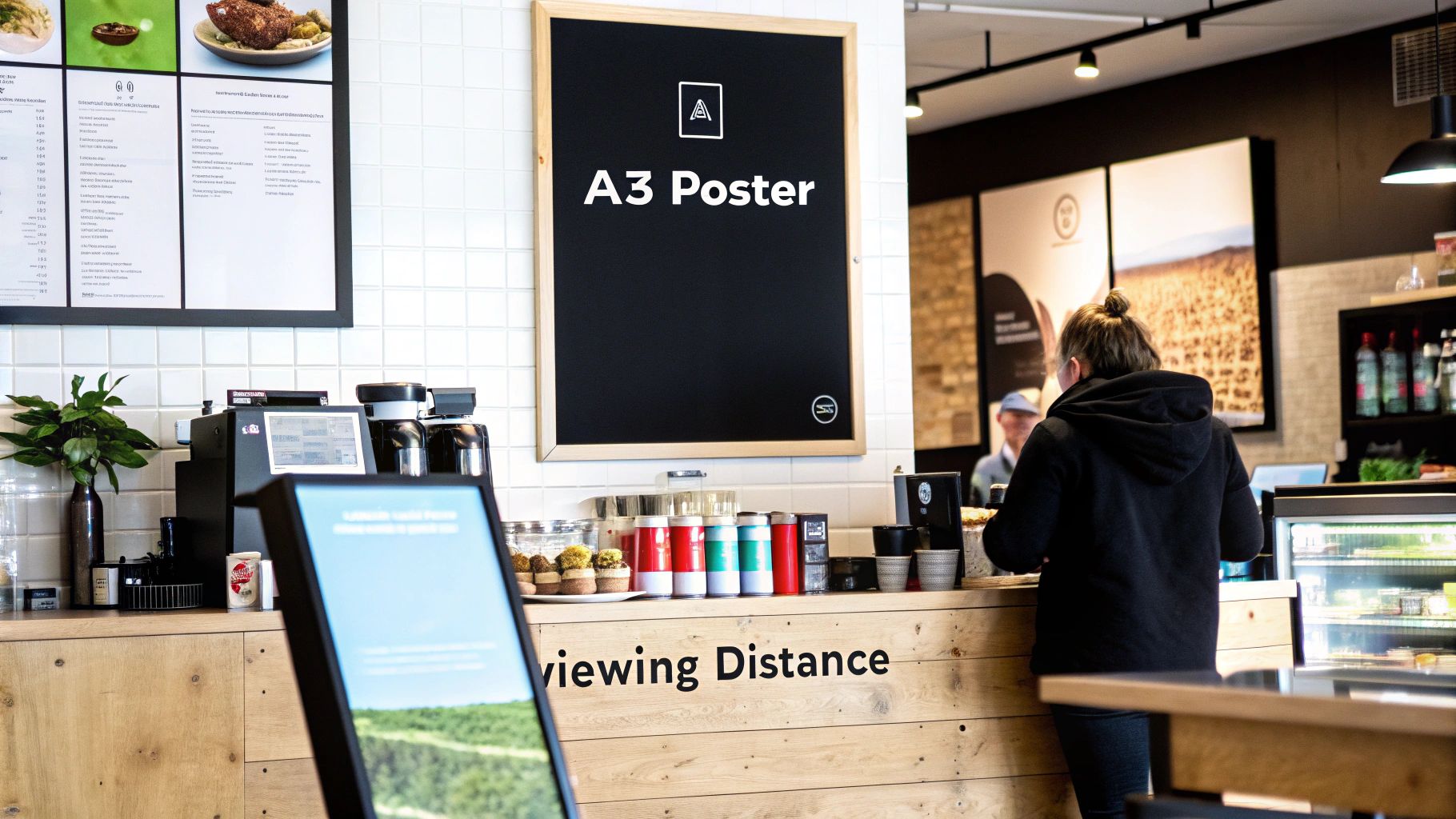
Take an A3 poster (297mm x 420mm), for example. It’s the perfect fit for a café notice board or an office corridor where people are only a metre or two away. Its size is inviting, encouraging people to step closer to read detailed info like menus or event schedules.
The further away your audience is, the bigger your poster needs to be. This isn't just about grabbing attention—it's about basic readability. A poster seen from across the street is competing with countless other visual distractions.
Sizing Up for Maximum Impact
Now, let's flip the script. Imagine you’re promoting a festival with a banner stretched across a busy high street. Your audience could be 30 metres away or even more. An A3 poster here would be completely invisible.
This is where the big guns come out. Large-format sizes like A0 (841mm x 1189mm) give you a huge canvas to play with. You can use bold, simple text and striking images that people can absorb in a split second from a serious distance. The fine print doesn't matter here; it's all about that instant impact.
To make it crystal clear, here’s how it breaks down:
-
Location: Narrow hallway or inside a small shop.
- Viewing Distance: 1-3 metres.
- Ideal Size: A3 or A2.
- Focus: Perfect for getting into the details.
-
Location: Large shop window or an event hall.
- Viewing Distance: 5-10 metres.
- Ideal Size: A1 or A0.
- Focus: Strong headline and a clear call to action.
-
Location: Outdoor banner hanging over a road.
- Viewing Distance: Over 20 metres.
- Ideal Size: A0 or a larger custom banner.
- Focus: Minimal text, high-contrast imagery that pops.
When you match your poster size to its location, you’re making sure every penny you invest in design and printing works as hard as it possibly can.
Preparing Your Artwork for Flawless Printing
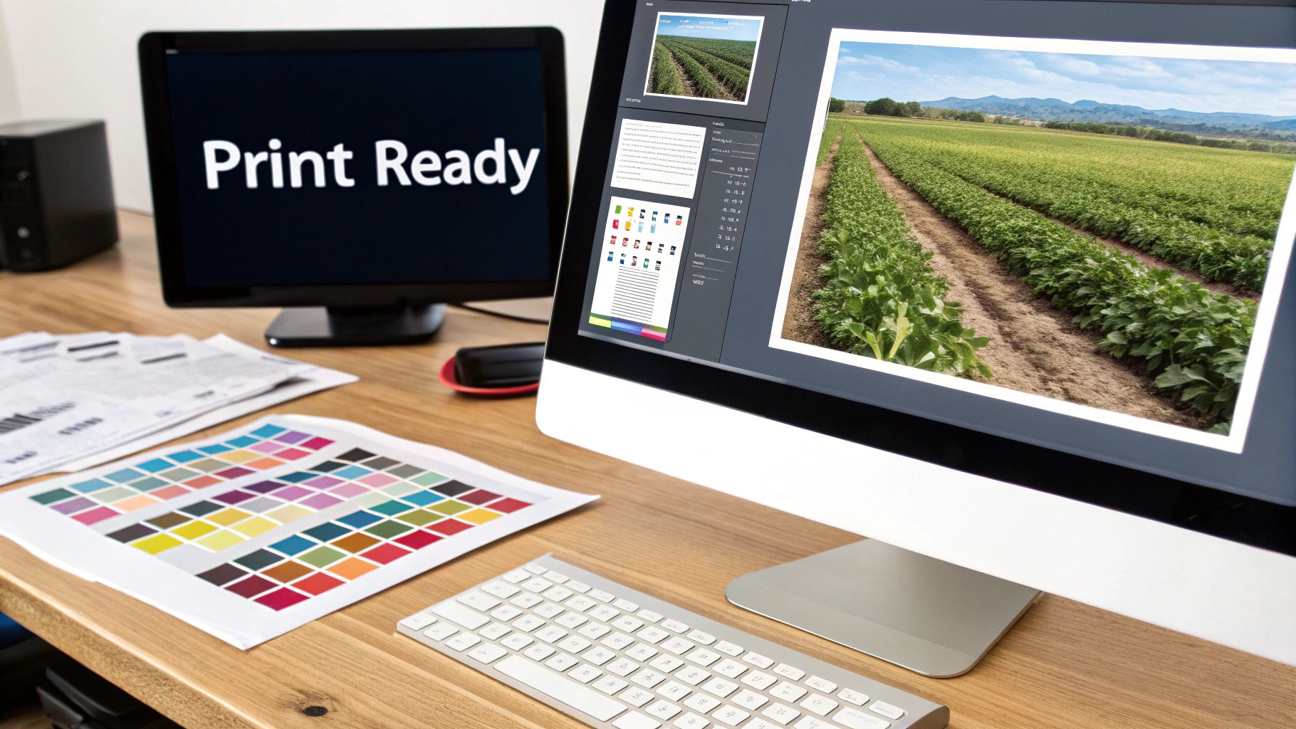
Ever designed something that looked amazing on screen, only for the printed version to be a letdown? Maybe the colours seemed flat, or the images were a bit fuzzy. It’s a common issue, and it happens because screens and printers speak completely different languages. Getting your artwork ready for print is the crucial step that translates your digital vision into a perfect physical poster.
Think of your design file as a recipe. For the final cake to turn out perfectly, the recipe needs to be precise, clear, and written for the right "kitchen"—in this case, our printing press. Nailing a few technical details is the secret to avoiding disappointment and ensuring your poster looks exactly how you imagined it.
Let's break down the four essentials of a print-ready file, without any confusing jargon.
Get Crystal Clear Images with the Right DPI
DPI stands for Dots Per Inch, and it’s the single most important ingredient for a sharp, clear print. Your screen uses pixels to show an image, but our printers use tiny dots of ink. To create a crisp poster, the printer needs enough information from your file to work with.
For professional printing, 300 DPI is the gold standard. At this resolution, your file tells our printer to lay down 300 tiny ink dots for every inch of paper. The result? Sharp lines, rich detail, and no fuzziness. In contrast, web images are often just 72 DPI, which looks fine on a screen but will come out pixelated and blurry on paper.
Key Takeaway: Always set up your design file to 300 DPI before you start creating. You can't just increase the DPI on a finished low-resolution image—that just stretches the existing pixels and makes the blurriness even worse.
Use the Correct Colour Profile: CMYK
Your computer screen creates colour by mixing Red, Green, and Blue light (RGB). It’s an "additive" process, where light is projected to make colours. Printers do the opposite. They use a "subtractive" process, applying layers of Cyan, Magenta, Yellow, and Black ink (CMYK) onto paper, which absorbs light.
Because of this fundamental difference, a design created in RGB mode will look different when printed. Those bright, electric blues and vibrant greens on your screen can end up looking muted and dull on paper. To make sure what you see is what you get, always design your poster in the CMYK colour mode from the very start.
Getting a handle on technical details like colour profiles and resolution is key to a perfect print. For a deeper look into the numbers, this guide on Poster Pixel Dimensions: A Guide to Perfect Print Quality is a fantastic resource.
Add Bleed to Avoid White Edges
Ever tried to frame a photo perfectly, but a tiny sliver of the background shows because the frame isn't perfectly aligned? That's what can happen in printing without bleed.
Printers print on large sheets of paper that are then trimmed down to the final poster size. No matter how precise the machinery is, tiny shifts can happen during the cutting process. To prevent ugly white borders, you need to extend your background colour or image 3mm past the final trim line on all four sides. This extra area is the bleed, and it acts as a safety net, ensuring your design goes right to the very edge after being cut.
Define Your Safe Area
While bleed protects the outside edges of your design, the safe area protects what’s on the inside. This is a margin, usually about 5mm inside the final trim line, where you should keep all your important text, logos, and key visuals.
Why is this so critical?
- It ensures no part of your logo or phone number gets accidentally chopped off.
- It gives your design breathing room, making it look more professional and balanced.
By keeping your essential information inside this safe zone, you guarantee your message is delivered clearly and looks polished. For more practical examples, check out our complete guide on uploading artwork for custom banners, which covers these concepts in more detail.
Print-Ready Artwork Checklist
To make things even easier, here’s a quick summary of what you need to check before sending us your file. Getting these four things right is the secret to a flawless print every time.
| Technical Element | Requirement | Why It's Important |
|---|---|---|
| Resolution (DPI) | 300 DPI | Ensures images are sharp, clear, and not pixelated when printed. |
| Colour Profile | CMYK | Guarantees the colours you see on screen match the final printed colours. |
| Bleed | 3mm on all sides | Prevents white edges by extending the design beyond the cut line. |
| Safe Area | 5mm from all edges | Protects key text and logos from being trimmed off during production. |
Following this checklist is the best way to ensure your artwork is ready for our presses and that the final poster will look absolutely stunning.
Choosing the Right Materials and Finishes
Getting the poster size right is only half the battle. The material it’s printed on is what really gives your message staying power. A poster’s substrate and finish aren't just about looks—they’re practical choices that dictate its durability, appearance, and ability to handle its environment. The right material makes sure your poster can withstand the elements, while the right finish makes your colours truly pop.
Think of the material as the foundation. For an outdoor banner on a construction site, you need something that can take a beating from rain and sun without fading or tearing. This is where weatherproof PVC vinyl comes in, offering a tough, long-lasting solution that keeps your message crystal clear, come wind or shine.
But what about locations with serious wind, like scaffolding or fences? Standard vinyl can act like a sail, putting huge strain on the fixings and risking damage. For these spots, wind-resistant mesh is the perfect choice. Its tiny perforations let air pass right through, which reduces the load and prevents tearing, making it a much safer and more reliable option.
Matching Materials to Your Environment
Picking the right material all boils down to one simple question: where will your poster live? An indoor retail promotion has completely different demands from a massive outdoor festival banner.
-
Indoor Retail and Exhibitions: When your poster is inside a shop or at a trade show, visual quality is everything. A satin or gloss finish on high-quality paper stock makes colours look deeper and more vibrant, grabbing the attention of anyone walking by. Satin gives you a subtle sheen that cuts down on glare, while gloss delivers maximum punch under spotlights.
-
Outdoor Events and Festivals: Here, durability is the name of the game. For brands with an environmental focus, our eco-friendly, PVC-free materials are a fantastic alternative. They're just as tough as traditional options but are fully recyclable, letting you align your promotional efforts with your brand's values.
The material you choose sends its own message. A durable, weatherproof vinyl signals permanence and reliability, while a sleek satin finish suggests premium quality. This choice is an extension of your branding.
The data backs this up. For large-scale promotions, the right materials are crucial. UK event planners lean heavily on B1 poster sizes for things like backdrops, and this format drove a huge chunk of the promotional printing industry's £1.232 billion record sales. In construction, B1 mesh posters fulfilled 22% of all safety signage needs on fencing, and new recyclable options boosted adoption by 12% thanks to new sustainability regulations. To see how different materials are trending, you can explore more insights about digital printing trends on ibisworld.com.
Selecting the Best Finish
Once you’ve settled on the material, the finish is what adds that final professional touch. Each option creates a distinct look and feel, so it’s important to match it to your design and where it will be displayed.
For instance, a matt finish is perfect for posters with a lot of text, as it minimises glare and makes them easy to read from any angle. On the other hand, a gloss finish is brilliant for photographic or image-heavy designs. It enhances colour depth and creates a striking, high-impact look that can’t be ignored. It’s also worth looking into the various types of plastic for signs to see how different materials perform in the real world.
Got Questions? We’ve Got Answers.
Even after you’ve nailed down the technical bits, a few practical questions can pop up before you’re ready to order. Here are the clear, straightforward answers to the questions we get asked most often about poster printing. Think of it as your final pre-flight check.
We’ve pulled together the top queries from our customers to help you finalise your order with total confidence.
What Is the Best Resolution for Poster Printing?
For a truly professional finish, your artwork needs to be 300 DPI (Dots Per Inch) at its final print size. This is the gold standard across the industry for a reason – it guarantees your text is razor-sharp and your images are crisp and clear. No compromises.
Could you get away with 150 DPI? Maybe, but only for massive posters viewed from a great distance. Sticking to 300 DPI is the safest bet to avoid any hint of pixelation or blurriness.
Better yet, when you send us your files, our in-house pre-flight team automatically checks the resolution for you. If we spot anything that might affect the quality, we’ll give you a heads-up before a single drop of ink is used.
Can I Print a Poster in a Custom Size?
Of course. While the standard A-series and B-series sizes are brilliant, cost-effective choices, we specialise in custom-sized printing. We know that sometimes you have a particular frame to fill or an awkward space that needs a perfectly tailored solution.
If you need a custom poster size for printing, just give us the exact dimensions when you place your order.
Our team is also on hand to advise on aspect ratios. It’s a crucial step to make sure your design isn’t stretched or distorted, giving you a perfectly proportioned poster for any non-standard display.
How Do I Add Bleed to My Artwork File?
Adding a 'bleed' is essential. It's the secret to avoiding those thin, unprofessional white edges after your poster is trimmed. In your design software, whether it’s Adobe Illustrator or Photoshop, you just need to extend your background colour or image 3mm beyond the final trim line on all sides.
So, if you’re printing an A1 poster (841mm x 594mm), your artwork file should actually be 847mm x 600mm. Easy.
Don’t forget to keep all your important text and logos at least 5mm inside the trim line. We call this the 'safe area', and it ensures nothing important gets chopped off during the finishing process.
What Is the Typical Turnaround Time for Poster Printing?
We move fast. The vast majority of poster orders are printed and dispatched from our UK facility within 24-48 hours of artwork approval.
All orders come with tracked UK delivery, so you can expect to have your brand-new posters in your hands within just a few working days.
If you’re up against a tight deadline for a campaign or event, just let our team know when you order. We’ll always do everything we can to work with your schedule and get your posters to you on time.
Ready to bring your design to life? At Banner Printing Ltd, we combine high-quality materials, fast turnaround, and expert support to deliver posters that make an impact. Explore our poster printing options and get an instant quote today!


