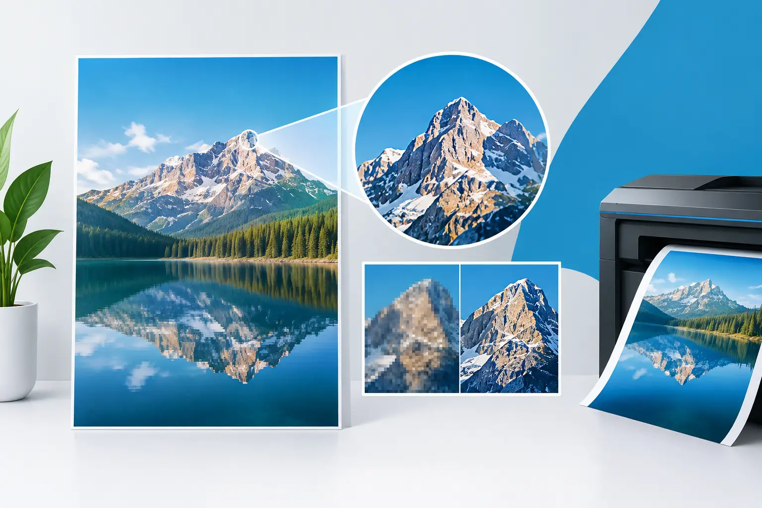
A poster can have the right message, strong branding and a great offer, then still disappoint because the finished print looks soft or pixelated. Poster print resolution is what separates a crisp, professional display from artwork that loses impact the moment it is enlarged. The good news is that you do not need to be a designer to get it right. You simply need to prepare your file for the size it will be printed.
For shop windows, event walls, retail promotions and site notices, sharp print helps people trust what they are seeing. It makes prices easier to read, logos more recognisable and photographs far more persuasive. Before you upload artwork, use this guide to check whether your poster file is ready for press.
What poster print resolution actually means
Resolution describes how much image detail is available for print. It is usually measured in DPI, or dots per inch, although artwork software may show PPI, meaning pixels per inch. For most customers preparing digital artwork, the practical concern is the same: does the file contain enough pixels to print cleanly at the final poster size?
A high-resolution file contains more image information. When printed at the intended dimensions, its text edges, product details and photos stay smooth. A low-resolution image must be stretched to fill the same space. The printer cannot create genuine detail that was not in the original file, so individual pixels can become visible and fine features can blur.
DPI is often treated as one fixed rule, but viewing distance matters. A small poster viewed up close needs finer detail than a large display viewed from several metres away. That is why a file for an A4 counter poster has different requirements from artwork for a large outdoor advertising board.
The best resolution for printed posters
For posters that will be viewed at close range, aim for 300 DPI at the final print size. This is the standard target for high-quality promotional print and is especially useful for A4, A3 and A2 posters containing small text, detailed product photography or QR codes.
For larger posters, 150 DPI at final size is often perfectly suitable. An A1 or A0 poster is normally read from further away, so the human eye will not detect the difference as readily. Larger format print is about the right balance between image quality, file size and intended viewing distance.
Use these figures as a reliable working guide:
- A4 posters: 300 DPI where possible
- A3 posters: 300 DPI for close-up viewing
- A2 posters: 200-300 DPI depending on content
- A1 and A0 posters: 150-200 DPI is usually sufficient
There are exceptions. If an A1 poster contains a close-up product shot with tiny labels, use the highest practical resolution. If it is a simple event poster with bold type and flat-colour graphics, 150 DPI can still produce a clean, effective result. The design itself matters as much as the dimensions.
Calculate the pixels you need before designing
Artwork programmes usually work in pixels, while poster sizes are often chosen in millimetres. To calculate the pixel dimensions needed, first convert the size from inches, then multiply each measurement by your chosen DPI.
For example, A3 measures 297 x 420 mm, which is approximately 11.7 x 16.5 inches. At 300 DPI, your artwork should be around 3,500 x 4,950 pixels. That gives the printer enough detail for a sharp A3 poster.
An A1 poster measures approximately 23.4 x 33.1 inches. At 150 DPI, a suitable file would be about 3,510 x 4,965 pixels. Notice that this is close to the pixel count needed for A3 at 300 DPI. The physical size is larger, but it will generally be viewed from further away.
Do not judge quality by the file size in MB alone. A large PDF can still contain a low-resolution image, while a modestly sized PDF made with vector text and graphics may print beautifully. Check the pixel dimensions of photographs and raster images, then make sure they are being used at no larger than their intended print size.
Vector artwork keeps text and logos crisp
Not every part of your poster relies on pixel resolution. Vector graphics are created from mathematical paths rather than a fixed grid of pixels. Logos, icons, shapes and text built as vectors can be scaled up without becoming blurry.
This is why a PDF exported from professional design software is often an excellent choice for poster artwork. Text remains sharp, solid colour areas stay clean and logos retain their definition. If you are using a logo supplied as SVG, AI or EPS, keep it in that format where possible rather than taking a screenshot or copying it from a website.
Photographs are different. They are raster images made from pixels, so they need to be high enough resolution at the size they appear on the poster. A mobile phone photograph can work very well if it is an original, high-quality image. A small image saved from social media usually will not.
Why online images often fail in print
Images on websites are designed to load quickly on screens, not to fill a printed poster. A photograph that looks fine on a laptop may only be 1,200 pixels wide. It could be suitable for a small online banner but will look soft when enlarged across an A2 or A1 design.
The same applies to images copied from email signatures, messaging apps and social platforms. These platforms frequently compress pictures, reducing detail before you even download them. Always start with the original photo from the camera, photographer or image library if you have access to it.
Avoid trying to fix a small image by increasing its DPI setting in software. Changing 72 DPI to 300 DPI without adding pixels does not create extra detail. It only changes the metadata or reduces the print size the software assumes. Enlarging software can improve some images slightly, but it cannot turn a tiny web image into a sharp full-poster photograph.
Set up the poster file correctly
Resolution is one part of print-ready artwork. The right setup also prevents unwanted borders, cropped details and dull colours.
Build the document at the final finished size from the beginning. Add 3 mm bleed on every edge if your design has background colours, photos or graphics that need to reach the edge of the poster. Bleed gives a small area for trimming tolerance, so the final result has no narrow white strips around the outside.
Keep important text, logos and QR codes away from the trim edge. A 3-5 mm safe margin is sensible for most posters, while a little more space can improve the layout on larger sizes. If the poster needs to work quickly in a busy retail setting, make the headline and key call to action easy to read from the intended distance.
Use CMYK colour mode for the most predictable print result. Screens display colour with light in RGB, while printers use inks. Bright neon-style colours and intensely saturated blues or greens can appear different once printed. CMYK setup gives a more realistic view of how the final poster is likely to look.
Export a file the printer can use confidently
A high-quality PDF is normally the safest format for poster print. It preserves layout, can retain vector elements and is straightforward to check before production. Where your software provides the option, select a print-quality PDF preset and include bleed.
JPEG and TIFF files can also work, particularly for photographic posters, but make sure they are exported at the correct final dimensions and resolution. PNG files are useful for certain graphics but are not always the best choice for a full print file. Avoid sending screenshots, Word documents or presentation slides unless they have been created specifically at the required poster size.
Before placing an urgent order, open the exported PDF and inspect it at 100 per cent zoom. Look closely at small text, logos, faces, gradients and QR codes. If these areas look fuzzy on screen at full size, they are unlikely to improve in print.
A quick pre-print check that saves time
Before uploading your artwork, check four things: the document matches the poster size ordered, photos have enough pixels for their printed size, bleed is included where backgrounds run to the edge, and important content sits inside the safe area.
Then check the message itself. A perfectly sharp poster will still underperform if the offer is buried in clutter or the contact details cannot be read quickly. Use clear hierarchy: a strong headline first, the key information next, then the action you want people to take.
If you are working to a tight event, promotion or opening deadline, it is worth checking the artwork before production starts rather than risking a reprint later. Banner Printing UK produces posters for real-world deadlines, from retail campaigns to exhibitions, so a clean, correctly sized file helps keep production moving quickly.
The best poster files are not always the biggest. They are the files built at the right size, with the right level of detail for where people will see them. Get that balance right and your message will look as professional on the wall as it did on your screen.