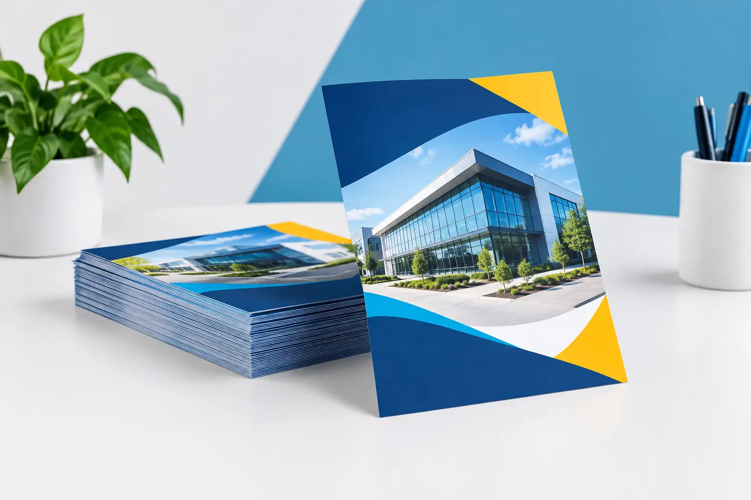
A flyer has only a few seconds to earn attention. Whether it is handed out outside a venue, placed on a counter or delivered locally, promotional flyer printing needs to make the offer clear before the reader moves on. The strongest results come from matching the format, paper and message to one practical objective: getting people to visit, book, call, scan or buy.
For UK businesses working to a deadline, flyers remain one of the quickest ways to put a time-sensitive message into people’s hands. They are affordable at scale, easy to distribute and useful alongside banners, posters and roller displays. The difference between a flyer that gets kept and one that gets binned usually comes down to planning, not a bigger design budget.
Promotional flyer printing starts with one clear job
Before choosing a size or uploading artwork, decide exactly what the flyer must achieve. A restaurant promoting a new lunch offer needs footfall at quiet times. A tradesperson may need local homeowners to request a quote. An event organiser needs ticket sales before a fixed date. These goals require different wording, imagery and calls to action.
Trying to sell every service on one side of A5 is a common mistake. A flyer is not a brochure. Give the main offer room to breathe, support it with the information needed to act, then remove anything that distracts from the next step.
A clear hierarchy works well: lead with the benefit or offer, show the key visual, add essential details, then make the action obvious. For example, “20% off weekday lunches” is stronger than a general statement about good food. Add the dates, location and booking method in a size people can read without effort.
If the campaign has more than one purpose, consider separate versions. A recruitment flyer and a customer promotion may share branding, but they should not compete for space or attention.
Choose a flyer size people will use
Size affects cost, handling and how much information can be read comfortably. There is no single best option, but there is usually a best option for the job.
A6 flyers are compact, economical and ideal for simple offers, vouchers, appointment reminders and event handouts. They are easy to carry and work well where staff are giving out high volumes. The trade-off is limited space, so the message must be focused.
A5 is the dependable all-round choice for many local promotions. It gives enough room for a strong image, a headline, contact details and a clear offer without feeling oversized. It suits menus, opening announcements, salon offers, property services and trade promotions.
DL flyers are narrow and familiar, particularly for menus, service price lists and offers distributed through doors or placed in display stands. Their tall format can work brilliantly with a simple vertical layout, but avoid shrinking too much text into the available area.
A4 is better when the flyer needs to carry more detail, such as a programme, product range, price list or information sheet. It is not always the right choice for street distribution, where a smaller format is easier to take away. If the material needs lasting reference, however, the extra room can be worthwhile.
Paper stock sends a message before the copy does
Paper weight changes how a flyer feels and how well it stands up to real use. Thin paper may be suitable for a short, high-volume campaign, but it can feel less substantial and crease more easily. Heavier stock creates a more professional impression, especially where the flyer represents a higher-value service, retail launch or established brand.
A lighter stock can be the sensible commercial choice for large door-drop quantities and straightforward promotions. Midweight stock is a strong option for most business flyers, giving good colour reproduction and a reassuring feel without unnecessary cost. Heavier card stock suits premium invitations, menus, voucher cards and promotions people are likely to retain.
Finish matters too. Gloss can make photography and bold colours stand out, which is useful for food, retail products and entertainment offers. Silk provides a smoother, more understated appearance and is easier to write on if staff need to add appointment times or codes. Uncoated stock has a natural feel and can suit independent shops, local services and brands that want a less polished look.
The right choice depends on where the flyer will be used. A flyer handled outdoors, passed between lots of people or displayed for several days needs more resilience than one placed inside a shopping bag or included with an order.
Build artwork for print, not just for a screen
A design can look sharp on a phone and still disappoint when printed. Screens use light and can make colours appear more vivid, while print depends on ink, stock and the quality of the supplied file. Preparing artwork correctly avoids delays and gives the finished flyers the professional standard your campaign deserves.
Use high-resolution images and keep logos crisp. Blurry photographs, screenshots and copied web graphics often become more noticeable once printed at full size. Small text should be used carefully, particularly on dark or busy backgrounds. If a key detail cannot be read at arm’s length, it needs more space or a larger type size.
Before approving artwork, check these four essentials:
- Keep important text, logos and contact details safely inside the edge of the page.
- Add bleed where required so background colours and images print cleanly to the trim edge.
- Check phone numbers, dates, prices, postcodes and QR codes character by character.
- Make one call to action prominent, rather than giving equal weight to every possible contact method.
QR codes are useful when they take people directly to a relevant page, booking form or menu. They are less effective when they lead to a generic homepage and force the customer to search again. Leave clear space around the code and test it with more than one phone before printing.
Make the offer easy to understand at a glance
Good flyer copy is direct. Start with what the customer gains, then explain the conditions in plain language. Time limits, selected products, minimum spends and booking requirements should be clear, but they should not overpower the offer itself.
Local relevance can improve response. Mentioning a neighbourhood, nearby event, opening date or collection point makes the promotion feel purposeful rather than mass-produced. This is particularly valuable for independent retailers, hospitality venues, gyms, tradespeople and community organisations working within a defined area.
Use credibility where it helps the decision. A short customer rating, years of experience, specialist qualification or simple proof point can reassure someone who has not heard of your business. Keep it specific. “Trusted local service” is weaker than a factual statement that gives readers a reason to believe you.
For urgent promotions, make the deadline visible. A launch weekend, seasonal sale, limited ticket release or introductory offer needs a date that is impossible to miss. If there is no genuine deadline, do not invent one. A believable message builds more value than forced urgency.
Plan distribution before you place the order
Printing is only one part of the campaign. Think about where the flyers will go, who will hand them out and how many people you realistically expect to reach. This helps determine the quantity, format and timing.
A café may get better results from counter cards and A6 flyers handed out with nearby purchases than from a large untargeted drop. A construction firm might use A5 flyers around completed projects, supported by weatherproof site banners. An exhibition team can place flyers beside a roller banner to give visitors something useful to take away after a conversation.
Track the response wherever possible. Use a campaign-specific code, QR destination, booking reference or dedicated landing message. You do not need complicated reporting to learn what works. If one offer produces more calls or redemptions than another, that insight can shape the next print run.
Quantity is a balance. Ordering too few can mean a successful campaign ends before it has proper reach. Ordering far too many can leave you with outdated stock after prices, dates or services change. For first-time promotions, a measured run with a clear way to track results is often the safer choice. Once the offer proves itself, reordering becomes a more confident decision.
Match turnaround to the campaign deadline
Fast promotional flyer printing is valuable when the date cannot move: a last-minute event, a new opening, a weekend sale or an unexpected stock clearance. But speed works best when artwork is ready, details have been checked and the delivery date is planned backwards from when distribution begins.
Allow time for the flyers to arrive, be checked and get to the people or locations handling distribution. A brilliant offer arriving after the event has started is still a missed opportunity. UK-based production and fast dispatch can make a real difference here, particularly when the campaign also needs matching posters, banners or business cards.
The best flyer is not the one with the most words or the flashiest finish. It is the one that makes a useful promise, looks professional in the reader’s hand and arrives in time to be put to work.