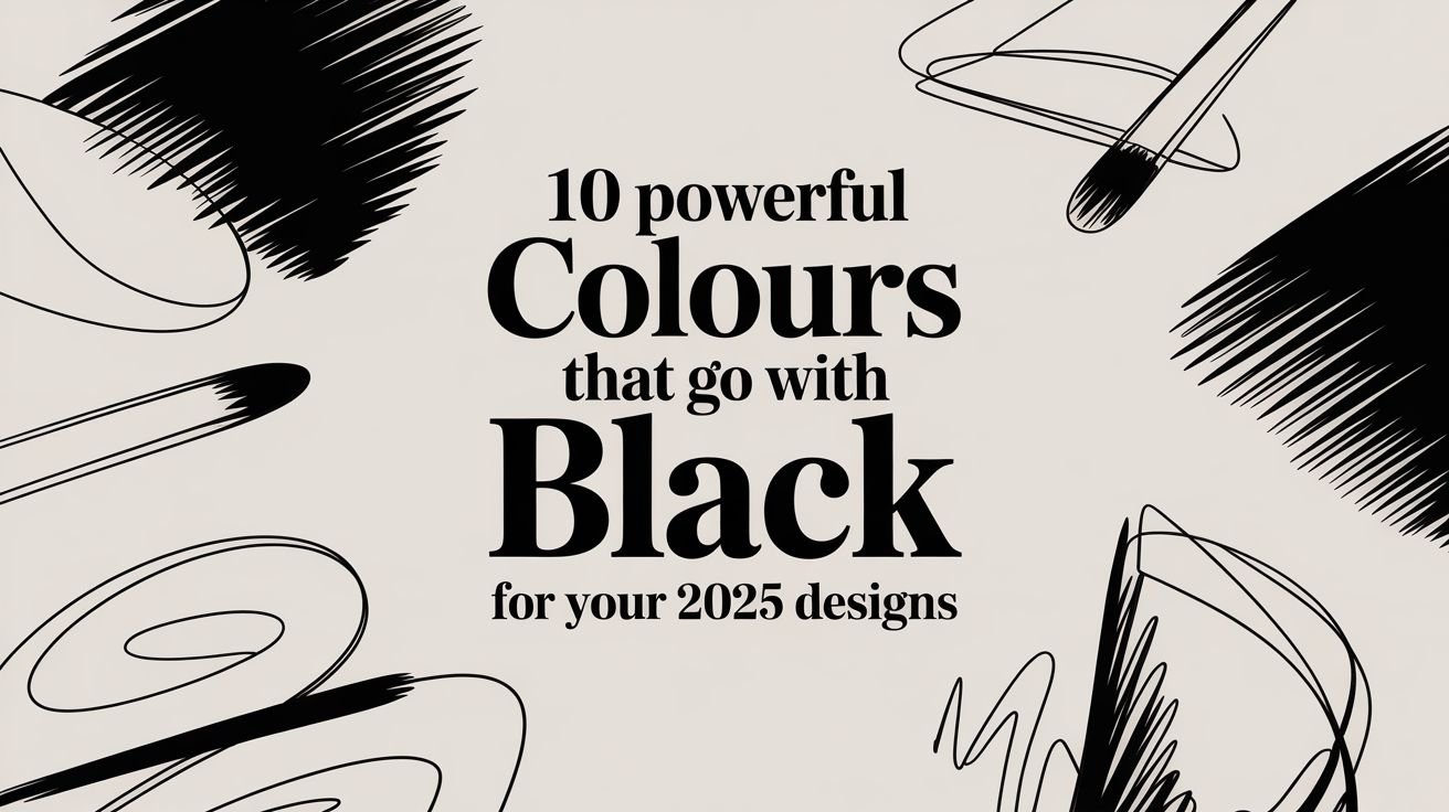
Black isn't just a colour; it's a canvas. As a foundational element in design, its true power is unlocked by what you pair it with. The right combination can evoke luxury, command attention, or communicate quiet sophistication. While many designers stick to familiar pairings, a world of dynamic and impactful palettes awaits those willing to explore.
Whether you're creating a high-impact vinyl banner for a trade show, designing elegant retail signage, or developing a memorable brand identity, understanding which colours that go with black is a crucial skill for making your message resonate. This guide moves beyond the basics to provide a practical resource for your business. We will explore 10 powerful and versatile pairings, complete with actionable insights and technical specifications.
You will find HEX and RGB codes for digital use, specific advice for achieving vibrant and accurate results in print, and real-world application suggestions for each palette. Our goal is to equip you with the knowledge to make bold, informed decisions for your projects, ensuring your final design is not just seen, but felt. Let's explore the combinations that will elevate your visuals and effectively communicate your brand's unique story.
1. Black & White
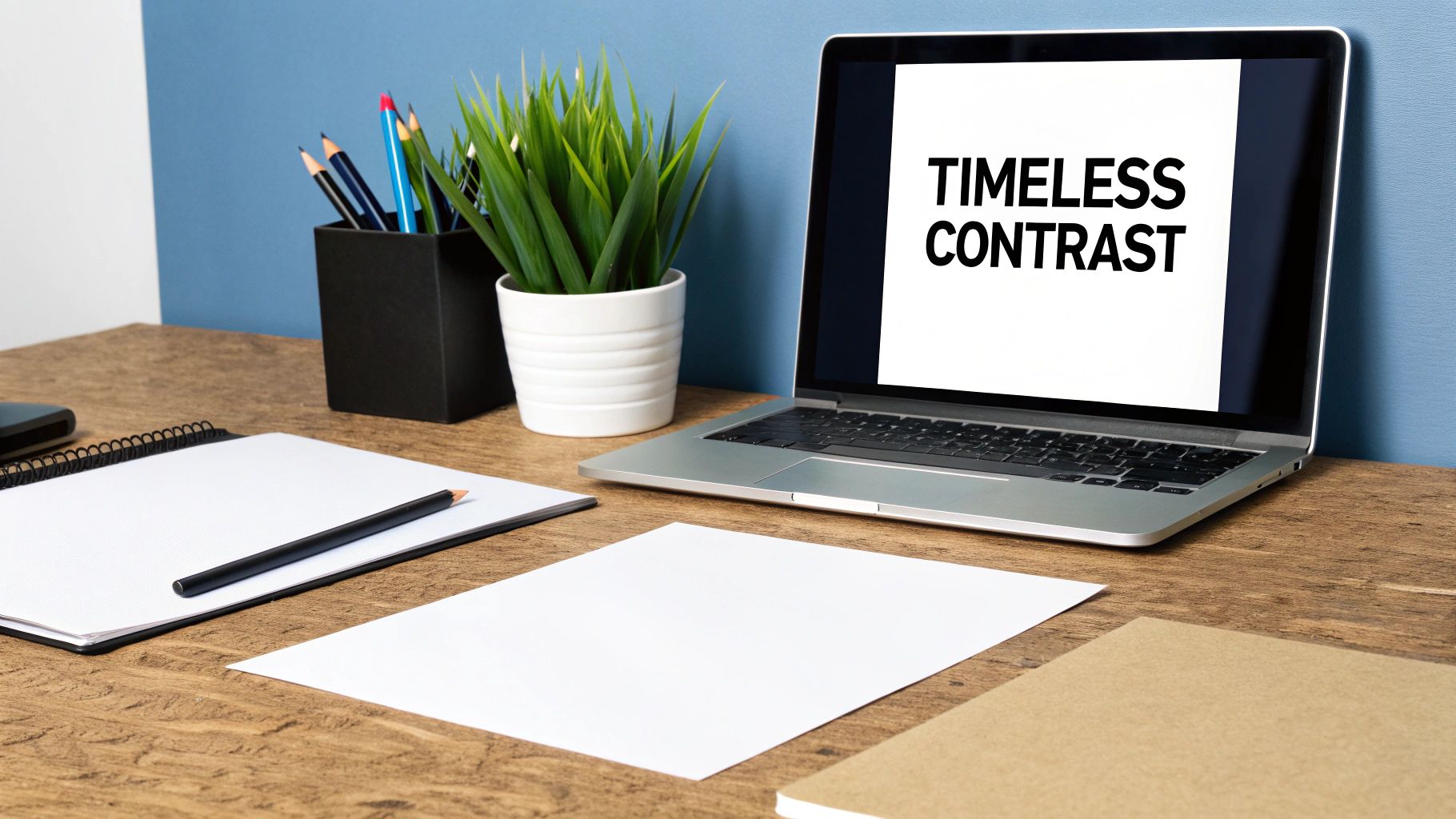
The ultimate classic, black and white is a foundational pairing in design, representing the pinnacle of contrast and visual clarity. This combination is not just a stylistic choice; it's a powerful tool for communication, conveying elegance, authority, and modernity. Its inherent simplicity ensures that messaging is direct and unambiguous, making it one of the most reliable and versatile colours that go with black. Popularised by icons like Coco Chanel and modernists, its timeless appeal remains unmatched in branding, print, and digital media.
Why It Works
The power of black and white lies in its maximum value contrast. This stark difference between light and dark creates a visual hierarchy that is instantly legible and impactful. It’s a sophisticated pairing that strips away distractions, focusing the viewer’s attention purely on form, typography, and message. This makes it ideal for luxury brands like Chanel and tech giants like Apple, who use it to project an image of premium quality and minimalist confidence.
Suggested Usage
- High-Contrast CTAs: For call-to-action buttons that demand attention.
- Premium Branding: Perfect for logos and packaging aiming for an elegant, high-end feel.
- Formal Signage: Ideal for event invitations, corporate banners, and directional signs.
Practical Tips
For print materials such as banners and displays, ensure your black is a "rich black" (a mix of CMYK) rather than just 100% K (black ink) to avoid a washed-out, grey appearance next to crisp white. The high contrast of this pairing is also excellent for accessibility, meeting WCAG standards easily. When planning a photoshoot or event, consider how this classic combination translates to physical spaces; explore a variety of backdrops and stands for photography to create a professional and polished setting.
2. Black & Gold
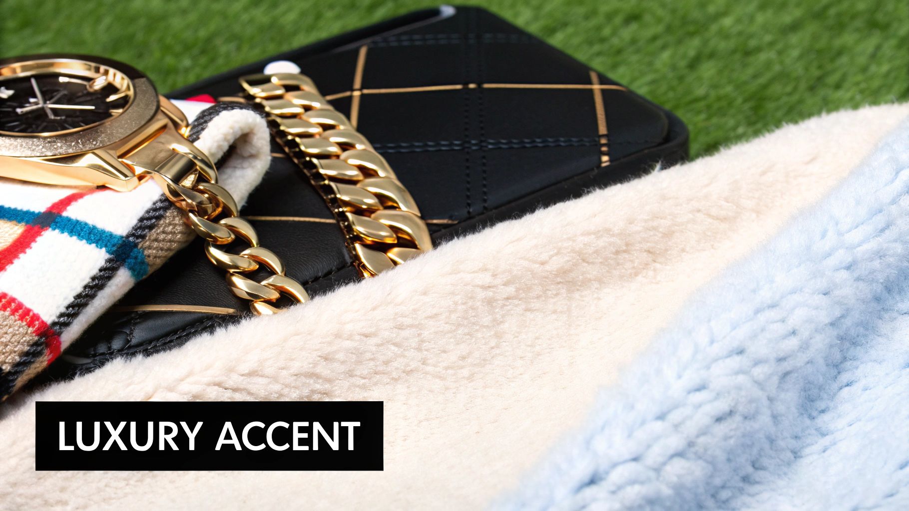
Synonymous with luxury, black and gold is a powerful combination that exudes opulence, success, and prestige. The deep, absorbent nature of black provides the perfect canvas for gold's warm, metallic radiance, creating a dynamic interplay of shadow and light. This pairing is a classic choice in high-end design, conveying an immediate sense of quality and exclusivity. Popularised by luxury fashion houses like Versace and prestigious events such as the Oscars, it remains one of the most effective colours that go with black for creating an unforgettable, high-impact aesthetic.
Why It Works
The magic of black and gold lies in its psychological association with wealth and elegance. Black signifies authority and sophistication, while gold represents achievement and grandeur. Together, they create a visual language that is both commanding and aspirational. This pairing is particularly effective in branding for premium products, from high-end whiskey and champagne labels to exclusive fashion collections, where it instantly elevates the perceived value of an item.
Suggested Usage
- Luxury Packaging: Ideal for high-end product boxes, bags, and labels.
- VIP Event Branding: Perfect for invitations, award ceremony banners, and gala decor.
- Premium Menus: Use for fine dining restaurants or exclusive cocktail bars.
Practical Tips
For print materials like foiled business cards or premium event banners, use gold sparingly as an accent to maintain a sophisticated feel. Overuse can make a design look gaudy rather than elegant. Pair this combination with classic serif typography to enhance its timeless appeal. When printing, consider using metallic inks or gold foil finishes to capture the true shimmer of gold, as a standard CMYK mix can often appear flat and muted.
3. Black & Silver
A pairing synonymous with innovation and sophistication, black and silver combines deep, grounding black with the sleek, reflective qualities of silver. This duo communicates a message of modernity, technological advancement, and premium quality. It evokes a sense of cutting-edge design and precision, making it one of the most effective colours that go with black for brands aiming to appear forward-thinking. Popularised by tech giants like Apple and luxury automotive brands, this combination is a hallmark of contemporary, high-value product design.
Why It Works
The combination works by contrasting the complete light absorption of black with the light-reflecting brilliance of silver. This creates a dynamic visual that is both elegant and futuristic. Black provides a solid, authoritative base, allowing the metallic sheen of silver to stand out as a highlight, drawing attention to key features, logos, or product details. This pairing is favoured by brands like Sony and Mercedes-Benz because it implies precision engineering and a clean, minimalist aesthetic that feels both professional and aspirational.
Suggested Usage
- Tech and Electronics Branding: Ideal for websites, packaging, and advertising for gadgets and software.
- Luxury Product Design: Perfect for automotive details, high-end appliances, and premium accessories.
- Corporate Signage: Conveys a professional, modern image for office spaces and corporate events.
Practical Tips
When using silver in print, especially for items like roller banners or business cards, consider a metallic or foil finish to truly capture its reflective quality. For digital designs, use gradients and subtle highlights to simulate a metallic texture. This pairing thrives in minimalist layouts with clean, modern typography, enhancing its sleek and uncluttered feel. Ensuring high-resolution graphics is crucial, as any pixelation will detract from the sharp, high-tech impression you want to create.
4. Black & Red
A pairing charged with energy and emotion, black and red creates a dramatic and powerful visual statement. This combination is visceral, commanding attention while conveying passion, urgency, and confidence. Its high-impact nature makes it a formidable choice in marketing and branding, where provoking a strong response is key. Popularised by high-octane brands like Ferrari and Red Bull, this is one of the boldest colours that go with black, ideal for making an unforgettable impression.
Why It Works
The combination of black and red is psychologically potent. Black provides a serious, sophisticated backdrop that allows the vibrant, energetic red to take centre stage without overwhelming the viewer. This creates a focused intensity that is both alluring and assertive. It’s a classic pairing in the entertainment industry, particularly for theatre and performance marketing, as well as in casino and gambling aesthetics, where it is used to build excitement and convey a sense of high stakes.
Suggested Usage
- Urgent CTAs: Ideal for "Buy Now" or "Limited Offer" buttons that need to inspire immediate action.
- High-Energy Branding: Perfect for sports, automotive, or entertainment brands aiming for a dynamic feel.
- Event Promotion: Use for posters and banners for concerts, festivals, or product launches to generate buzz.
Practical Tips
When using red in print for banners or displays, ensure your colour profiles are correctly calibrated to achieve a true, vibrant red rather than a dull orange or muted pink. The combination’s high contrast works well for accessibility, but the specific shade of red must be chosen carefully to meet WCAG contrast ratio standards against black, especially for text. This pairing is excellent for creating a focal point in a busy environment, making it a strong choice for exhibition stands and trade show graphics where you need to stand out.
5. Black & Navy Blue
Often considered a stylistic taboo, the combination of black and navy blue is, in fact, a deeply sophisticated and professional pairing. It merges the undisputed authority of black with the trustworthiness and stability of navy, creating a nuanced and powerful corporate aesthetic. This subtle, low-contrast duo communicates confidence and seriousness, making it a stellar choice for brands in the finance, legal, and professional services sectors. It’s a modern, understated alternative to the starkness of black and white, projecting an image of quiet, established authority.
Why It Works
The effectiveness of black and navy blue lies in their analogous relationship on the colour wheel; they are close neighbours, creating a harmonious and cohesive look. This low-contrast pairing feels deliberate and refined, suggesting a brand that is confident enough to not need loud colours to make a statement. It’s a favourite in corporate America and the financial industry, used by institutions like JPMorgan Chase to convey gravity, reliability, and immense professional integrity. The combination feels both traditional and contemporary.
Suggested Usage
- Corporate Branding: Ideal for logos and brand guides for financial, legal, and consulting firms.
- Professional Websites: Creates a clean, trustworthy, and sleek user interface.
- Formal Event Materials: Perfect for invitations, programmes, and signage at corporate galas or conferences.
Practical Tips
To prevent this dark pairing from feeling too heavy, ensure there is plenty of white space in your design to provide visual relief. Introducing a metallic accent, like silver or gold, can add a touch of luxury and help delineate elements. For printed materials like event banners or professional displays, using a high-quality satin or matte finish can enhance the sophisticated feel of these colours that go with black, preventing glare and enriching their deep tones.
6. Black & Neon/Bright Colours
Black and neon is an edgy, high-energy pairing that commands attention by combining the deep neutrality of black with the electric vibrancy of bright, fluorescent tones. This combination is distinctly modern and dynamic, creating maximum visual impact. It’s a favourite in youth culture, gaming, and forward-thinking branding, channelling a sense of energy, rebellion, and digital-age confidence. This makes it one of the most exciting and contemporary colours that go with black.
Why It Works
This pairing thrives on extreme contrast, but instead of value (light vs. dark), its power comes from chromatic intensity. The sober, recessive nature of black provides the perfect canvas, allowing the intense saturation of neon colours like lime green, hot pink, or electric blue to shine without overwhelming the eye. This creates a visual effect that feels almost luminous, making it ideal for brands like Nike and the esports industry, which aim to project an image of power, speed, and innovation.
Suggested Usage
- Youth-Oriented Branding: Perfect for brands targeting younger demographics in fashion, tech, or entertainment.
- Event & Nightlife Marketing: Ideal for posters, social media, and banners for festivals, concerts, and clubs.
- Digital Interfaces & Gaming: Excellent for UI elements, logos, and in-game assets that need to stand out.
Practical Tips
Use neon tones sparingly as accents against a predominantly black background to maintain sophistication and avoid visual fatigue. This combination is especially effective for digital-first designs, as screens can replicate the glowing effect of neons accurately. When designing for print, consult with your printer to ensure they can achieve the desired vibrancy. For event promotions, this striking pairing is incredibly effective; discover more about how to design a banner to capture this energetic aesthetic for your next event.
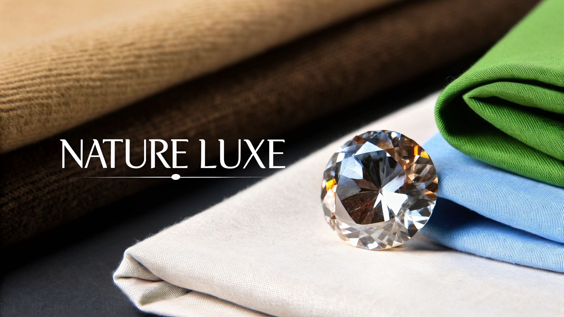
7. Black & Cream/Beige
Softening the intensity of pure black, this pairing with cream or beige creates a warm, sophisticated, and approachable aesthetic. It strikes a beautiful balance, blending the boldness of black with the gentle, earthy softness of cream. This combination feels both luxurious and comfortable, making it a popular choice for brands that want to convey elegance without being intimidating. It is one of the most refined colours that go with black, often seen in high-end fashion, interior design, and premium lifestyle branding.
Why It Works
Black and cream works so well because it reduces the starkness of a black and white palette while retaining a high-end feel. The warm undertones in cream and beige introduce a sense of organic comfort and humanity, making the overall design feel more inviting and grounded. This pairing evokes feelings of quiet luxury and timeless style, favoured by interior designers and architects who aim to create spaces that are both modern and welcoming.
Suggested Usage
- Luxury Branding: Perfect for boutique hotels, high-end retail, and premium property development.
- Lifestyle Content: Ideal for social media, lookbooks, and websites in the wellness or fashion sectors.
- Elegant Print: Suited for menus, business cards, and event invitations that require a touch of class.
Practical Tips
To enhance this pairing, incorporate natural textures like wood, linen, or stone to amplify its organic warmth. For printed materials, choose an uncoated, textured paper stock to give the cream a richer, more tactile quality. This colour scheme is particularly effective for physical spaces and large-format displays; you can explore a wide range of custom backgrounds and banners to create a cohesive and sophisticated brand environment for events or retail interiors.
8. Black & Emerald Green
A luxurious and nature-inspired pairing, black and emerald green combines the foundational elegance of black with the rich, vibrant sophistication of a precious gemstone. This combination evokes a sense of opulence, growth, and natural vitality, making it an exceptional choice for brands that want to communicate premium quality with an organic touch. It’s a powerful and confident pairing, perfect for standing out in markets like wellness, high-end beauty, and sustainable luxury.
Why It Works
The deep, grounding nature of black provides the perfect stage for emerald green's jewel-toned brilliance to shine. This creates a high-end aesthetic that feels both established and full of life. The psychological connection of green to nature, wealth, and harmony, when paired with black’s authority, results in a message of cultivated, premium quality. This is why luxury brands like Rolex and high-end beauty lines use this combination to project an image of timeless elegance and natural prestige.
Suggested Usage
- Luxury Packaging: Ideal for high-end skincare, organic products, and boutique goods.
- Wellness Branding: Conveys a sense of premium health, vitality, and natural ingredients.
- Hospitality & Events: Creates an inviting yet exclusive atmosphere for hotels, restaurants, and galas.
Practical Tips
When using this combination in print, such as on premium roller banners or event signage, ensure your emerald green is vibrant and not murky. Use a coated paper stock to help the green pop against the deep black. To avoid the design feeling too heavy, use emerald as an accent colour and balance the composition with plenty of white space. This pairing also works beautifully with gold or brass metallic foils for an extra touch of luxury on printed materials.
9. Black & Copper/Bronze
Evoking a sense of artisanal craftsmanship and rustic elegance, the combination of black with copper or bronze offers a warm, earthy alternative to brighter metallics. This pairing balances black’s deep neutrality with the inviting, reddish-brown lustre of copper, creating a look that feels both historic and contemporary. It’s a sophisticated duo that suggests authenticity and quality, making it an excellent choice among colours that go with black for brands aiming to convey a sense of heritage or bespoke artistry. Popularised by the craft movement and boutique hospitality, its appeal lies in its organic, grounded warmth.
Why It Works
Black & Copper/Bronze works by contrasting the cool, profound depth of black with the warm, reflective qualities of the metal. Unlike the high-shine of gold or silver, copper and bronze have a muted, rich patina that adds texture and character. This combination taps into trends favouring natural materials and handcrafted aesthetics, creating an atmosphere that is welcoming and refined. The pairing is perfect for artisanal coffee shops, high-end restaurants, and premium home decor brands that want to establish an intimate, high-quality ambiance.
Suggested Usage
- Boutique Branding: Ideal for logos and packaging for craft goods, distilleries, or artisanal food products.
- Upscale Hospitality Signage: Perfect for restaurant menus, hotel wayfinding, and event promotions.
- Artistic Event Banners: Use for gallery openings, craft fairs, and exhibitions to create a creative, sophisticated feel.
Practical Tips
When using this duo in print, such as on roller banners or menus, consider using a metallic foil or a high-quality print finish to replicate the shimmer of copper or bronze. For digital assets, use gradients and subtle light effects to simulate the metallic texture. This combination excels when paired with natural materials like wood and leather, so consider these elements in your event or retail space design to create a cohesive and immersive brand experience.
10. Black & White with Pastel Accents
This sophisticated combination builds on the classic black and white foundation by introducing soft pastel accents like blush, mint, or baby blue. It injects a touch of modern warmth and approachability into the high-contrast pairing, creating a balanced and inviting aesthetic. This trio is one of the most stylish colour combinations that go with black, perfect for brands wanting to appear both elegant and friendly. Popularised by contemporary tech startups and lifestyle brands, it softens the formal edge of monochrome without sacrificing its inherent polish.
Why It Works
This palette works by leveraging the powerful contrast of black and white as a stable base, while using pastels to guide the eye and add personality. The softness of the pastels (like blush pink or soft lavender) creates a pleasing visual harmony against the starkness of black, preventing the design from feeling too severe. This makes it an excellent choice for modern wellness apps, fashion labels, and event designs that need to communicate sophistication alongside a gentle, human touch.
Suggested Usage
- Modern Branding: Ideal for tech startups and SaaS companies aiming for a clean yet approachable look.
- Lifestyle & Wellness: Perfect for apps, packaging, and marketing materials in the wellness sector.
- Contemporary Events: Excellent for modern wedding invitations, event programmes, and signage.
Practical Tips
To maintain balance, use pastels sparingly as accent colours for buttons, icons, or key highlights, allowing the black and white structure to dominate. Stick to one or two complementary pastels to avoid a cluttered feel. When preparing designs for print, such as for a roller banner, ensure your pastel shades have enough saturation to be visible and not appear washed out against the bright white and deep black.
Top 10 Color Pairings with Black
| Style | 🔄 Implementation complexity | ⚡ Resource requirements | ⭐ Expected outcome | 📊 Ideal use cases | 💡 Key tip |
|---|---|---|---|---|---|
| Black & White | Low — straightforward contrast rules | Low — minimal inks, easy repro | ⭐⭐⭐⭐ Classic, maximum readability | Editorial, corporate, minimalist, print | Add a third accent or texture to soften starkness |
| Black & Gold | Medium — needs metallic finishes & balance | High — metallic inks/foils, careful production | ⭐⭐⭐⭐ Luxurious, high perceived value | Luxury branding, packaging, fashion | Use gold sparingly; balance with white space |
| Black & Silver | Medium — reflective materials and finishes | Medium — metallics or coatings recommended | ⭐⭐⭐ Modern, tech-forward and polished | Tech products, automotive, electronics | Keep typography clean; use subtle reflections |
| Black & Red | Low–Medium — strong contrast requires control | Low — standard colors, easy to produce | ⭐⭐⭐⭐ Energetic, attention-grabbing, urgent | Entertainment, events, CTAs, sports | Use red as an accent and provide breathing space |
| Black & Navy Blue | Low — subtle tonal pairing, careful contrast | Low — standard color printing | ⭐⭐⭐ Professional, trustworthy, refined | Finance, legal, corporate branding | Add a light accent (white/gold) to avoid heaviness |
| Black & Neon/Bright Colors | Medium — high visual impact needs restraint | Medium — best on digital; tricky in print | ⭐⭐⭐ High-energy, memorable, can be fatiguing | Gaming, youth brands, nightlife, digital ads | Limit neon to accents; test legibility on screens |
| Black & Cream/Beige | Low — warm neutral balance, texture helps | Low — standard materials, textured finishes | ⭐⭐⭐⭐ Warm, elegant, approachable | Luxury lifestyle, interiors, hospitality | Use natural textures; watch cream tones for yellowing |
| Black & Emerald Green | Medium — saturation/balance is key | Medium — careful color matching required | ⭐⭐⭐⭐ Rich, premium, nature-inspired | Wellness, premium products, hospitality | Control saturation; pair with organic materials |
| Black & Copper/Bronze | Medium — metallic tone and aging considerations | Medium — metallics and finishes advised | ⭐⭐⭐ Distinctive, warm, artisanal | Artisanal brands, high-end interiors, hospitality | Embrace metallic finishes; consider patina effects |
| Black & White with Pastel Accents | Medium — pastel selection and contrast testing | Low–Medium — pastel accuracy matters in print | ⭐⭐⭐⭐ Sophisticated yet approachable, versatile | Startups, lifestyle brands, wellness, events | Use 1–2 pastels max; test for print and digital contrast |
Bringing Your Colour Palette to Life
Having explored the dynamic potential of ten distinct colour palettes, it's clear that black is far more than a simple, default option; it's a powerful canvas. The pairings we have detailed offer a complete spectrum of communication tools for your brand or event. From the uncompromising authority of Black and White to the sophisticated warmth of Black and Copper, the right combination can define your message before a single word is read. Understanding these colours that go with black is about mastering visual language.
The journey doesn't end with selecting a Hex code. The true test lies in execution, particularly in the physical world of print. A high-contrast Black and Neon scheme designed for a festival banner requires vibrant, light-fast inks to avoid looking washed-out outdoors. Similarly, an elegant Black and Gold palette for a premium pop-up display might lose its lustre without the right material finish to simulate a metallic sheen. The success of your design hinges on translating digital intent into tangible impact.
Key Takeaways for Flawless Execution
As you move forward, keep these core principles at the forefront of your design process:
- Context is King: The best colour palette is one that aligns perfectly with your brand's personality, your target audience, and the specific event or promotion. A bold, energetic red might be perfect for a sales announcement but less suitable for a luxury brand launch.
- Accessibility Matters: Always prioritise readability. While subtle combinations like Black and Navy Blue can be incredibly chic, ensure there is sufficient contrast for all text elements, especially on critical signage like safety notices or directional signs.
- Consistency Builds Recognition: Your chosen colours should be applied consistently across all marketing materials, from your website to your trade show banners. As you consider various colour combinations, remember that consistent application of your palette across all platforms is key. Developing strong social media brand guidelines can help maintain this visual integrity.
Mastering these combinations elevates your designs from merely functional to truly memorable. It gives your brand a confident, professional edge that captures attention and communicates value instantly. Whether you’re aiming for timeless elegance, modern disruption, or approachable warmth, the strategic use of colour with black is your most powerful tool.
Ready to see your perfectly chosen colour palette come to life on a grand scale? At Banner Printing Ltd, we specialise in transforming your designs into vibrant, high-quality printed materials ideal for any event or promotion. From PVC banners to pop-up displays, we ensure your colours are rendered with professional precision and clarity. Contact us today to make your vision a physical reality.


