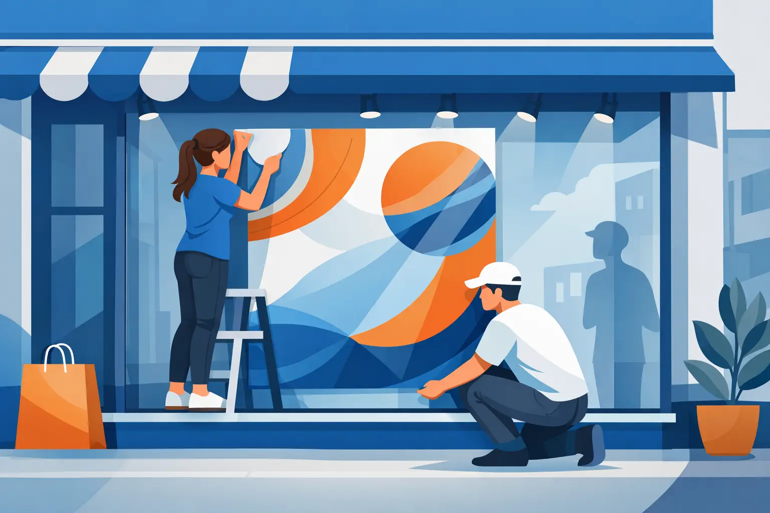
A passer-by gives your shopfront only a few seconds. That is why shop window poster printing needs to do more than look good at close range. It needs to stop people, communicate one clear reason to come in and remain easy to read through glass, reflections and changing daylight.
For retailers, salons, cafés, estate agents, gyms and local service businesses, window posters are one of the fastest ways to put a timely message in front of people already on your street. A seasonal offer, new menu, recruitment notice or event promotion can be printed, fitted and working for you without changing your whole shop display.
Start with the message, not the artwork
The most effective window posters are built around a single priority. Trying to advertise every product, service and social channel on one sheet usually creates a poster that nobody can read from the pavement.
Choose the action you want the customer to take. It may be to notice a sale, book an appointment, visit an event, try a new product or simply recognise that you are open. Put that message first, then support it with the details needed to act.
A simple hierarchy works best: a large headline, a clear offer or benefit, then practical information such as dates, prices, location or a short call to action. If someone can understand the main point while walking past, the poster is doing its job.
Be particularly careful with prices and terms. A striking “50% OFF” is useful only if the qualifying details are still legible. Keep essential conditions close to the offer and make sure they are large enough to read without stepping right up to the glass.
Choose a poster size that suits the window
Poster size should be led by viewing distance and available glass area, not just what fits your existing design. An A4 poster is useful beside a till or on an internal noticeboard, but it is rarely large enough to carry a key shopfront promotion on a busy high street.
A3 is a practical choice for smaller windows, counter-facing displays and messages viewed from nearby. A2 gives stronger street presence while leaving room for products behind the glass. A1 and larger formats are suited to broad windows, launch campaigns and property or retail promotions where the message needs to be seen from further away.
There is a trade-off. A large poster with too much copy can still feel cluttered, while a small poster may be technically sharp but disappear into a busy display. Before ordering, stand across the road or at the normal walking distance from your premises. That view should guide the scale of the headline and the size you choose.
If your window is divided by frames, handles or display fixtures, plan around them. Splitting a phone number, price or key word across a frame makes the display harder to scan. A little space around the artwork often produces a more professional result than filling every inch of glass.
Shop window poster printing: paper, finish and placement
The material and finish affect how the poster looks under shop lighting and through a window. A glossy finish can make colours appear punchy and works well for product-led visuals, food photography and bold retail campaigns. However, strong direct light can create reflections, especially when the poster is placed behind glass.
A silk or matt finish is often easier to read in bright windows because it reduces glare. It can also give premium services, menus and brand-led promotions a cleaner appearance. The right choice depends on your lighting, the direction the window faces and whether photography or text is doing most of the work.
Most shop window posters are displayed inside the premises facing out. This keeps them protected from rain, dirt and tampering, while still giving you a strong outward-facing message. If you need graphics applied directly to the glass, removable window films or static cling products may be a better fit than a paper poster. Match the product to the job rather than forcing one format to cover every need.
Think about how the poster will be fixed too. Poster frames create a tidy, repeatable display and make regular campaign changes quick. Clear pockets are useful for menus and notices. For temporary promotions, discreet mounting methods can work well, but avoid tape across important artwork or corners that will curl after a few days.
Design for real streets, not just screens
Artwork that looks balanced on a laptop can behave very differently in a shop window. Reflections from cars, street signs and the sky compete with the design. Inside, stock, mannequins and lighting add more visual noise. Your poster needs contrast and space to cut through it.
Use high-contrast colour combinations for the headline. Dark lettering on a pale background is usually easier to read than light text placed over a detailed image. If you use a photograph, add a solid colour panel or subtle overlay behind the text rather than hoping the image will provide enough contrast.
Keep typefaces simple and limit the number of styles. One strong font for headings and one clear font for supporting details is enough for most promotions. Very thin lettering, decorative scripts and long lines of capital letters can become difficult to read at distance.
Images need to be high resolution at their final print size. A photograph copied from social media may look acceptable on a phone but can print soft or pixelated when enlarged. Supply original photography, professionally prepared graphics or high-resolution logo files wherever possible. If you are unsure, checking the artwork before production is far safer than discovering a problem once the posters arrive.
Leave a safe margin around the edge of the design. This prevents key details sitting too close to the trim line and gives the poster a more controlled finish. It is also wise to build in bleed where required, especially if a background colour or image runs to the edge.
Rotate offers before people stop seeing them
Window space loses value when the same message stays up for months. Regular customers become blind to familiar displays, even if the original promotion was well designed. A planned rotation keeps the shopfront active and gives people a reason to look again.
You do not need a complete redesign every week. Create a consistent campaign style with your logo, core colours and a recognisable layout, then update the offer, image or headline. This protects brand consistency while making each message feel current.
Retailers can plan around sales periods, new ranges and seasonal dates. Hospitality venues can promote specials, live events or booking periods. Service businesses can use window posters for availability, local offers, new services, reviews or recruitment. The strongest messages are specific and time-sensitive: “Half price cuts Tuesday to Thursday”, “Autumn menu now serving” or “Appointments available this week” gives people a practical reason to respond.
Order with enough time for checks
Fast turnaround is valuable when a promotion changes at short notice, but the best results still begin with a quick pre-print check. Confirm the final size, read the copy aloud, verify dates and prices, and check that contact details are correct. A single wrong digit in a phone number can cost more than the time saved by rushing artwork through.
Order a small quantity for short campaigns, tests and localised offers. For evergreen messages or multi-site displays, ordering more can improve consistency and make replacements easier. It depends on how frequently the information changes and how much storage space you have available.
For urgent retail campaigns, UK-based production and fast dispatch can make the difference between catching a key trading weekend and missing it. Banner Printing UK produces professional display print for businesses that need clear artwork, dependable quality and delivery that supports real deadlines.
Your window is already one of your most visible marketing spaces. Give it a focused message, enough scale and print that holds its colour and clarity. The next customer walking past should know exactly why it is worth stepping inside.