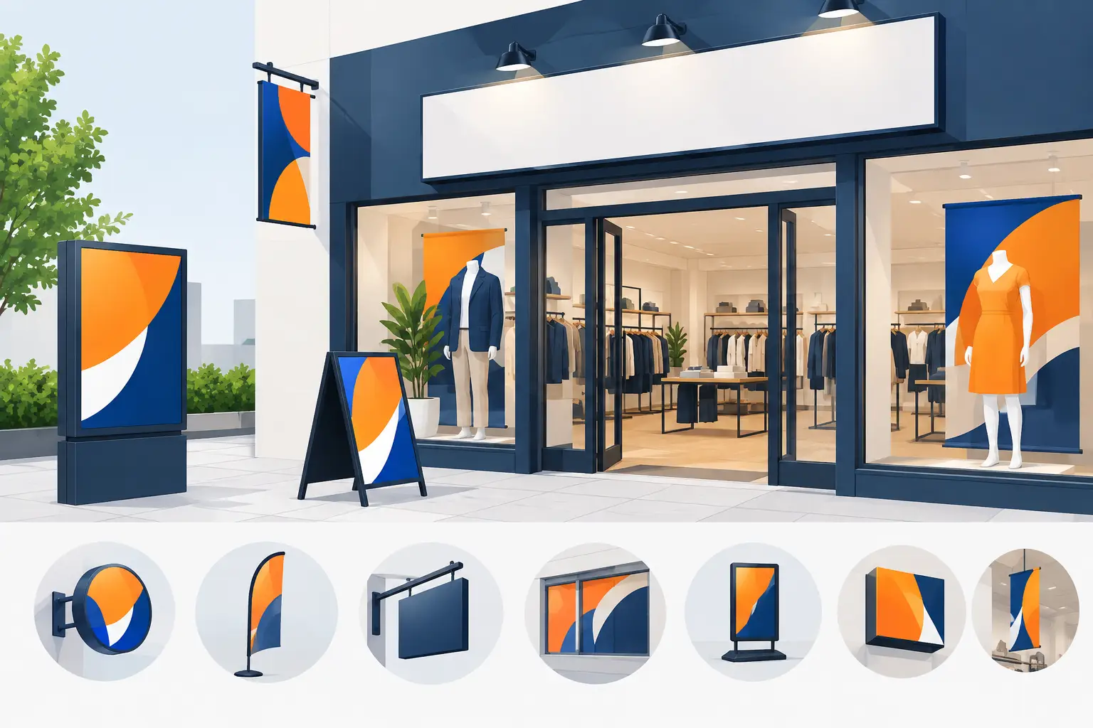
A customer can decide whether to step inside within seconds. The strongest top retail signage ideas do more than fill wall space – they make the offer clear, guide people to the right product and give your shop a professional, active feel. From a sale outside the door to a new range at the back of the premises, the right printed display earns its place by helping customers act.
For UK retailers, signage also needs to work in real conditions. It may be facing rain, bright window glare, busy pavements, changing promotions and staff who need to put it up quickly. That is why material, positioning and message matter just as much as the design.
Start with a clear job for every sign
Before choosing a banner, poster or roller display, decide what each sign is meant to achieve. A shopfront banner should attract passing trade. A window poster should give people a reason to enter. A point-of-sale sign should make an offer easy to understand before a customer asks a question.
Trying to say everything on one sign usually means nothing stands out. Keep the main message to one action, one offer or one product category. Use a large headline, a short supporting line and a clear price, date or direction where needed. If a shopper cannot read the purpose from a few metres away, it is doing too much.
12 top retail signage ideas for busier shops
1. Shopfront banners for instant visibility
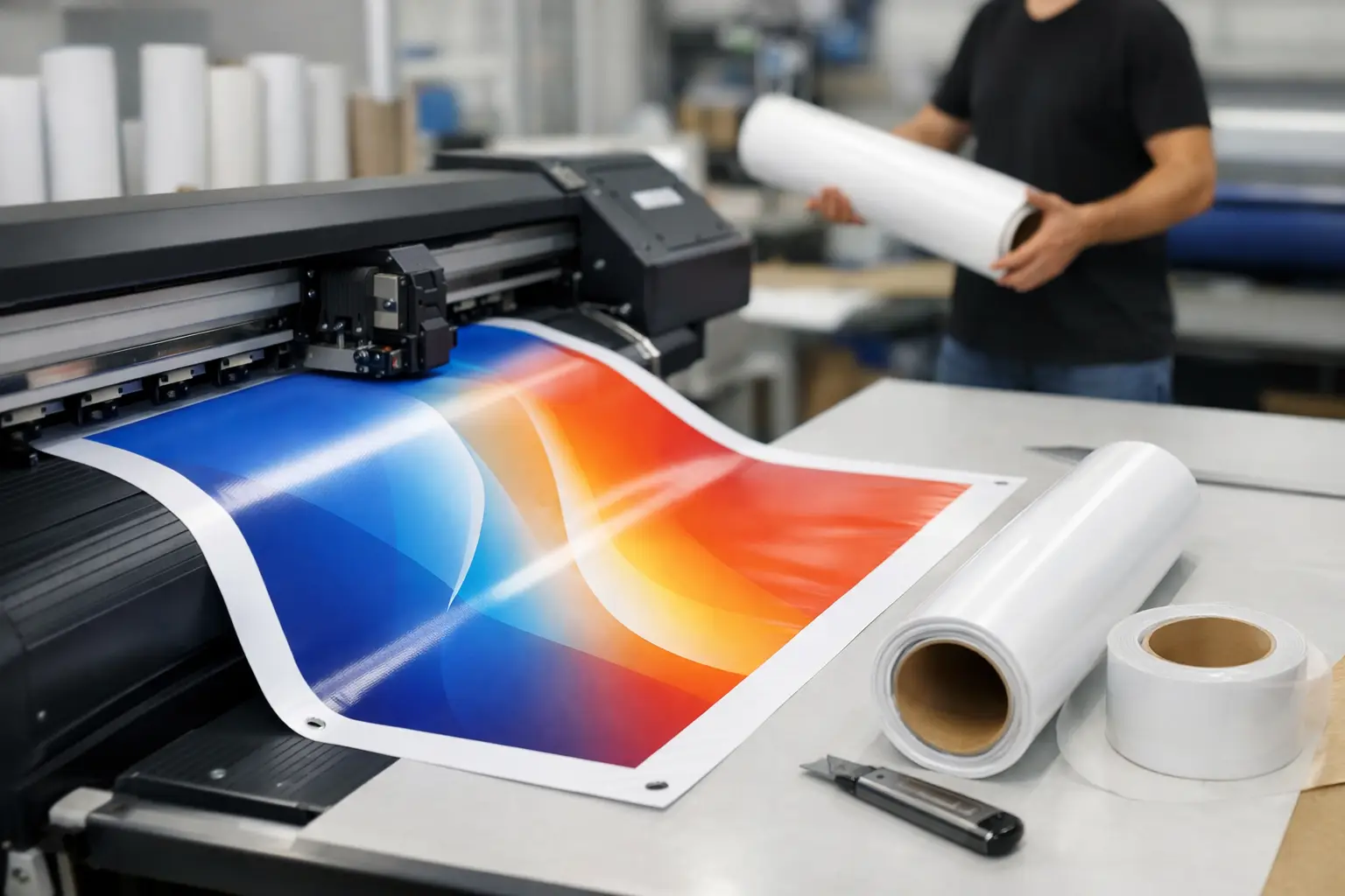
A vinyl banner is one of the most practical ways to make a frontage work harder. Use it to announce an opening, seasonal event, late-night shopping, clearance sale or a service that people may not realise you offer.
For permanent or repeat use, choose a concise message that will not date quickly. For example, “Trade Counter Open”, “Fresh Food Daily” or “Custom Gifts Made Here” can be more useful over several months than a short-lived campaign. A weatherproof, UV-resistant banner is particularly suited to exterior walls, railings and fencing.
2. Window graphics that sell before entry
Your windows are valuable promotional space, especially on high streets where footfall moves quickly. Large posters or window displays can lead with one strong offer: percentage off, new-season stock, bundle pricing or a limited-time promotion.
Avoid covering every pane with competing messages. A clear hero offer with brand colours and a large price point is easier to absorb. If your premises receive strong sun, test placement first, as reflections can reduce legibility at certain times of day.
3. A-frame-style pavement messaging
Where local rules and pavement space allow, a freestanding sign outside the entrance can turn passing interest into a visit. It works well for cafés, salons, convenience shops, showrooms and service businesses because it can address the immediate question: why come in now?
Keep the wording timely. “Lunch Served Until 3pm”, “Walk-Ins Welcome” or “This Week’s Offers Inside” creates more urgency than a generic brand statement. Check that it does not obstruct pedestrians, pushchairs or wheelchair users, and bring it in when conditions are windy.
4. Roller banners for entrances and promotions
Roller banners are portable, smart and quick to position. Place one just inside the doorway to introduce a promotion, explain a loyalty scheme or show off best-selling lines. They are also useful when you are running a pop-up, attending a local market or taking part in an in-store brand event.
The trade-off is reading distance. A roller banner is ideal for close-to-medium viewing, not for a message that must be read from across a car park. Use bold imagery, a short headline and enough empty space for the design to breathe.
5. Category signs that make browsing easier
Customers should not have to hunt for basic categories. Clear overhead or wall-mounted signage for departments such as “Homeware”, “Offers”, “Pet Supplies” or “Collection Point” reduces friction and helps staff spend less time giving directions.
This is especially valuable in larger independent shops, warehouses open to the public and retailers with frequently changing layouts. Use a consistent typeface, colour system and sign size so people learn how to navigate the space at a glance.
6. Shelf-edge and point-of-sale posters
The moment near the shelf is where a product message needs to be practical. Posters and small display signs can explain multi-buy pricing, product benefits, ingredients, sizes, availability or a related item worth adding to the basket.
Make the offer specific. “Any Two for £10” is clearer than “Great Value”. If an item is reduced, show the current price first and make any terms easy to read. Confusing promotional signs damage trust quickly, even when the deal is good.
7. New arrival displays that create movement
Regular customers need a visual reason to look again. A dedicated “New In” sign, supported by a poster, backdrop or display banner, makes fresh stock feel intentional rather than simply placed on a shelf.
This approach works well in fashion, gifts, beauty, food retail and homeware. Change the display often enough that returning customers notice it, but do not redesign the entire sign system every week. A reusable branded format with a replaceable poster is usually more cost-effective.
8. Sale signage with one strong message
Sales can look chaotic when every product carries a different handwritten label. A coordinated set of printed sale signs gives the promotion more authority and helps customers understand the rules.
Choose one lead message, such as “Up to 50% Off”, then use supporting signs for exact reductions or selected lines. Be accurate with dates, exclusions and stock limitations. Strong red and bright colour blocks can work well for urgency, but your branding should still be recognisable.
9. Queue and collection-point signs
Queues are part of retail, particularly at busy tills, collection desks and service counters. Good signage manages expectations before frustration builds. A sign can direct customers to the right queue, explain click-and-collect steps, identify returns and show estimated waiting information.
These signs are not always glamorous, but they make the operation feel organised. A simple poster behind the counter can also reduce repeated staff questions about collection times, payment methods or return procedures.
10. Seasonal banners that keep the shop current
Seasonal retail signage gives customers permission to buy now. Christmas, Easter, Valentine’s Day, Mother’s Day, back-to-school periods and summer events all create natural promotional windows.
Plan artwork early so signs arrive before the buying period begins. For outdoor campaigns, durable vinyl banners are a dependable option; for internal updates, posters and roller banners are easier to swap. Avoid printing large quantities with dates unless the promotion is fixed, as flexibility matters when stock changes.
11. Branded backdrops for demos and social content
A branded backdrop can turn a product demonstration, tasting session or launch event into a more polished retail moment. It creates a clean setting for photographs and customer-generated social content while keeping your logo visible without overwhelming the scene.
This is a useful option for beauty counters, gyms, showrooms, local launches and community events. Keep logos well spaced and make sure any key message sits at camera height rather than low down behind a table or display stand.
12. Directional signs for services beyond the shop floor
Retailers often lose sales simply because customers do not know a service exists. Directional signs can point to fitting rooms, consultations, trade counters, workshops, café seating, toilets, collections or upstairs departments.
Use arrows carefully and keep each sign tied to one route. If there are several destinations, a central directory near the entrance may work better than repeated arrows throughout the shop. The goal is confidence: customers should feel they know where to go without needing to ask.
Make the message readable at the right distance
A sign viewed from the pavement needs much larger text than one beside a till. As a rule, the farther away the customer is, the fewer words you should use. Exterior banners should rely on a headline, high-contrast colours and oversized lettering. Point-of-sale posters can carry a little more detail because shoppers are closer.
Contrast matters more than decoration. Dark text on a pale background, or pale text on a dark background, is generally easier to read than similar tones placed together. Avoid squeezing text over a busy photograph unless there is a solid colour panel behind it.
Check the final artwork at full size before print. Small logos, thin fonts and low-resolution images may look acceptable on a laptop but lose impact when enlarged. Banner Printing UK can help turn supplied artwork into print-ready displays where a quick refinement is needed.
Choose materials around the location
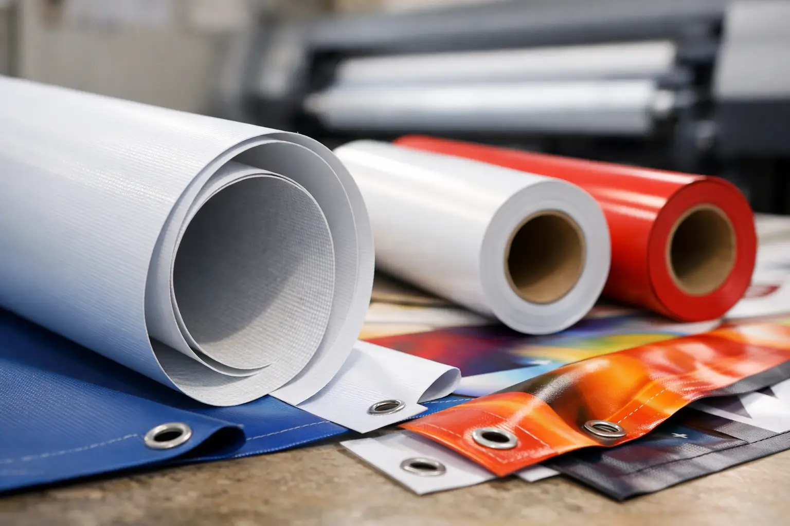
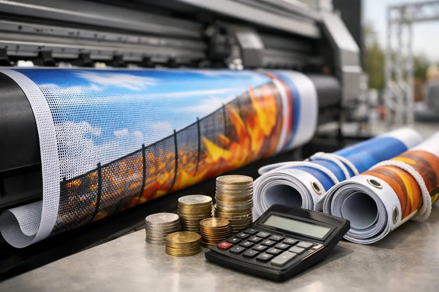
Indoor posters are cost-effective for short promotions and frequent updates. Roller banners suit campaigns that need to move between shop floors, events and pop-ups. Vinyl banners provide a durable choice for outdoor frontage, while mesh banner material can be better for windy, exposed fencing because air can pass through it.
There is no single best format. A city-centre boutique may prioritise polished window posters and compact roller banners, while a builders’ merchant may need large, weatherproof banners visible from the road. Match the format to viewing distance, installation point, expected lifespan and how often your message changes.
Keep retail signage working after installation
Print is only effective when it stays current. Build a quick monthly check into your shop routine: remove expired offers, replace curled posters, clean display stands and confirm that prices and opening information remain correct. A faded or out-of-date sign can make even a well-run business appear overlooked.
Start with the place where customers hesitate most – outside the entrance, at the first display or near the till – and give that moment one clear message worth noticing.