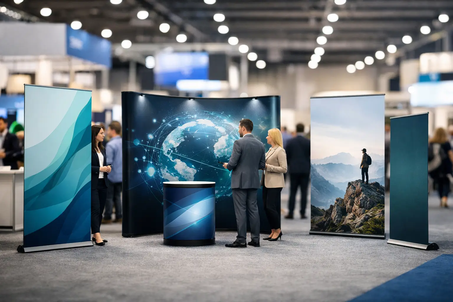
A crowded exhibition hall gives visitors seconds to decide whether your stand is worth stopping at. The best trade show banner examples do not try to tell the whole company story from three metres away. They make one clear promise, show people what to do next and look sharp under bright venue lighting.
For UK businesses working to a deadline, the right banner is also a practical choice. It needs to travel well, set up quickly and still represent the business properly after a full day of footfall. Here are 12 proven approaches, plus the design decisions that make them work.
Trade show banner examples built for busy stands
1. The bold headline roller banner
This is the dependable all-rounder: a large, benefit-led headline at the top, one strong image or product visual beneath it, then a clear contact detail or call to action near the bottom. A heating firm might lead with “Boiler cover without the call-centre runaround”. A software provider could use “See every job, invoice and engineer in one place”.
The point is not to be clever for its own sake. Your headline should tell a passing visitor why they should give you ten seconds. Roller banners suit this format especially well because their tall shape naturally guides the eye from the message to the action.
2. The product-in-use banner
If your product makes more sense when seen in action, make the photograph do the selling. A catering supplier could show a finished event setup. A workwear business might show a tradesperson on site wearing branded PPE. A salon product distributor could use a clean, high-quality image from a working salon.
Choose one image with a clear subject, not a busy collage. Exhibition graphics are viewed from a distance, so small details disappear. Add a short supporting line that explains the result, rather than repeating what the visitor can already see.
3. The problem-and-solution display
Some services are hard to understand at first glance. In that case, a banner can frame the problem before presenting the fix. For example: “Late deliveries costing you customers?” followed by “Same-day local fulfilment for growing retailers.”
This format works well for B2B exhibitors, consultants and service businesses. Keep the problem specific enough to feel familiar to the right visitor. A vague statement such as “Need help with business?” will not earn attention on a busy stand.
4. The results-led banner
Numbers give visitors a reason to believe the claim. A banner for an accountancy firm might feature “£2.4m saved in tax for clients last year”, provided the figure is accurate and can be supported. A recruitment agency may lead with “92% of placements still in post after 12 months”.
Use one standout statistic, not a wall of figures. Results work best when they are meaningful to the audience and displayed in large type. Small print, qualifications and supporting detail can be handled in conversation or on a leaflet.
5. The range-of-services banner
Businesses with several related services often need to show breadth without creating visual clutter. A clean solution is a main headline, followed by three service areas with simple icons or tightly cropped images. Think “Design. Print. Install.” or “Survey. Supply. Maintain.”
Limit this to three clear categories. Once a banner contains six services, three accreditations, two phone numbers and every social media icon, it starts behaving like a noticeboard rather than a sales tool. Let the banner open the conversation, then use brochures for the detail.
6. The new-product launch banner
Trade shows are ideal for giving a launch moment more impact. A product launch banner should put the product name first, use a distinctive product image and add a single line explaining what is new or better. “Introducing the compact mixer built for mobile caterers” is more useful than simply saying “New product”.
Leave enough empty space around the product. This makes the banner easier to read and gives the launch a premium, confident feel. If stock is limited or visitors can claim an event-only offer, include that message only if the team can fulfil it reliably.
7. The testimonial banner
A short customer quote can add immediate credibility, particularly where trust is a major buying factor. This works well for care providers, construction businesses, training companies and professional services. Use a real quote with the customer’s name, organisation and permission where appropriate.
Keep it concise. “They delivered our site signage within 48 hours and it looked spot on” is stronger on a banner than a long paragraph full of background. Pair the quote with a recognisable client logo only where approval has been given.
8. The before-and-after banner
Transformation is persuasive because visitors can understand it instantly. Interior fit-out firms, landscapers, cleaning companies, vehicle wrappers and web designers can all use a before-and-after format. The key is consistency: use images taken from a similar angle and give each side equal visual weight.
Do not over-edit the before image to make the change look more dramatic than it was. Clear, honest examples build trust. A simple line such as “From tired reception to a client-ready welcome” gives the visual a commercial context.
9. The location or local-service banner
For businesses serving a defined area, local relevance can beat a broad corporate claim. A banner reading “Commercial electrical work across Greater Manchester” tells the right visitor immediately that you are relevant to their project. This is useful at regional trade events, business expos and supplier days.
Avoid listing every town you cover unless location is the main reason people choose you. A strong regional line, a phone number and a clear service description usually do the job more effectively.
10. The QR-led demonstration banner
A QR code can turn a banner into a practical lead-generation tool, but only when there is a real reason to scan it. Offer a product demo, price guide, sample request, appointment booking page or event competition. Place the code at a comfortable scanning height and give it breathing room.
Test it before printing. Codes that are too small, placed over a patterned background or printed with weak contrast can fail under exhibition lighting. Also give visitors an alternative route, such as a short web address or a member of staff ready to help.
11. The branded backdrop
A wider fabric or PVC backdrop works well behind a counter, demo area or speaking space. It can carry your logo, key visual and campaign message while creating a tidy, professional frame for photos. For businesses hoping to be tagged in event posts, this can be more useful than several small banners.
A repeated-logo pattern is practical for photography, but it is not always the best choice for a selling stand. If the backdrop is your only large-format display, include a value proposition as well as the branding. People need to know what you do before they remember who you are.
12. The offer banner
A direct offer can increase stand traffic when it is genuinely valuable and easy to understand. Examples include “Book at the show and save 15%”, “Free site survey for the first 20 visitors” or “Collect your trade price list today”.
Use this approach carefully. Heavy discount messaging can cheapen a premium service, while a complicated offer can create queues and confusion. For higher-value sales, an offer based on a consultation, sample pack or priority booking may feel more appropriate than a percentage off.
What the strongest exhibition banners have in common
The common thread across these trade show banner examples is focus. Each one has a job: attract attention, explain a benefit, prove credibility or prompt an action. Trying to do all four at once is where many designs lose their impact.
Start with viewing distance. A visitor should understand the main message from several metres away, so use large type and strong contrast. Dark text on a pale background or pale text on a dark background is usually easier to read than low-contrast brand colours layered together. Keep logos clear, but do not allow them to dominate the headline unless brand recognition is already doing the selling.
Artwork quality matters just as much. Images supplied from a website, social post or screenshot may look acceptable on a laptop but become soft when enlarged. Use high-resolution photography, vector logos and correctly sized artwork from the outset. If you are unsure, getting the file checked before print is faster than discovering a pixelated image on setup day.
Choosing the right banner format
A roller banner is often the best choice for one-message displays, especially where setup time is tight and staff are travelling by car or train. It is portable, self-contained and easy to position at the edge of a stand or beside a product display.
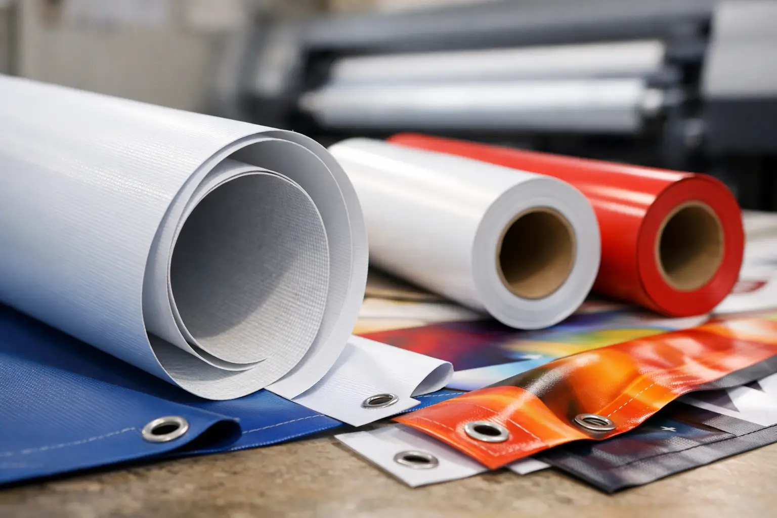
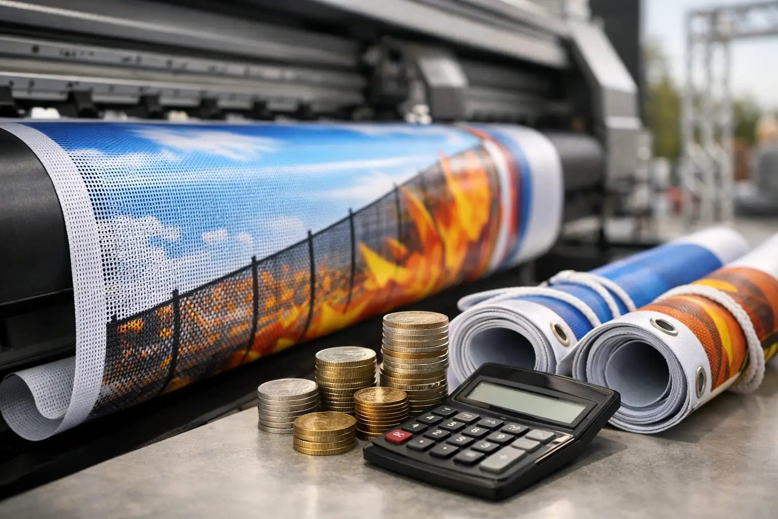
A larger backdrop makes sense when you need to fill a wall, create a branded meeting point or improve the look of a shell scheme. For outdoor trade events, choose weatherproof materials and a display method that can handle wind and changing conditions. Mesh banners can be a better option on fencing because their perforated structure lets air pass through, though fine detail will not reproduce as sharply as it does on solid vinyl.
Order with the venue and schedule in mind. Check the stand dimensions, access times, any restrictions on hanging graphics and whether you need fire-rated materials. For urgent campaigns, UK-based production and fast dispatch can make the difference between arriving prepared and making do with an outdated display.
The banner that performs best is rarely the one with the most information. It is the one that makes the right person stop, understand your value and feel confident enough to start a conversation.