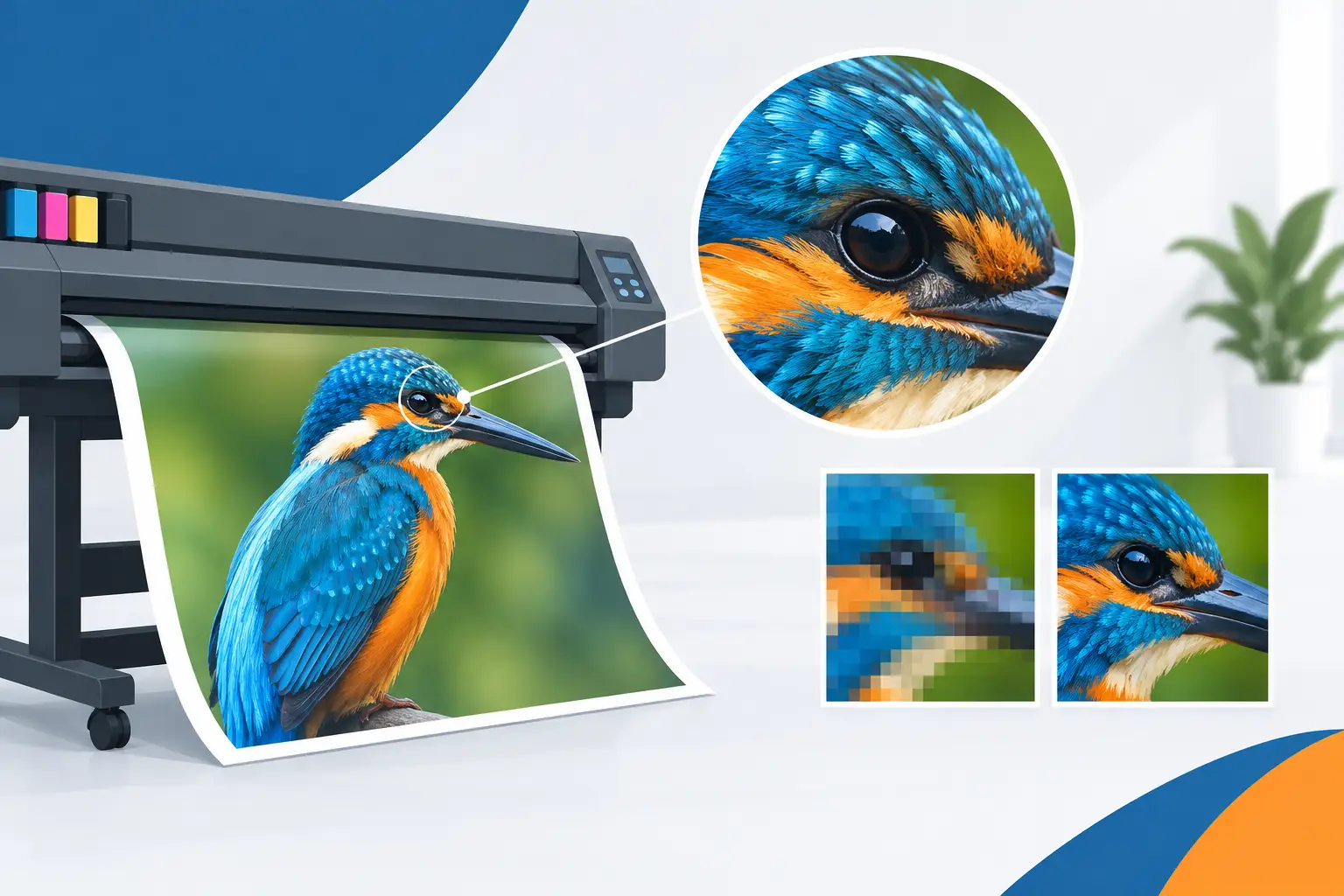
A banner can look perfectly sharp on a laptop and still disappoint at 3 metres wide. This print resolution guide explains what makes artwork suitable for large-format print, so you can order banners, posters and displays with confidence – even when time is short.
The key is not simply choosing the highest DPI number available. Print quality depends on the final product size, the viewing distance, the source of your images and whether your artwork is being enlarged beyond what it can support. Get those details right before production and your branding will stay crisp, readable and professional.
What print resolution actually means
Print resolution describes the amount of image detail available for reproduction. It is commonly measured in DPI, meaning dots per inch, and PPI, meaning pixels per inch. For customers supplying artwork, PPI is usually the more useful measure because digital files are made from pixels.
A photograph with more pixels can be printed larger before it starts to look soft or blocky. A vector logo is different: it is built from mathematical paths rather than a fixed grid of pixels, so it can scale up without losing definition. This is why logos, text and simple graphic elements should be supplied as vector artwork wherever possible.
DPI on its own does not tell the full story. A 300 DPI file may be excellent for an A4 leaflet but far too small for a large event backdrop if it only contains enough pixels for that smaller format. Always check resolution against the finished print dimensions.
Print resolution guide: the right DPI for each product
For close-viewed printed products such as business cards, flyers and stickers, aim for 300 PPI at final size. Customers hold these items in their hands, so fine text, product photography and detailed graphics need the extra clarity.
Posters and indoor retail graphics are commonly produced at around 150 PPI at final size. They are usually viewed from a little further away, making this a practical balance between sharp results and manageable file sizes.
For large-format banners, exhibition backdrops and window displays, 100 to 150 PPI at final size is generally more than sufficient. These products are designed to be seen from several metres away, not inspected from a few centimetres. A 72 PPI image may also print well on a very large outdoor banner if it has the right pixel dimensions and will be viewed at distance, but it should be assessed carefully rather than treated as a standard rule.
There is no benefit in forcing every large banner file to 300 PPI. It can make uploads unnecessarily slow, increase file handling time and create massive documents without adding visible detail at normal viewing distance.
Start with final size, then check pixels
The most reliable way to assess artwork is to work backwards from the finished size. To calculate the pixel dimensions needed, multiply the print size in inches by your target PPI.
For example, a 2 metre by 1 metre banner is approximately 78.7 by 39.4 inches. At 100 PPI, the artwork should be about 7,870 by 3,940 pixels. At 150 PPI, it would need to be roughly 11,805 by 5,910 pixels.
This does not mean every banner needs the larger file. If the banner will be fixed to railings, displayed at a sports event or positioned behind a stage, 100 PPI is often a sensible and effective target. If it will be used indoors at a trade stand where visitors stand close to it, 150 PPI gives more headroom for detailed photography and smaller printed text.
When artwork is created at scale, make sure the scale is clear. A file supplied at 50% of finished size can work well if the effective resolution doubles when printed at full size. For instance, artwork set up at half size and 300 PPI becomes 150 PPI at final output size. Include the intended finished dimensions in the file name or order notes to avoid assumptions.
Why low-resolution images look poor in print
Low-resolution images do not gain detail when they are enlarged. Software can add pixels to make the file physically bigger, but it cannot recreate the genuine image information that was never captured. The result may look blurred, pixelated or artificially sharpened.
Common problem files include screenshots, images copied from social media, photographs sent through messaging apps and pictures taken from websites. These are often compressed for fast screen viewing. They may look acceptable on a phone, then break down when expanded across a roller banner or 5 metre vinyl banner.
If a key image is too small, changing the design can be the best answer. Use the image at a smaller size, choose a different photograph, create a clean graphic-led layout or make the text and logo do more of the work. A strong, simple banner often delivers better roadside or exhibition impact than a busy design built around one weak image.
Text, logos and graphics need a different approach
Photographs need enough pixels. Text and logos need clean edges. Where possible, export logos as PDF, SVG, EPS or AI files, and keep text as editable vector type within your design file until artwork is approved.
If you are exporting a print-ready PDF, avoid flattening everything into a low-resolution JPEG first. A properly exported PDF can preserve sharp vector text and logos while keeping photographic elements at the correct resolution. This matters particularly for QR codes, web addresses, price lists and small contact details, where even a slight loss of clarity can affect usability.
Very small text is rarely effective on a large banner anyway. The issue is not only print resolution but viewing distance. A headline needs to be readable in seconds, while supporting information should be reserved for people standing closer. Prioritise a clear message, prominent branding and a visible call to action.
Colour settings and file formats
Resolution is only one part of a print-ready file. CMYK is the preferred colour mode for commercial print because it is based on the inks used in production. RGB artwork can still be converted, but bright screen colours, especially vivid blues, greens and fluorescents, may change during conversion.
A high-quality PDF is normally the best all-round format for banners, posters and display graphics. It is reliable, supports vector artwork and usually keeps type and layout intact. TIFF and high-resolution JPEG files can also work well for photographic designs, provided they are supplied at the correct final dimensions and resolution.
Avoid repeatedly saving a JPEG. Each re-save can apply further compression, reducing image quality. Keep an original master file, then export a fresh print file when you are ready to order.
A quick artwork check before placing your order
Before uploading, check four practical points:
- Set the document to the correct finished dimensions, or clearly state the scale used.
- Use 300 PPI for small hand-held print, 150 PPI for close-viewed displays and around 100 PPI for most large banners.
- Supply logos and text as vector elements wherever possible.
- Review images at 100% zoom and confirm that text, QR codes and important details remain clear.
Also allow for finishing. Vinyl banners may need eyelets, hems or pole pockets, while posters and backdrops can require bleed around the edge. Keep vital copy, logos and faces safely inside the design area rather than placing them against the trim line.
When you should ask for an artwork check
If your order is urgent, do not gamble on a file that looks questionable. Ask for an artwork check when you are using a screenshot, scaling an old poster design into a large banner, working with a logo supplied as a small JPEG or producing an exhibition backdrop for the first time.
At Banner Printing UK, practical artwork refinement is part of getting a job ready for production. A quick review before print can prevent the far more expensive problem of receiving a banner that is technically printed correctly but does not present your business at its best.
The right file is not necessarily the largest one. It is the file that matches the product, viewing distance and message. Build your artwork around that standard, and your next banner or display will arrive ready to be seen for the right reasons.