Cream is more than just a safe neutral; it's a versatile foundation for creating memorable, high-impact visuals. Often underestimated, its inherent warmth and softness can anchor a wide range of colour palettes, from serene and sophisticated to bold and dramatic. However, understanding what colours goes with cream is crucial for unlocking its full potential, especially in visual marketing materials like banners and signage where first impressions count. A poorly chosen pairing can look dated or washed out, but the right combination can communicate your brand’s message with clarity and style.
This guide explores 10 expertly curated colour palettes that harmonise beautifully with cream. We'll move beyond basic theory and provide practical, actionable insights for your design projects. For each palette, we'll break down the mood it creates, offer specific HEX codes, and provide contrast guidance to ensure your text is accessible and legible. To truly unlock the power of cream in your designs, it's essential to understand the broader principles of mastering home design color and how different hues interact.
We will also look at real-world applications, from corporate branding to retail displays, helping you select the perfect combination for your next project. Whether you're designing a roller banner for a trade show or refreshing your shop's signage, this comprehensive list will give you the confidence to use cream effectively and create designs that stand out for all the right reasons.
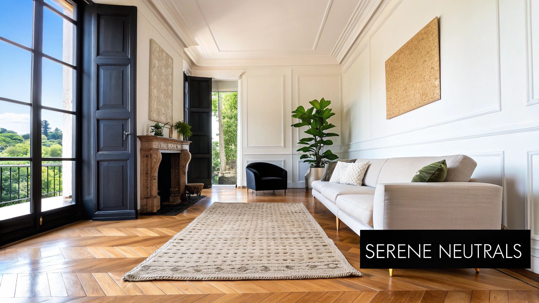
1. Cream and Soft Grey: The Epitome of Understated Elegance
When exploring what colours go with cream, the pairing of cream and soft grey stands out for its timeless sophistication. This combination masterfully blends the gentle warmth of cream with the cool neutrality of a light grey, creating a palette that is both calming and exceptionally versatile. The result is an atmosphere of understated elegance, striking a perfect balance between comfort and professionalism.
This combination works because it offers subtle contrast without being jarring. The cream provides a soft, inviting base, while the grey introduces a touch of cool, modern crispness. This nuanced interplay allows for a design that feels cohesive and harmonious, almost monochromatic, yet with enough depth to remain visually interesting. It’s a favourite in minimalist and Scandinavian design, popularised by brands like Restoration Hardware, for its ability to create clean, tranquil, and light-filled spaces.
Why This Combination Works
The power of cream and soft grey lies in its quiet confidence. It doesn't need to shout to be noticed. This makes it an ideal choice for environments where clarity, stability, and reliability are paramount. For businesses, this translates into branding that feels established, trustworthy, and high-end.
Key Colour Codes:
- Cream: Hex #FFFDD0
- Soft Grey: Hex #D3D3D3
- Dark Grey (for text): Hex #696969
Practical Applications and Styling Tips
This palette is highly effective across various industries, from corporate branding to luxury retail.
- For Banners and Signage: Use a cream background with soft grey text or graphic elements. To create depth without adding more colours, use varying shades of grey, such as Dove Grey (#A9A9A9) for accents.
- Preventing Monotony: Incorporate subtle, textured patterns in the background of your design. A faint linen or geometric pattern in a slightly darker cream can add visual interest.
- Adding an Accent: For a modern touch, introduce a metallic silver accent. This can be used for borders, logos, or key highlights to elevate the design.
- Ensuring Accessibility: Contrast is crucial. When placing text on a cream background, opt for a darker grey like Dim Grey (#696969) to ensure readability, which is essential for wayfinding signs and marketing brochures.
2. Cream and Warm Gold: A Touch of Timeless Luxury
When considering what colours go with cream, the partnership of cream and warm gold creates an atmosphere of undeniable opulence and warmth. This combination marries the understated, gentle nature of cream with the rich, radiant quality of gold, resulting in a palette that feels both grand and inviting. It’s a pairing that speaks of timeless luxury and sophisticated comfort, perfect for creating environments that are both welcoming and distinctly high-end.
This combination works by layering warmth upon warmth. The cream provides a soft, elegant backdrop that prevents the gold from appearing too ostentatious. In return, the gold introduces a luminous quality and a sense of richness that elevates the entire aesthetic. This pairing is a cornerstone of classic and glamorous design, famously utilised by luxury brands like Ralph Lauren Home and Versace to evoke a sense of heritage, quality, and prestige.
Why This Combination Works
The strength of cream and warm gold lies in its ability to create an immediate sense of occasion and value. It’s a palette that feels special, making it ideal for brands and spaces that want to project an image of premium quality and elegance. For businesses, this translates into branding that feels luxurious, trustworthy, and aspirational.
Key Colour Codes:
- Cream: Hex #FFFDD0
- Warm Gold: Hex #D4AF37
- Deep Brown (for text): Hex #5C4033
Practical Applications and Styling Tips
This luxurious palette is incredibly effective for businesses in the hospitality, beauty, and high-end retail sectors.
- For Banners and Signage: Use a solid cream background and incorporate gold for logos, borders, and key text. This is particularly effective for premium spa and wellness centres or high-end jewellery stores.
- Balancing the Elements: To avoid overwhelming the design, use cream as the dominant colour and apply gold as a strategic accent. This ensures the look remains sophisticated rather than flashy.
- Modernising the Look: For a contemporary twist on classic luxury, opt for a matte or brushed gold finish instead of a high-shine metallic. This adds texture and a more subtle sophistication.
- Enhancing Readability: When setting text against a cream background, a deep, warm brown like Dark Sienna (#5C4033) provides excellent contrast while complementing the overall warmth of the palette. This is crucial for wedding invitations and marketing materials.
3. Cream and Deep Navy Blue: A Study in Classic Contrast
When considering what colours go with cream for a look that is both striking and timeless, the pairing of cream and deep navy blue is a superb choice. This combination marries the gentle, inviting warmth of cream with the deep, authoritative coolness of navy, creating a palette that exudes confidence and sophistication. The result is a high-contrast aesthetic that feels both classic and refreshingly crisp.
This combination works because it achieves a powerful visual balance. Cream acts as the perfect bright, airy canvas, preventing the rich navy from overwhelming a space or design. In turn, the navy provides a strong grounding element, adding depth, structure, and a touch of formality. This dynamic is famously leveraged in nautical themes and traditional British design, popularised by iconic brands like Ralph Lauren for its ability to convey a sense of heritage, luxury, and aspirational living.
Why This Combination Works
The power of cream and navy blue lies in its confident, high-contrast appeal. It communicates stability, tradition, and quality without being stuffy. For businesses, this translates into branding that feels established, trustworthy, and premium, making it ideal for corporate identities, financial institutions, and luxury service providers.
Key Colour Codes:
- Cream: Hex #FFFDD0
- Deep Navy Blue: Hex #000080
- Dark Grey (for text): Hex #36454F
Practical Applications and Styling Tips
This palette is incredibly versatile and can be adapted for everything from corporate branding to event decor.
- For Banners and Signage: Use a cream background to ensure your message stands out, with navy blue for headlines and key information. This high contrast is excellent for readability from a distance. For more details on effective visual hierarchy, explore our guide on how to design a banner.
- Balancing the Palette: To prevent the contrast from feeling too stark, use cream as the dominant colour (around 60-70% of the design) with navy serving as a powerful accent.
- Adding Warmth and Texture: Introduce brass or gold metallic elements for logos, borders, or accents. This adds a layer of warmth and luxury that complements both the cream and navy beautifully. Natural wood textures can also soften the overall look.
- Incorporate Patterns: Classic patterns like stripes, chevrons, or subtle geometrics in navy and cream can add dynamic visual interest to marketing materials, from brochures to exhibition stands.
4. Cream and Soft Blush Pink: A Modern Romantic Duo
When considering what colours go with cream, the partnership with soft blush pink emerges as a delicate and profoundly modern choice. This pairing combines the gentle, off-white warmth of cream with the subtle, rosy tint of blush, creating an aesthetic that is both romantic and refreshingly contemporary. The result is a palette that feels nurturing, calm, and effortlessly chic.
This combination works by layering two warm, light tones to build a soft-focus, harmonious environment. The cream provides a classic, versatile foundation, while the blush introduces a hint of colour and personality without overwhelming the space. This pairing has been widely embraced in the "millennial design" movement and popularised by fashion brands like Anthropologie for its ability to create inviting, stylish, and photogenic settings.
Why This Combination Works
The strength of cream and blush pink lies in its sophisticated subtlety. It evokes a sense of tenderness and warmth, making it perfect for brands and spaces that aim to be approachable, elegant, and modern. This palette is particularly effective for beauty, wellness, and lifestyle brands seeking to project a gentle yet confident identity.
Key Colour Codes:
- Cream: Hex #FFFDD0
- Soft Blush Pink: Hex #FADADD
- Dark Grey (for text): Hex #696969
Practical Applications and Styling Tips
This gentle palette is ideal for industries from fashion and beauty to hospitality and event design.
- For Banners and Signage: Use cream as the main background colour with blush pink as a secondary block or for gentle graphic elements. This creates a soft, welcoming feel for event banners or in-store promotions. Explore various backgrounds and banners on bannerprintingltd.co.uk for more inspiration.
- Balancing Softness: To prevent the design from feeling overly sweet, introduce clean lines or modern geometric patterns. A sharp, minimalist font in dark grey can provide a grounding contrast.
- Layering for Depth: Add crisp white elements to the mix to enhance the brightness and create an airy, open feel. In print materials, this could be a white border or negative space.
- Material and Texture: This combination pairs beautifully with natural textures. Think about incorporating elements like light wood, linen, or rose gold metallic finishes in your branding or event decor to add tactile interest and a touch of luxury.
5. Cream and Sage Green: A Natural, Restorative Haven
When considering what colours go with cream, the partnership with sage green creates a sanctuary of calm and natural beauty. This pairing elegantly combines the gentle, earthy warmth of cream with the muted, soothing tones of sage green, evoking a sense of peace found in nature. The result is a restorative and serene atmosphere, perfect for spaces designed for wellness and relaxation.
This combination works because it draws from an organic, botanical palette that feels both grounded and refreshing. The cream provides a light, airy foundation that prevents the muted green from feeling too dark, while the sage introduces a touch of sophisticated colour that is easy on the eye. It's a favourite in contemporary farmhouse and biophilic design, popularised by interior designers like Amber Lewis for its ability to craft spaces that feel connected to the outdoors.
Why This Combination Works
The strength of cream and sage green lies in its ability to create a nurturing and tranquil environment. This palette speaks to wellness, balance, and organic living without being overt. For businesses, this translates into branding that feels health-conscious, trustworthy, and calming, making it ideal for the wellness, beauty, and organic product industries.
Key Colour Codes:
- Cream: Hex #FFFDD0
- Sage Green: Hex #B2AC88
- Dark Green (for text): Hex #556B2F
Practical Applications and Styling Tips
This gentle palette is incredibly effective for brands and environments focused on health, nature, and well-being.
- For Banners and Signage: Use cream as the primary background colour to maintain a bright and inviting feel. Introduce sage green through typography, borders, or botanical illustrations to create a natural focal point.
- Creating a Grounded Feel: Pair this colour scheme with imagery of natural materials like light wood, stone, or linen. This enhances the organic and authentic feel of your branding.
- Adding Botanical Elements: Incorporate leaf motifs or subtle floral patterns in a slightly darker shade of sage to add depth and reinforce the connection to nature. This is particularly effective for packaging or promotional materials.
- Ensuring Accessibility: For text on a cream background, a darker, earthy green like Dark Olive Green (#556B2F) provides excellent contrast and readability, ensuring your message is clear on everything from spa menus to event posters.
6. Cream and Warm Taupe: A Sophisticated and Earthy Harmony
When considering what colours go with cream, the pairing with warm taupe offers a rich, earthy sophistication. This combination merges the soft lightness of cream with the grounding, organic depth of taupe, a grey-brown hue with warm undertones. The result is a palette that feels both luxurious and welcoming, creating an atmosphere of refined comfort and quiet confidence.
This duo works beautifully because it layers two complex neutrals to build depth and warmth. Cream serves as a bright, airy foundation, while taupe introduces a sense of substance and connection to the natural world without overwhelming the space. This subtle, tonal contrast creates a cohesive and inviting environment, popularised in high-end residential interiors by designers like Tom Ford and featured by luxury furniture brands such as Minotti for its ability to craft spaces that are both modern and timeless.
Why This Combination Works
The strength of cream and warm taupe lies in its understated, nature-inspired elegance. It evokes a feeling of calm and stability, making it an excellent choice for environments designed to be both impressive and comfortable. For businesses, this translates into branding that feels grounded, authentic, and premium, suggesting quality and reliability.
Key Colour Codes:
- Cream: Hex #FFFDD0
- Warm Taupe: Hex #BDB5A6
- Charcoal (for text): Hex #36454F
Practical Applications and Styling Tips
This versatile palette is highly effective in upscale retail, contemporary office design, and high-end fashion showrooms where a sense of understated luxury is desired.
- For Banners and Signage: Use a warm taupe background with crisp cream text for a sophisticated, high-contrast look. This is perfect for luxury brand event banners or premium product displays.
- Preventing Flatness: Texture is key. Incorporate materials like linen, raw silk, or brushed suede in your designs. A background with a subtle, woven texture can add significant visual interest without introducing new colours.
- Adding an Accent: Introduce a metallic accent like brushed brass or soft gold. This can be used for logos, borders, or lettering to enhance the warmth and add a touch of glamour to your marketing materials.
- Ensuring Accessibility: For text-heavy applications like brochures or menus, place dark charcoal text on a cream background. This ensures maximum readability while maintaining the palette’s sophisticated, warm aesthetic.
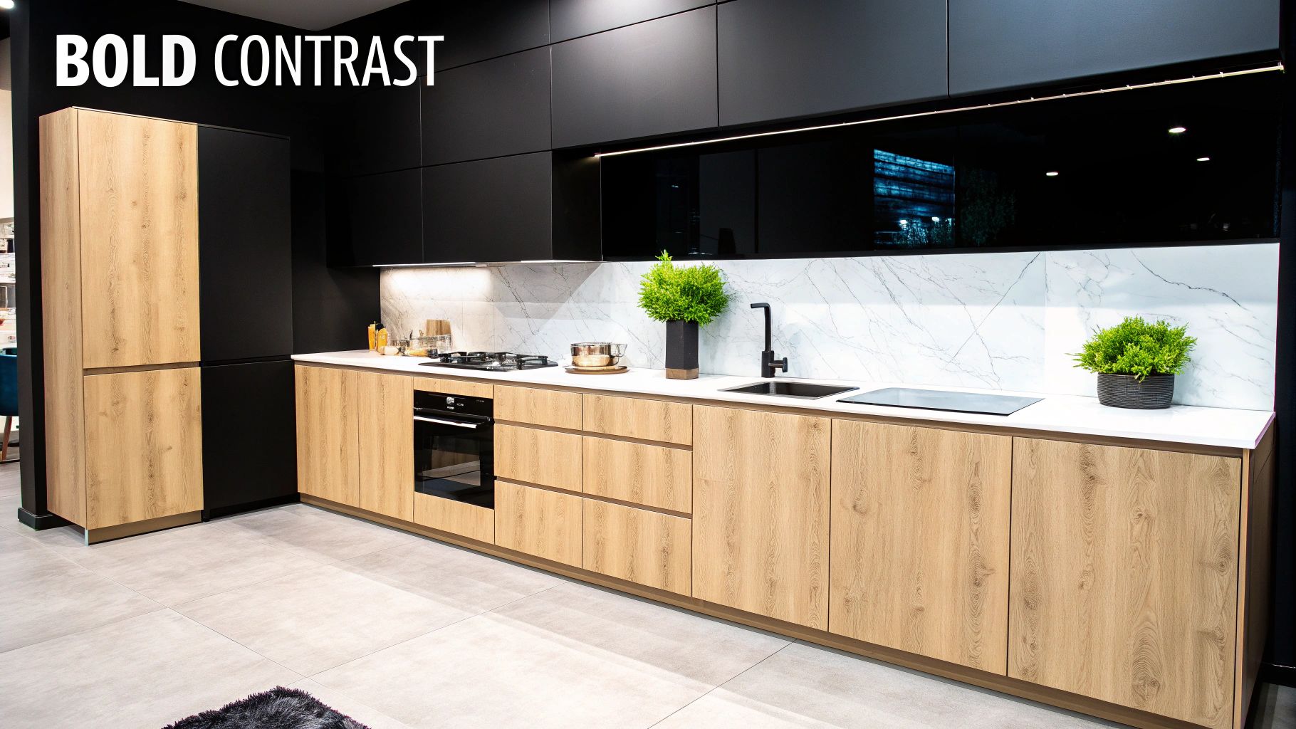
7. Cream and Charcoal Black: Bold, Contemporary Impact
For those seeking a palette with dramatic flair, the combination of cream and charcoal black is a standout choice. This pairing leverages high contrast to create a look that is both modern and undeniably sophisticated. The soft, gentle warmth of cream acts as a perfect counterbalance to the deep, grounding intensity of charcoal black, resulting in a design that feels balanced, intentional, and full of visual impact.
This combination works because it plays on the classic black-and-white theme but softens it for a more luxurious feel. The cream replaces the starkness of pure white, introducing an element of warmth that prevents the palette from feeling too cold or clinical. This dynamic duo is a cornerstone of modern, industrial, and transitional design, popularised by influential figures like interior designer Axel Vervoordt and the wider modernist movement for its ability to create powerful, architectural statements in any space.
Why This Combination Works
The strength of cream and charcoal black lies in its confident and decisive nature. It’s a palette that commands attention, making it perfect for brands and spaces that want to project strength, elegance, and modernity. In marketing, it communicates a premium, high-end message, ideal for luxury goods, contemporary art galleries, or high-fashion retail spaces. The high contrast also ensures excellent readability, a key factor for effective signage. To explore this further, you can learn more about what other colours go with black.
Key Colour Codes:
- Cream: Hex #FFFDD0
- Charcoal Black: Hex #36454F
- Off-White (for accents): Hex #FAF9F6
Practical Applications and Styling Tips
This powerful duo is incredibly effective for creating memorable branding and striking displays.
- For Banners and Signage: Use a cream background with bold, charcoal black typography for maximum legibility and impact. This is ideal for trade show banners or in-store promotional posters where you need to grab attention from a distance.
- Balance the Proportions: To avoid overwhelming the viewer, let cream be the dominant colour. Use charcoal black for key elements like headlines, logos, or architectural features in a display.
- Soften with Texture: Introduce textures to soften the high contrast. A matte finish on a charcoal element or a subtly textured cream background can add depth and a tactile quality to your designs.
- Add Warmth: In physical spaces like retail displays or event booths, incorporate warm lighting to complement the cream and prevent the charcoal from feeling too stark or imposing. This creates a more inviting atmosphere.
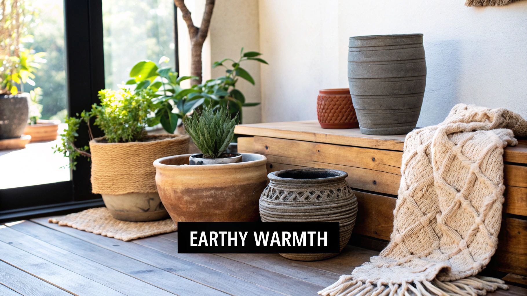
8. Cream and Warm Terracotta: An Earthy, Sun-Kissed Embrace
When considering what colours go with cream for a warm and inviting atmosphere, the pairing with terracotta is an exceptional choice. This combination channels the sun-drenched landscapes of the Mediterranean and the rustic charm of Southwestern design. The earthy, baked-clay tones of terracotta provide a grounding, natural warmth that beautifully complements the gentle softness of cream, creating a palette that feels both vibrant and deeply comforting.
This duo works by balancing the light, airy quality of cream with the rich, grounded nature of terracotta. Cream acts as a serene backdrop, preventing the potent warmth of terracotta from overwhelming a space. The result is a harmonious and hospitable environment that feels artisanal and authentic. This aesthetic is frequently seen in the work of designers like Martyn Lawrence Bullard and popularised by brands like Anthropologie, which celebrate handcrafted, global-inspired styles.
Why This Combination Works
The strength of cream and terracotta lies in its ability to create an immediate sense of warmth and welcome. It's a palette rooted in nature and tradition, evoking feelings of comfort, stability, and creativity. For businesses in the hospitality, wellness, or artisanal craft sectors, this combination communicates an approachable, high-quality, and authentic brand identity.
Key Colour Codes:
- Cream: Hex #FFFDD0
- Terracotta: Hex #E2725B
- Dark Brown (for text): Hex #654321
Practical Applications and Styling Tips
This earthy palette is perfect for creating engaging and memorable branding, especially for businesses with a focus on natural products or experiences.
- For Banners and Signage: Use a cream background to ensure your message is clear and inviting. Apply terracotta for headlines, logos, or as a bold border to capture attention. This works exceptionally well for café menus, spa service lists, or artisan market stalls.
- Incorporate Natural Textures: To enhance the organic feel, overlay subtle textures like clay, linen, or rough plaster onto your digital or printed designs. This adds depth and reinforces the artisanal theme.
- Balancing the Palette: Use cream as the dominant colour (around 60-70%) and terracotta as a powerful accent. Introduce natural wood tones or deep greens as secondary accents to create a more dynamic look.
- Ensuring Readability: When setting text over a terracotta background, a crisp off-white or light cream is effective. For text on a cream base, a dark, earthy brown like Raw Umber (#654321) offers excellent contrast while staying true to the palette.
9. Cream and Soft Lavender: A Whimsical and Serene Pairing
When considering what colours go with cream, the gentle and slightly whimsical combination of cream and soft lavender offers a unique and modern aesthetic. This pairing blends the comforting warmth of cream with the cool, ethereal quality of lavender, creating a palette that is both peaceful and subtly romantic. The result is a serene atmosphere that feels sophisticated yet approachable, perfect for spaces designed for relaxation and calm.
This combination works because it provides a soft whisper of colour without overwhelming the senses. Cream acts as a perfect, neutral base, allowing the delicate lavender tones to come forward without becoming dominant. This nuanced interplay creates a cohesive and dreamy look, popularised by contemporary design influencers and modern wellness brands. It’s a palette that evokes a sense of tranquility and gentle creativity, making it ideal for creating inviting and stylish environments.
Why This Combination Works
The strength of cream and soft lavender lies in its ability to create a tranquil and imaginative space. It’s a pairing that feels both contemporary and timeless, offering a fresh alternative to more traditional neutral palettes. For businesses in the wellness, beauty, or creative sectors, this combination communicates a sense of calm, elegance, and forward-thinking style.
Key Colour Codes:
- Cream: Hex #FFFDD0
- Soft Lavender: Hex #E6E6FA
- Deep Plum (for contrast): Hex #4E2A40
Practical Applications and Styling Tips
This palette is highly effective for branding and interiors that aim to be calming and chic, from boutique hotels to contemporary retail spaces.
- For Banners and Signage: Use a cream background as the dominant canvas. Introduce soft lavender through graphic elements, borders, or a subtle watercolour-style wash. This keeps the design light and airy.
- Creating a Focal Point: To prevent the palette from feeling too uniform, use a deeper shade like plum or aubergine for key text, such as a company name or event title. This adds necessary contrast and visual hierarchy.
- Balancing the Palette: Incorporate clean, bright whites and modern, clean-lined furniture or typography to keep the aesthetic feeling fresh and contemporary rather than overly sweet.
- Material and Texture: This combination pairs beautifully with natural materials. Think light woods, linen textures, and brushed metals like silver or champagne gold to enhance the sophisticated feel in marketing materials or interior design.
10. Cream and Rich Bronze: The Essence of Timeless Luxury
When considering what colours go with cream for a truly opulent effect, the pairing with rich bronze is unmatched. This combination merges the soft, understated warmth of cream with the deep, lustrous warmth of bronze, creating a palette that feels both luxurious and historic. The result is a sophisticated, gallery-like aesthetic that exudes richness and timeless elegance.
This combination works by layering a warm neutral base with a warm metallic accent. Cream provides a quiet, elegant canvas that allows the bronze to shine without becoming overpowering. The metallic quality of bronze introduces texture, depth, and a sense of enduring quality, reminiscent of classical art and high-end design. This pairing is favoured by interior designers like Peter Dunham and luxury brands for its ability to craft spaces that feel curated, expensive, and deeply inviting.
Why This Combination Works
The power of cream and rich bronze lies in its ability to communicate heritage and high-calibre craftsmanship. It doesn't follow fleeting trends; instead, it projects a sense of permanence and sophisticated taste. This makes it ideal for businesses in the luxury sector, from high-end hospitality to bespoke retail, where establishing an atmosphere of exclusivity and quality is paramount.
Key Colour Codes:
- Cream: Hex #FFFDD0
- Rich Bronze: Hex #B08D57
- Dark Brown (for text): Hex #5C4033
Practical Applications and Styling Tips
This palette is highly effective for creating an exclusive and memorable brand experience.
- For Banners and Signage: Use a cream background with text or logos in a flat bronze colour. For premium signage, consider using actual bronze materials or a foil finish to capture the metallic lustre and create a tactile, high-end impression.
- Balancing the Elements: Maintain cream as the dominant colour to keep the design feeling light and airy. Use bronze sparingly as an accent in frames, fixtures, logos, or typography to guide the eye and add points of interest.
- Adding Texture: Enhance the palette by incorporating warm textures. In print materials, a matte, slightly textured cream paper stock can contrast beautifully with a bronze foil stamp.
- Ensuring Readability: When using this palette for text, ensure sufficient contrast. A dark, warm brown like Dark Bronze (#5C4033) for body copy on a cream background provides excellent legibility while staying within the warm, earthy theme.
Top 10 Color Pairings with Cream
| Palette | Implementation Complexity 🔄 | Resources & Materials 💡 | Expected Outcomes 📊⭐ | Ideal Use Cases |
|---|---|---|---|---|
| Cream and Soft Gray | Low 🔄 — straightforward; check undertones | Low — standard paints, fabrics; add texture | Serene, elegant, low-contrast 📊 ⭐⭐ | Minimalist homes, offices, hotel lobbies |
| Cream and Warm Gold | Medium 🔄 — accent-driven; avoid excess | Metallic finishes, fixtures, layered lighting 💡 | Warm, luxurious, elevated 📊 ⭐⭐⭐ | Luxury hotels, jewelry stores, premium spas |
| Cream and Deep Navy Blue | Medium 🔄 — high-contrast balance needed | Quality pigments, upholstery, brass or wood accents 💡 | Strong, formal, grounding contrast 📊 ⭐⭐⭐ | Corporate branding, nautical, traditional interiors |
| Cream and Soft Blush Pink | Low–Medium 🔄 — subtle execution required | Soft textiles, artwork, cushions; layered whites | Romantic, calming, trendy 📊 ⭐⭐ | Bedrooms, beauty brands, boutique cafés |
| Cream and Sage Green | Low 🔄 — natural, easy to implement | Natural materials, plants, wood finishes 💡 | Restorative, spa-like, earthy 📊 ⭐⭐ | Wellness centers, contemporary farmhouse, botanicals |
| Cream and Warm Taupe | Low 🔄 — very adaptable | Layered neutrals, varied textures, warm lighting | Refined, versatile, timeless 📊 ⭐⭐ | Luxury residences, upscale retail, offices |
| Cream and Charcoal Black | High 🔄 — proportion and lighting critical | Matte/varied finishes, strong lighting, architectural accents | Dramatic, modern, high-impact 📊 ⭐⭐⭐ | Industrial lofts, galleries, statement kitchens |
| Cream and Warm Terracotta | Medium 🔄 — balance rustic and modern | Clay pottery, warm woods, textured textiles 💡 | Warm, inviting, culturally rich 📊 ⭐⭐ | Mediterranean villas, Southwestern homes, artisanal spaces |
| Cream and Soft Lavender | Low–Medium 🔄 — shade and lighting sensitive | Soft fabrics, muted accents, careful lighting | Gentle, peaceful, slightly romantic 📊 ⭐⭐ | Bedrooms, wellness rooms, boutique hotels |
| Cream and Rich Bronze | Medium 🔄 — metallic restraint advised | Bronze fixtures, hardware, patina-aware materials 💡 | Opulent, gallery-like, warm sophistication 📊 ⭐⭐⭐ | High-end residences, galleries, luxury hospitality |
Bringing Your Cream Colour Palette to Life
Choosing what colours go with cream is more than a simple design decision; it is a strategic choice that defines the voice and atmosphere of your brand. Throughout this guide, we have explored ten distinct and powerful pairings, each offering a unique narrative. From the serene and professional pairing of cream and soft grey to the bold, dramatic statement made by cream and charcoal black, the versatility of this foundational shade is undeniable.
We’ve seen how warm gold introduces a touch of luxury perfect for high-end retail, while sage green evokes a sense of natural, organic calm ideal for wellness brands. Each combination is a toolkit, ready to be deployed to achieve a specific marketing objective. The key takeaway is that cream is not merely a neutral background colour; it is an active participant in your design, capable of softening, warming, and elevating its companion hues.
From Theory to Tangible Results
Translating a digital colour palette into a physical, real-world asset requires precision and a deep understanding of materials. The success of your chosen palette-whether it's the subtle warmth of terracotta on an outdoor vinyl banner or the rich depth of deep navy blue on an indoor roller banner-hinges entirely on the quality of its execution.
Here are the critical final steps to ensure your vision is realised perfectly:
- Finalise Your HEX Codes: Double-check that the specific HEX codes you’ve chosen are consistently applied across all design files. This simple step prevents colour discrepancies between different marketing materials.
- Consider Your Substrate: The material you print on affects colour appearance. A colour may look different on a glossy roller banner compared to a matte-finish PVC banner. Always consider the final medium when approving proofs.
- Prioritise Accessibility: Revisit your contrast ratios. Ensure your text is legible against your chosen cream and colour pairing, especially for essential information on safety signage or promotional banners.
- Align with Your Brand's Core Message: Does your final colour choice truly reflect your brand’s personality? A playful startup might lean towards soft blush pink, whereas a corporate firm would be better served by the authority of warm taupe or charcoal.
Key Insight: A well-chosen colour palette is only as effective as its execution. The transition from a digital design to a printed product is where your brand's commitment to quality is truly tested.
Ultimately, bringing any cream colour palette to life hinges on mastering these essential design concepts in interior design and applying them to your branding materials. By moving beyond simply asking "what colours go with cream" and instead focusing on how those colours work together to communicate your message, you unlock a new level of strategic branding. You create an experience that is not only visually pleasing but also emotionally resonant and commercially effective, turning a simple banner or sign into a powerful tool for connection.
Ready to see your perfect cream colour palette printed with vibrant accuracy and professional quality? At Banner Printing Ltd, we specialise in transforming your designs into high-impact banners and signage that capture attention. Explore our range of printing services today and let us help you bring your vision to life.


