
A poster has only a few seconds to do its job. Whether it is in a shop window, beside a till, on an event noticeboard or in a busy reception area, it needs to stop people, communicate the offer and tell them what to do next. Well-planned promotional posters turn that short moment of attention into footfall, enquiries, bookings or sales.
For UK businesses working to a deadline, the strongest poster is not necessarily the busiest or most artistic one. It is the one that stays clear at a glance, prints sharply at the size required and arrives in time for the campaign. That calls for practical decisions about format, artwork, paper and placement before the order goes to print.
Start With One Clear Promotional Goal
A poster cannot carry every message your business wants to share. Trying to promote a new product range, explain five service benefits, announce a competition and include every contact detail usually creates a design that customers walk past.
Decide what the poster must achieve first. A retail sale poster may need to make the offer and end date impossible to miss. An exhibition poster may need to establish who you are and what you provide from several metres away. A tradesperson advertising locally may need to put the service area and phone number front and centre. The goal determines the hierarchy of every element on the page.
Keep the message focused on one action. That could be “Visit us this Saturday”, “Book your free consultation”, “20% off selected lines” or “Scan to view the full menu”. Supporting text can add confidence, but the main message should remain understandable even when someone sees the poster from across the room.
Time-sensitive promotions benefit from visible dates. If the offer has conditions, make them legible rather than hiding them in tiny type. Clear terms protect trust and reduce awkward conversations at the counter.
Choosing the Right Promotional Poster Size
Size is a visibility decision, not just a budget decision. An A4 poster works well for close-up viewing on counters, community boards and smaller display areas. A3 gives your campaign more presence in windows, retail interiors and receptions. A2 and A1 are better suited to locations where people will view the message from a greater distance.
Think about where the customer stands when they first see it. A poster behind a café counter can deliver detail because customers are already close. A poster facing a pavement needs a much larger headline, stronger contrast and less copy. For an exhibition stand, several coordinated posters can be more effective than one crowded sheet, especially if each addresses a different service or product group.
There is a trade-off. Larger formats provide impact, but only if the artwork contains high-resolution images and enough clear space. Enlarging a low-quality logo or mobile phone photograph can leave it looking soft or pixelated in print. If the campaign needs a large display but the imagery is limited, use bold typography, simple brand colours and one clean product image rather than stretching several weak assets.
Design Promotional Posters for Fast Reading
People do not read posters in the same way they read a brochure. They scan. Your design should guide their eye through the message in a deliberate order: headline first, offer or key benefit second, then the call to action and contact details.
Make the headline earn its space
The biggest words should communicate the reason to pay attention. “Winter Tyres Fitted While You Wait” is more useful than a large company name on its own. “Half-Price Pizza Every Tuesday” is clearer than a generic “Special Offer”. Your branding still matters, but the campaign message should lead when the purpose is immediate response.
Use typefaces that remain easy to read at distance. Decorative fonts may suit a small accent, but they rarely work for pricing, dates or instructions. Avoid placing text over a detailed photograph unless there is a solid colour panel or enough contrast behind it.
Use images with a purpose
A good image can show a product, setting or outcome faster than a paragraph. A restaurant might feature one appetising dish rather than a crowded collage. A salon can use a polished result image. A construction firm may use a completed project that demonstrates the standard of work.
Choose imagery that supports the message, not just the available files. If the offer is about speed, a photo of the team at work can reinforce it. If it is about a premium product, clean lighting and uncluttered framing will do more than busy graphics. Always use images you have permission to reproduce.
Leave room to breathe
White space is working space. It separates the offer from the supporting detail and prevents a poster from becoming difficult to scan. A crowded layout often signals uncertainty, while a clear layout makes the business look organised and confident.
Before approving artwork, view it at a reduced size on screen. If the headline, price or call to action disappears in the small version, it is unlikely to perform well in a real display environment.
Paper, Finish and Print Quality Matter
Promotional posters are often judged alongside the business they represent. Dull colours, fuzzy text or a flimsy feel can weaken an otherwise strong campaign. High-quality poster printing keeps fine details crisp, brand colours consistent and photographs looking their best.
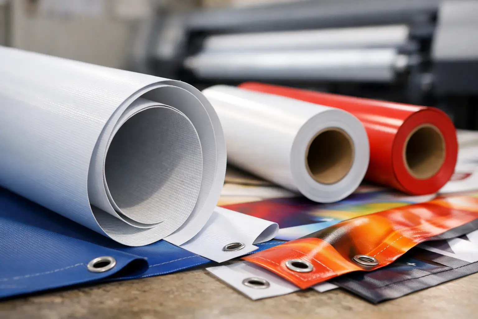
The right stock depends on the display environment and how long the posters need to last. For short-term indoor promotions, a standard poster stock is usually a cost-effective choice. For premium launches, hospitality displays or artwork with rich photography, a heavier or glossier finish can add visual impact. A matt finish can be the better option where overhead lighting causes glare, such as a shop interior or exhibition hall.
If the poster will be exposed to rain, direct weather or heavy handling, paper may not be the best product. A weatherproof banner, rigid sign or protected poster frame is often the more reliable choice. Selecting the correct display material at the outset prevents a quick promotional fix from becoming a replacement order days later.
Put Posters Where They Can Convert
A brilliant design cannot work if customers never see it. Place posters at natural decision points: in a window facing passing traffic, by the entrance, near a relevant product display, at the till or beside a booking desk. Match the message to the location. A poster near the door can build awareness, while one at the point of purchase can push a specific upgrade or limited-time offer.
Use repetition carefully. The same core campaign can appear in a window, on an internal display and at the counter, but each poster should suit its viewing distance. A large window format may carry the headline and offer only. A smaller counter version can include a QR code, full terms or a booking prompt.
Check the surroundings before printing. A dark poster may disappear against a dark wall. A pale design may get lost in a bright window. Nearby signs, reflections and furniture all affect whether the message stands out. Positioning is part of the design process, not an afterthought.
Get Artwork Ready for Print Without Delays
Fast turnaround is most useful when the artwork is ready to produce. Supply files at the final print size wherever possible, with images at suitable resolution for the intended format. A PDF is generally a dependable choice for finished artwork because it keeps fonts, layout and graphics together.
Build in a safe margin around the edge so that essential text, logos and QR codes are not too close to the trim. If a design includes a coloured background or image running to the edge, allow for bleed so the finished poster has a clean edge after trimming. These small production details make a noticeable difference to the final result.
For urgent campaigns, use a simple approval process. Confirm the size, quantity, artwork version, deadline and delivery address before production begins. This is particularly valuable for businesses managing multiple branches, event teams working from shared files and retailers running coordinated offers.
Banner Printing UK supports straightforward artwork upload and UK-based production for businesses that need professional promotional print without unnecessary hold-ups. With a clear brief and print-ready file, fast dispatch can help keep a last-minute campaign on schedule.
Give Each Poster a Job
The best campaigns treat posters as active sales tools, not background decoration. Review them after the promotion begins. Are customers mentioning the offer? Are staff being asked the right questions? Is a QR code being scanned, or is the phone number easy enough to use? Those answers help improve the next print run.
A focused message, a format suited to the space and sharp, dependable print can make a modest campaign far more visible. Give every poster one job, place it where that job can happen, and let the design do the talking before a customer has even stepped through the door.