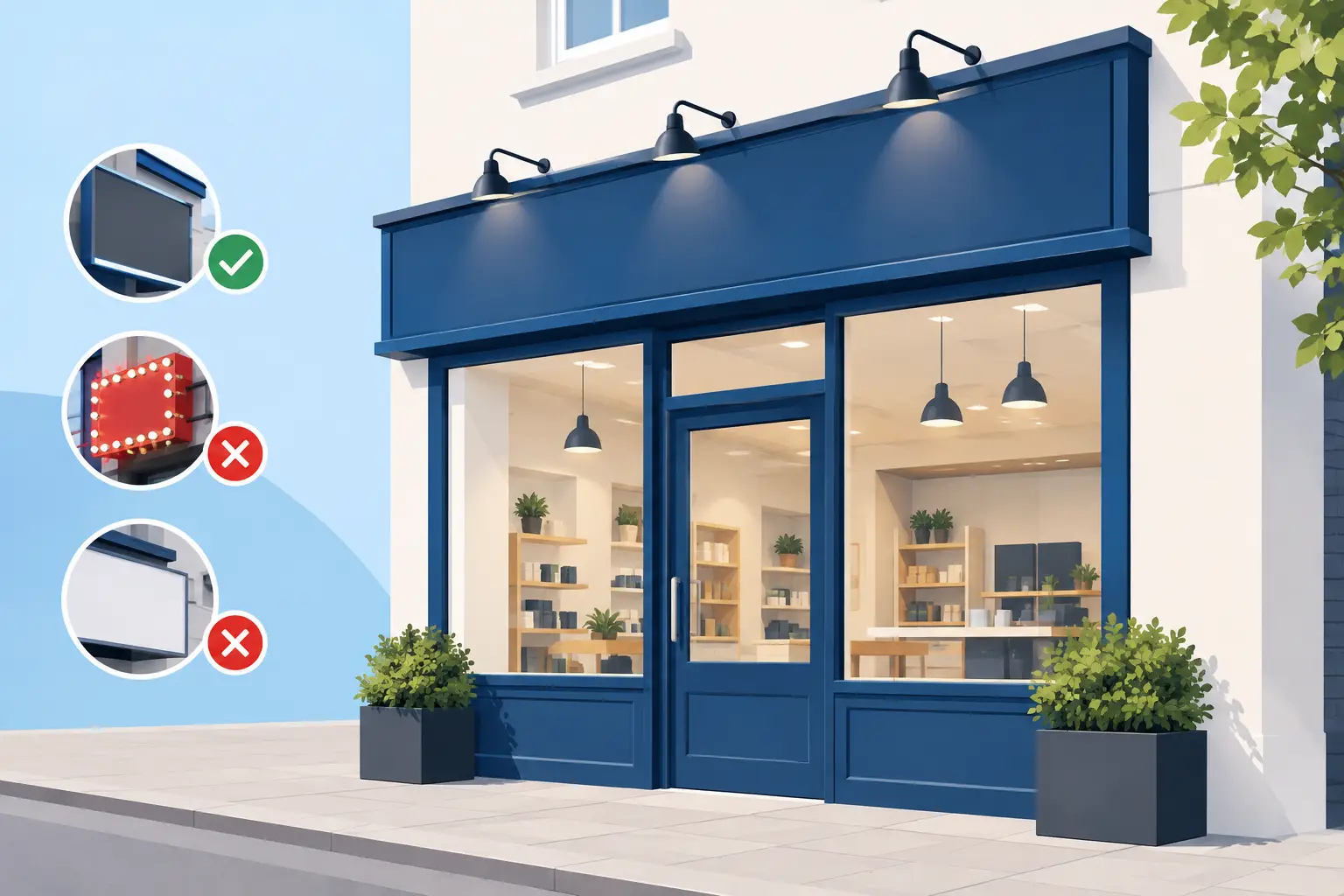
A shopfront has only a few seconds to do its job. Someone walking past needs to see what you offer, understand who you are and decide whether to look closer. To create readable shopfront signage, start with the viewing distance, not the artwork on your screen. A design that looks sharp at arm’s length can become a blur from the other side of the road.
For retailers, cafés, salons, trades and local services, legibility is not a decorative extra. It is what turns a frontage into a working sales tool. Clear signage helps regular customers find you, reassures first-time visitors and makes promotions visible when footfall matters most.
Create readable shopfront signage from the street
Stand where your customers stand. Look at the building from across the pavement, from the nearest parking bay and, where relevant, from passing traffic. This is the real test of whether your message can be read quickly.
Your business name should be the first thing people see. The service, product or offer comes next. Details such as a telephone number, website address or opening hours are useful, but they should not compete with the main message. When everything is given the same size and weight, nothing stands out.
A simple hierarchy usually works best. Put the business name or strongest offer in the largest type, use a short supporting line beneath it, then place secondary information in a smaller but still clear size. For example, a barber may lead with their name, followed by “Walk-ins Welcome” or “Gents’ Haircuts”, then opening times on a separate window graphic or panel.
The right amount of information depends on the location. A shop on a busy high street can rely on passing footfall and may need just a name and a clear category. A business set back from the road may need larger lettering and a more descriptive message. If drivers are part of your audience, keep the wording especially brief. They do not have time to read a paragraph at 30 mph.
Use type that works at a glance
Decorative fonts have their place in a logo, but they are rarely the best choice for a full sign message. Choose clean letterforms with open shapes and enough spacing between characters. Sans serif typefaces are often reliable for shopfronts because they remain clear at a distance, particularly when printed large.
Avoid using several typefaces simply to make the design look more interesting. One font family, with a bold weight for the key message and a regular weight for supporting text, is usually enough. Upper and lower case is also easier to read than full capitals for longer lines. Capitals can work well for a short word such as “SALE” or “OPEN”, but a whole sentence in capitals slows the eye down.
Give words room to breathe. Tight letter spacing, compressed type and long lines make signage harder to scan. As a practical rule, break a message into short lines and keep the most important words together. “Fresh Coffee Daily” reads faster than a crowded list of drinks, snacks and every available add-on.
Logos need the same discipline. A detailed logo may be recognisable on a business card but lose definition when reproduced at large scale or viewed from a distance. If your logo includes fine lines, tiny text or complex imagery, consider using a simplified version for exterior display.
Size is a visibility decision
There is no single perfect font size because it depends on the sign position, viewing distance and amount of available space. However, the further away people need to read it, the larger the main lettering must be. Do not shrink the business name to fit extra wording. Reduce the copy first.
Before committing to print, view your design at 100% scale where possible, or print a small section at actual size. This can reveal whether thin strokes disappear, text is too tightly packed or a key word needs more impact.
Build contrast into the design
Strong contrast is what separates readable signage from signage that looks good only on a bright computer display. Dark lettering on a light background, or light lettering on a dark background, gives the eye a clear starting point. Black on white is highly effective, but it is not the only option. Deep navy on white, white on charcoal or yellow on black can all work well when used carefully.
What matters is the difference in brightness between text and its background. Two colours may suit your brand yet still sit too close together visually. Red text on a dark blue panel, for example, can be difficult to read from a distance, especially in poor weather or evening light.
Be cautious with text placed over photographs, patterns or gradients. These can work for a large background image, but the wording needs a calm, solid area behind it. A coloured block, opaque panel or subtle overlay can protect readability without losing the visual impact of the image.
If your brand colours are light or low contrast, use them as accents rather than forcing them to carry the main message. A bright logo can sit alongside high-contrast lettering and still feel consistent with the rest of your branding.
Plan for weather, light and real conditions
A shopfront sign is judged outside, not in a tidy artwork preview. Sun glare, rain, shadows from neighbouring buildings and reflections in glass can all change how the design performs.
Glossy finishes can make colours look lively, but they may reflect strong sunlight on a south-facing frontage. Matte surfaces often reduce glare and can be a better option for information-heavy window displays or panels. On glass, consider what is behind the sign as well. Interior lighting, displays and movement can reduce the clarity of text if the design is too transparent or pale.
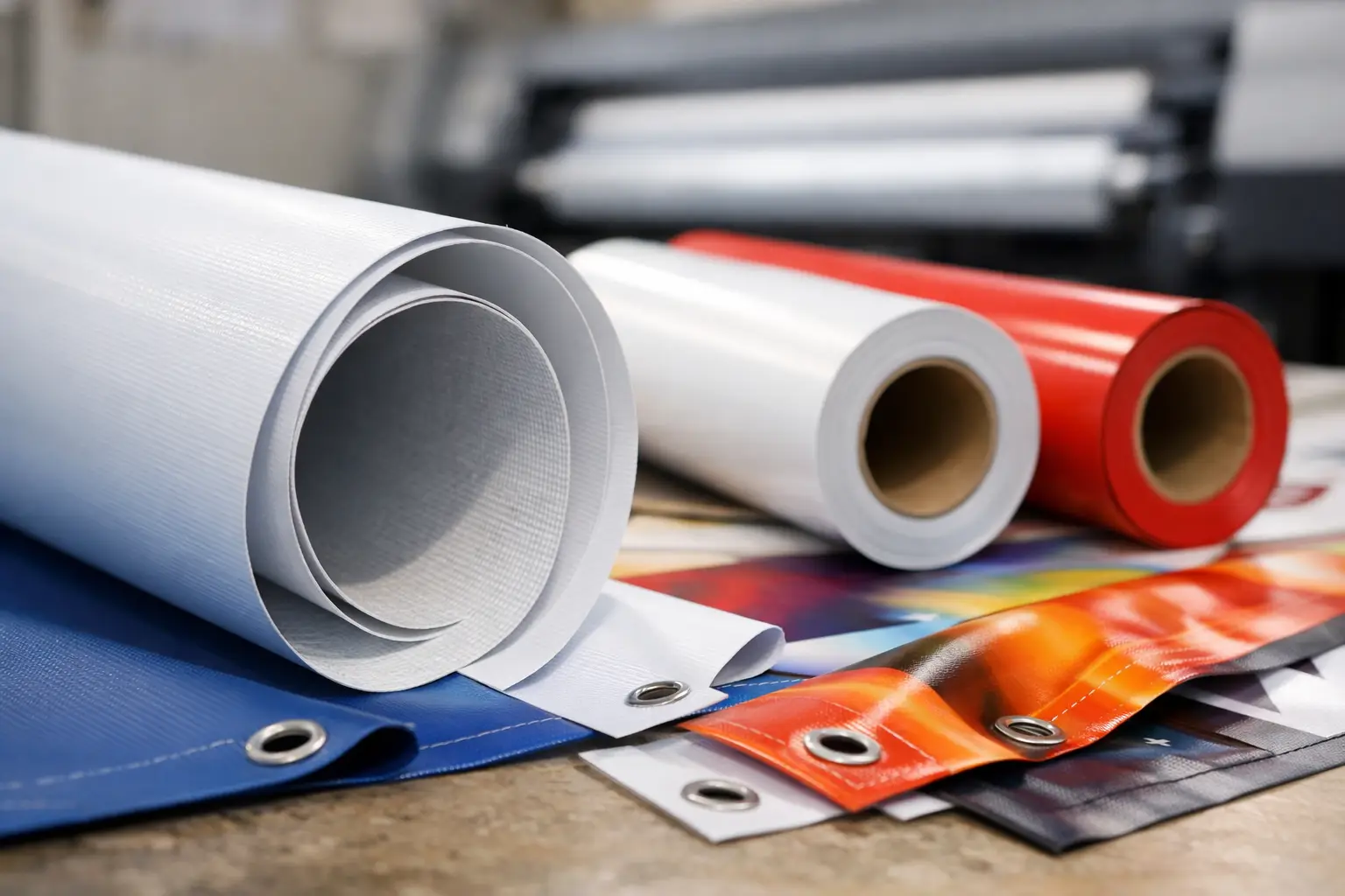
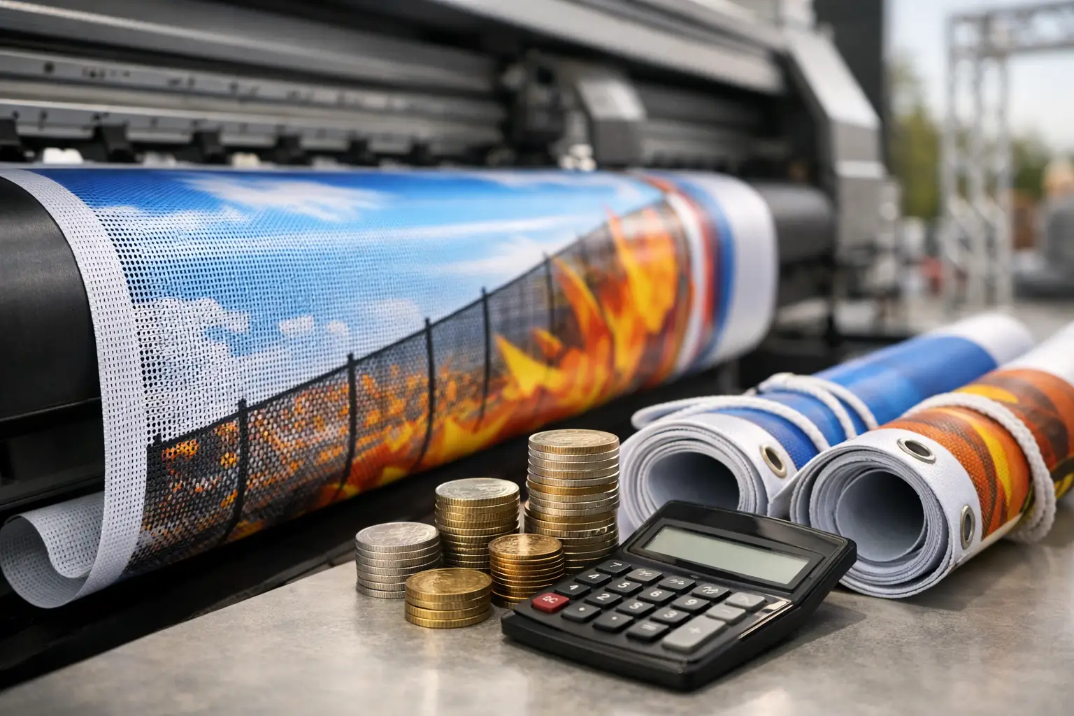
For temporary promotions, events and opening announcements, a weatherproof vinyl banner can deliver large, high-impact wording quickly. Use bold text, simple graphics and reinforced fixing points so it stays secure and visible outdoors. Mesh banners can be useful in exposed locations where wind needs to pass through the material, although fine detail is less effective on the perforated surface.
For longer-running campaigns, UV-resistant inks and durable outdoor materials help your colours remain presentable through changing British weather. The material should suit the job, not just the artwork. A window poster, pavement-facing banner and construction hoarding each face different conditions.
Keep the message focused
Many unreadable shop signs fail because they try to answer every customer question at once. Your frontage is there to attract attention and establish confidence. It does not need to replace your menu, service brochure or full price list.
Choose one primary action. You may want people to visit, call, book, browse a sale or remember your name. Build the sign around that aim. A restaurant promoting lunchtime trade might use “Lunch From £8.95” as the lead message, while a new retailer may get better results from “Now Open” alongside a clear category and business name.
Offers should be easy to understand without small print. If a customer has to stop, squint and decode terms, the sign is doing too much. Save detailed conditions for an in-store poster, flyer or counter display where people have time to read.
Check your artwork before it goes to print
The fastest way to lose clarity is to send low-resolution artwork for a large format print. Images and logos should be supplied at suitable quality for their final size, ideally as vector files for logos and text-based graphics. Vector artwork stays crisp when enlarged, while a small web image can become pixelated very quickly.
Check spelling, phone numbers, dates and opening hours with fresh eyes. It sounds basic, but a rushed promotion with an incorrect date or missing digit is expensive to reprint. Also check margins and safe areas. Important text should sit well inside the edge of a banner or sign, away from hems, eyelets, frames and fixing points.
At Banner Printing UK, artwork can be reviewed and refined before production, which is particularly useful when you are working to a tight opening date or campaign deadline. Fast turnaround helps, but getting the message and file right before print protects both your budget and your presentation.
A readable shopfront does not need clever wording or crowded graphics. It needs a message people can understand before they have walked past. Put the essential words first, give them contrast and space, then choose a print material built for where the sign will be seen.