A building site can change by the hour. New access routes, deliveries, changing hazards and multiple contractors all make clear communication essential. This guide to building site signage explains how to plan signage that helps keep people informed, presents your company professionally and stands up to British weather without creating confusion on site.
The best signs do more than display a logo. They direct drivers to the right gate, tell visitors where to report, reinforce site rules and make a live project look managed from the pavement. For construction firms, developers and trades working to a deadline, getting these basics right early saves repeated questions, avoidable delays and rushed replacement orders later.
Start with the job each sign needs to do
Before choosing a material or uploading artwork, walk the site as a visitor would. Consider what a delivery driver sees from the road, where a subcontractor enters, and how someone finds the site office without needing to ask. A sign is effective only when it appears at the point where a person needs to make a decision.
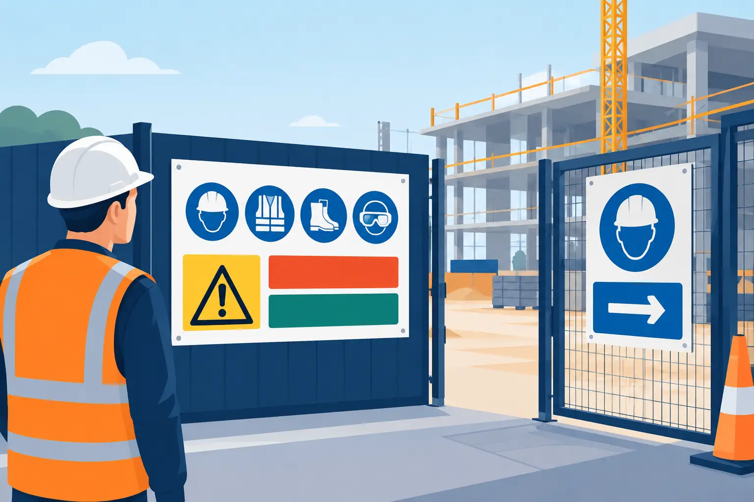
Most sites need a combination of statutory safety signage, directional signs and branded information. These are different jobs and should not be forced onto one crowded board. Required health and safety signs must use the appropriate symbols, colours and wording for the risk involved. Check current Health and Safety Executive guidance and any requirements set by your principal contractor, client or local authority before producing them.
Branded site signs then support the operational detail around those essentials. Hoarding banners can identify the project, display contact details or promote future availability. Entrance signs can state the site name, opening hours and visitor instructions. Directional signs can point to welfare, parking, the site office, delivery bays and emergency assembly points.
Where a project is public-facing, a well-designed perimeter also reassures neighbours and passers-by. It shows that the site is organised, gives a clear contact route for enquiries and keeps the contractor’s name visible throughout the build.
Plan your building site signage by location
A practical sign plan usually begins at the boundary and works inwards. This prevents common gaps, such as a clear reception sign that nobody can find from the entrance or a delivery instruction hidden after the turning point.
At the roadside, use large, high-contrast information that can be read safely from a vehicle or pavement. This is the place for the project name, developer or contractor branding, a simple contact number and, where appropriate, a clear arrow for deliveries or visitor access. Avoid fitting every detail onto one panel. Drivers need the next instruction, not the full project story.
At the gate, prioritise rules and actions: report to reception, wear required personal protective equipment, use the designated entrance, or call a named number before entering. Inside the boundary, repeat directions where routes split. A sign that is visible from one angle may be missed entirely by someone arriving on foot or in a lorry.
For larger sites, map the journey from gate to work area. Identify every point where somebody could take a wrong turn, reverse unexpectedly or enter a restricted zone. Temporary signs may be needed as phases change, so choose formats that can be replaced quickly rather than treating the first print run as permanent.
Choose materials for real site conditions
Material choice depends on where the sign will sit, how long it needs to last and how it will be fixed. The cheapest option is not always the most economical if it curls, fades or tears before the project reaches its next phase.
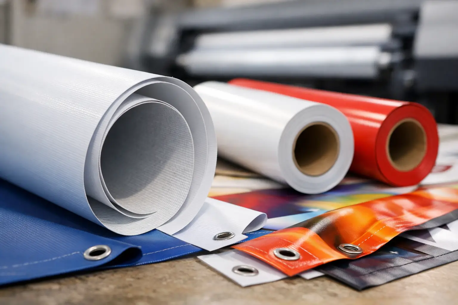
Vinyl banners are a reliable choice for perimeter fencing, gates, scaffolding and hoardings. They offer strong colour reproduction, are weatherproof and can be finished with eyelets for straightforward fixing. They work particularly well for contractor branding, project messaging, directional information and site rules that need to be seen at scale.
Mesh banners suit exposed fencing and windy locations. Their perforated surface allows air to pass through, reducing wind load while still carrying a clear printed message. The trade-off is that fine detail and small text are less effective than on solid vinyl, so keep the design bolder and simpler.
Rigid boards are often better for signs that need a flatter, more permanent appearance, such as entrance information or fixed directions. Consider the fixing method before ordering. A good print can still fail if it is attached with weak cable ties, positioned against sharp edges or left loose enough to flap in the wind.
For short-term notices, posters can be useful inside site cabins, welfare areas and reception points. They are not a substitute for durable outdoor signage, but they are a cost-effective way to display changing information such as meeting times, updated procedures or workforce messages.
Make every message readable at a glance
Construction sites are visually busy. Plant, fencing, vehicles, high-vis clothing and changing work zones all compete for attention. Your signage must earn its visibility with clear hierarchy rather than more text.
Put the most important instruction first and make it the largest element. If a sign needs to say “Deliveries”, “Site Entrance” or “Report Here”, that phrase should be immediately obvious. Supporting details can sit below in smaller type, but they should not compete with the main action.
Use strong contrast between text and background. Dark lettering on a pale field, or light lettering on a dark field, is generally easier to read than colours with similar tones. Brand colours matter, but legibility comes first where safety, access and logistics are concerned.
Keep phone numbers, web addresses and small-print project details away from long viewing distances. If people need to read them, place them where they can stop safely. Avoid overloading designs with multiple logos, lengthy paragraphs and image-heavy backgrounds. On a site perimeter, a simple message usually works harder than a clever one.
Artwork quality matters too. Logos and photographs should be supplied at suitable print resolution, and text should be converted or checked carefully before production. A quick proofing step can catch a missing digit, incorrect postcode or outdated project date before it is printed across a 10-metre run of banners.
Get the scale and fixing details right
Size should follow viewing distance. A small sign can work at a pedestrian gate where people stand close to it. A banner facing a road, car park or long fence line needs larger lettering and fewer words. If the message cannot be read in a quick glance, increase the format or simplify the content.
Think about height as well as width. Signs installed too low can be blocked by parked vehicles, materials or people. Signs installed too high may be difficult to read and harder to maintain. At gates and entrances, ensure the design remains visible when the gate is open as well as closed.
Eyelets should be spaced to support the banner properly, with enough fixings to keep it taut. Use suitable cable ties, bungee cords or purpose-made banner fixings for the setting. In high-wind areas, mesh material, reinforced edges and regular inspections are sensible precautions. Never allow a damaged or loose sign to become a hazard in its own right.
Build in flexibility for changing projects
A building site is not static, so signage should not be treated as a one-off task. Allocate space in the programme and budget for updates when phases, access routes or contractor details change. It is better to replace one outdated directional banner promptly than leave a confusing instruction in place because the original print was intended to last six months.
Keep the artwork files organised by project and sign type. That makes repeat orders faster, particularly when you need matching banners for a new entrance or revised delivery route. Use consistent colours, logos and wording across the site, but do not let brand consistency override clear instructions. A safety or directional message must always remain the priority.
A simple pre-order check can prevent most avoidable errors:
- Confirm which signs are legally required and which are operational or promotional.
- Check the viewing distance, fixing points and likely weather exposure at each location.
- Review phone numbers, addresses, gate instructions and project dates with the site team.
- Make the main instruction large enough to read quickly from the intended approach.
- Allow time for proof approval, production and delivery before the site needs to open or change phase.
Order with the deadline in mind
Site signage is often required at short notice, whether a project is starting, a new tenant is being marketed or access arrangements have changed. Ordering early gives more room to review artwork and choose the right format, but fast production remains valuable when deadlines move.
Banner Printing UK produces custom large-format print in the UK, making it easier to order practical vinyl or mesh banners for site boundaries, entrances and project promotion without unnecessary delays. Supply clear artwork where possible, state the finished size and fixing requirements, and check the proof carefully before approval. This keeps the process quick while protecting the quality of the final print.
The strongest building site signage is rarely the flashiest. It is the sign that appears exactly where it is needed, says the right thing in seconds and continues doing its job through rain, wind and a changing construction programme.