
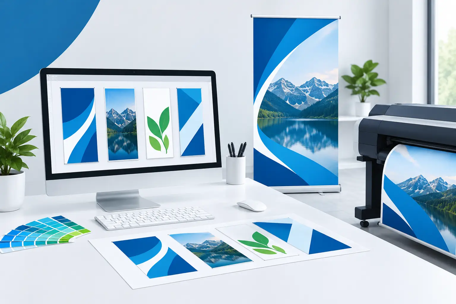
A banner can be printed within 24-48 hours, but poor artwork can still make it look rushed. Pixelated logos, text too close to the edge and the wrong file size are common causes of disappointing results. Well-prepared banner artwork templates remove that uncertainty, giving your promotion the space, clarity and finish it needs to work from a distance.
Whether you are promoting a trade stand, opening a shop, marking out a building site or advertising an event, the template is more than a blank page. It is the production guide that helps turn your design into a banner that prints accurately, fits its intended display area and stays readable in the real world.
Start with the right banner size and format
The best design begins with the job it needs to do. A small indoor roller banner is viewed close up, while a large vinyl banner above a shopfront, on fencing or beside a road needs to make an instant impression from several metres away. Choosing a template that matches the final print size is the first essential step.
Do not start on a generic social media canvas and attempt to stretch it later. Enlarging artwork built for a screen usually results in soft graphics and an unbalanced layout. Instead, open the template for the exact product and dimensions you intend to order, then build the design around that space.
Orientation matters too. Landscape banners suit long messages, web addresses and roadside promotions. Portrait layouts are often better for roller banners, entrances and exhibition displays. If your message will appear alongside other signage, measure the available area before committing to a format. A banner that technically fits can still look cramped if the visual proportions are wrong.
What banner artwork templates should include
A useful print template clearly identifies the finished size, bleed area and safe area. Each serves a different purpose, and understanding the difference prevents costly mistakes.
The finished size is the visible area of the banner once it has been trimmed, hemmed or fitted with eyelets. Bleed is extra artwork that extends beyond that edge. It allows the printer to trim the banner cleanly without leaving an unwanted white line around the design.
The safe area sits inside the finished edge. Keep key content, including logos, phone numbers, offer details and small text, within this zone. On a vinyl banner, the outer edge may be folded for hemming or reinforced around eyelets. On a roller banner, the lower section can disappear into the base mechanism. A message placed too close to these areas may be difficult to read or partially hidden.
Background colours, patterns and images can extend into the bleed. Important content should not. This simple rule gives the production team the tolerance required for a professional finish.
Design for the distance, not just the screen
The most attractive banner artwork on a laptop can fail outdoors if it asks people to read too much. Most passers-by will give a banner only a moment of attention. They need to understand the offer before they have walked, driven or moved on.
Lead with one clear message. A promotion such as “50% Off This Weekend”, “Now Open” or “Free Site Survey” should be the biggest element on the page. Your business name, logo and contact details support that message rather than competing with it.
Use a clear reading order: headline first, essential detail second, call to action last. For example, a restaurant launch banner might put the opening date at the top, the venue name in the centre and booking information at the bottom. This gives the eye a natural route through the design.
Text size depends on the banner size and viewing distance, so there is no single point size that suits every job. As a practical check, zoom out from your design. If the main message loses impact at a reduced scale, it is unlikely to perform well from across a car park or exhibition aisle. Keep body copy short, avoid thin decorative typefaces and give each line enough breathing room.
Use images that are ready for large-format print
Large-format printing exposes weak imagery quickly. A small image that looks fine on a phone may become blurry, blocky or noisy when printed at banner scale. Wherever possible, use high-resolution photographs and original logo files.
For photographic artwork, a resolution of around 150dpi at final print size is generally suitable for banners viewed at normal distances. Do not be alarmed if this is lower than the resolution required for a business card or leaflet. Banners are usually seen from farther away, so the viewing conditions are different. However, starting with a tiny web image and enlarging it is never a reliable fix.
Vector logo files are the strongest option because they can be scaled without losing sharpness. These are commonly supplied as PDF, AI, EPS or SVG files. If you only have a JPG or PNG logo, check it at full size in the template before uploading. Fine lettering, jagged edges and low-resolution transparency often show up once printed.
Photographs also need room to breathe. Do not place a busy image directly behind small lettering unless there is a solid colour panel, overlay or clear part of the photograph to support it. High contrast is what makes a message readable, particularly under changing outdoor light.
Get colours and branding right before production
Screen colours are made from light, while printed colours are made from ink. That means a bright shade on your monitor may print slightly differently on vinyl, mesh or fabric. Colour variation is normal, particularly when files are built in RGB rather than CMYK.
If brand colour accuracy is critical, build the artwork in CMYK and use approved brand values where available. Keep the design simple enough that the key colours remain strong. Dark text on a pale background, or pale text on a dark background, usually gives the best legibility. Avoid placing similar tones together, such as mid-blue text over a dark-blue photograph.
Consistency is especially valuable when you are ordering several items for the same campaign. Use the same logo version, core colours, headline style and contact details across banners, posters, flyers and display stands. It helps customers recognise you quickly and makes temporary event signage look considered rather than improvised.
Choose a file format your printer can use
A print-ready PDF is normally the safest format for completed banner artwork. It preserves layout, fonts and vector elements more reliably than many editable files. Where possible, export at the template dimensions with bleed included and crop marks only if requested.
If you are supplying an editable file, make sure all fonts are outlined or packaged correctly, and ensure linked images are included. Missing fonts can change the layout, while missing image links can leave blank areas in the final file.
Before uploading, give the file a final check at 100% on the most detailed areas. Look closely at phone numbers, web addresses, prices and dates. These are often the details that change late in a campaign and are easiest to overlook. It is also worth checking that your email address and telephone number are current. A perfectly printed banner cannot generate enquiries if the contact detail is wrong.
A quick pre-print check that saves time
When a deadline is close, a short pre-flight check is faster than reprinting a banner after an error has reached production. Confirm these points before placing the order:
- The template matches the product, orientation and final dimensions.
- Backgrounds extend into the bleed, while key text stays in the safe area.
- Images and logos remain sharp at print size.
- The headline is easy to read from the intended viewing distance.
- Contact details, dates, prices and spelling have been checked by another person where possible.
If anything feels uncertain, simplify rather than add more. A direct message with a strong logo and a clear call to action almost always outperforms a crowded design full of competing information.
Match the design to the material and location
The environment should influence the artwork as much as the brand guidelines do. Standard vinyl banners are a dependable choice for bold promotions, shopfronts, events and site signage. Their solid surface makes colours appear strong and gives large graphics real impact.
For exposed fencing or windy locations, mesh banner material allows air to pass through. This is practical for reducing wind load, but the small perforations can make delicate type and very fine image detail less effective. Use larger text, bolder shapes and clear contrast for the best result.
Roller banners need a slightly different approach. They are portable and ideal for reception areas, exhibitions and sales presentations, but the base can conceal part of the lower artwork. Keep your strongest message in the upper and middle sections, with secondary contact details positioned safely above the bottom allowance shown on the template.
Good banner design is not about filling every centimetre. It is about making the right information impossible to miss. Start with the correct template, protect the essential details and give the printer a clean, high-quality file. The result is a display that arrives ready to represent your business with confidence when the deadline matters.

There are 3 comments
[…] edge of the banner, but they still need consideration during artwork setup. Keep essential text, logos, phone numbers and QR codes well clear of the trim and fixing area. A key detail placed too close to an eyelet can be obscured […]
[…] artwork protects your deadline and your finished result. Create the file at the ordered dimensions, include the required bleed where relevant, and keep critical text and logos away from trim edges, […]
[…] promotion with an incorrect date or missing digit is expensive to reprint. Also check margins and safe areas. Important text should sit well inside the edge of a banner or sign, away from hems, eyelets, […]